Project - Designing Value Groups
112K views
lesson video
Project - Designing Value Groups
courseDrawing BasicsFull course (181 lessons)
$159
assignments 180 submissions
Patrick Bosworth
Don't go chasing waterfalls, please stick to the oceans, rivers, and lakes that you're used to...
LESSON NOTES

Want more? Join the premium course and get full access to all lessons, demos, assignments, and critiques!

Organizing values into strong, connected shapes does three huge things for your drawings.

  • Improves readability: Allows the viewer to understand your drawing at a glance.
  • Adds depth: Well-organized values build a convincing hierarchy of planes.
  • Commands attention: With control over where the eye goes, every accent, texture, and highlight feels deliberate.

Oceans, Lakes, and Rivers

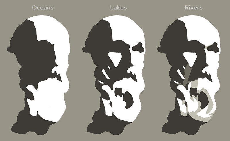
Think of value groups as oceans, lakes, and rivers:

  • Oceans are large areas of light or shadow.
  • Lakes are medium-sized shapes from the opposite value family within an ocean.
  • Rivers are halftone or reflected light connections between lakes and oceans, guiding the flow and gesture in your composition.

Rivers help to tame down distracting lakes and guide the flow in your composition. This approach helps unify your values, grouping them into larger connected shapes.

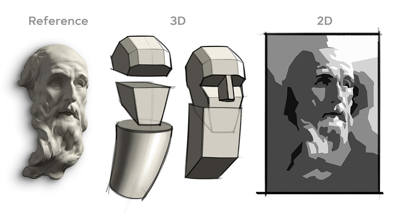
Balancing 2D Composition and 3D Form

Don't just copy the shapes you see, think like a designer.

  • 2D Composition: Values, their shape, size, and location play a big role in the overall composition and how the eye flows through the drawing.
  • 3D Form: Values reveal planes, a change in value suggests a change in plane.

Every shape you design should enhance both the two-dimensional arrangement and carve out the three-dimensional forms. Sometimes, major plane changes help unify smaller shapes, improving the 2D composition.
Organizing values into strong, connected shapes does three huge things for your drawings:

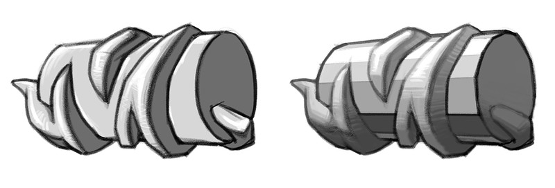
For example, think of big planes on the forehead or jaw, or simplify the hair and beard into cylinders. Small forms can feel cluttered, but if you let the cylinder's major plane changes influence the values of the small shapes, they work together cohesively.

Dealing with Floaters

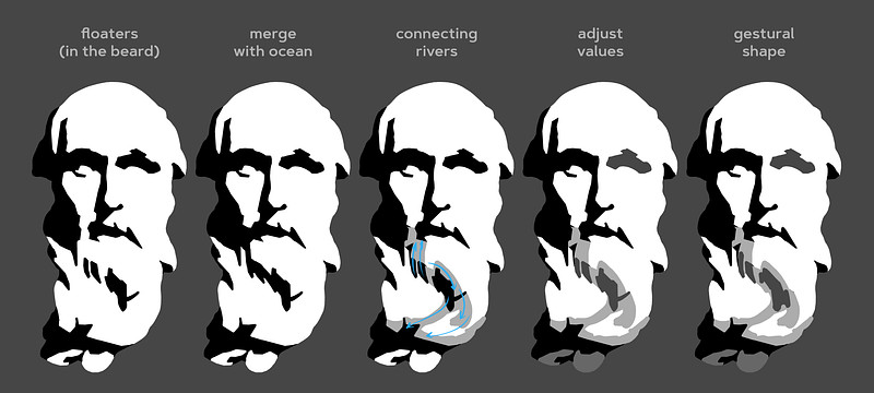
Be aware of how much each shape stands out, based on its value contrast with surrounding shapes. A common rule of thumb is to avoid floaters, isolated shapes, unless they are intended to draw attention.

When you encounter a floating shape that feels distracting:

  • Merge it with the ocean: Modify the shape to make it part of the larger value area.
  • Add connecting rivers: Use halftones to connect a floating lake to an ocean or nearby lakes.
  • Adjust the value: Change the lake's value to make it closer to the surrounding values.
  • Modify the shape's gesture: Alter the shape to flow with the gesture of your composition.
  • Emphasize it intentionally: If you want that shape to stand out, let it be an eye-catching element.

Halftones aren't dark enough to be part of the shadow family, but they are dark enough to create a visual bridge between shapes. Consider the planes of the major 3D form and bring smaller lakes closer to the values of those planes.
Want more? Join the premium course and get full access to all lessons, demos, assignments, and critiques!

DOWNLOADS
jpeg
cast-1-level-1.jpg
204 kB
jpeg
cast-2-level-1.jpg
192 kB
jpeg
cast-3-level-1.jpg
285 kB
jpeg
cast-4-level-1.jpg
227 kB
jpeg
cast-5-level-2.jpg
210 kB
jpeg
cast-6-level-2.jpg
198 kB
jpeg
cast-7-level-2.jpg
2 MB
mp4
project-designing-value-groups.mp4
325 MB
txt
project-designing-value-groups-transcript-english.txt
8 kB
txt
project-designing-value-groups-transcript-spanish.txt
9 kB
file
project-designing-value-groups-captions-english.srt
14 kB
file
project-designing-value-groups-captions-spanish.srt
15 kB
ASSIGNMENTS

Remember when you simplified a pear and a portrait into five values? We're revisiting that concept, but now with more knowledge and experience! You know about shape design, gesture, structure, value organization, and the basic elements of light and shadow.

The main objective is to practice thinking of values as interconnected shapes and be intentional about how these shapes work together. A single thoughtful accent is louder than a bunch of accidental ones.

Level 1

Your assignment is to pick one of the provided photos of a sculpted portrait and create a careful study using values (2 in the shadows, 3 in the lights).

  • Use the Value Tool: Try the value tool to get an initial read of the rough value distributions.
  • Create Thumbnails: Figure out your composition before starting the larger drawing.
  • Work Full-Page: Avoid making it too small to control your lakes and rivers effectively.
  • Start with a Linear Lay-In: Use what you've learned about measuring and eyeballing proportions.
  • Separate Shadow from Light: Clearly distinguish between the shadow and light families.
  • Build Up Values: Gradually add all the other values you see.
  • Avoid Floaters: Allow only important shapes to grab attention.
  • Squint Often: It's the simplest way to see connections and identify distracting floaters.
  • Check Your Work: Flip your drawing upside down or look at it in a mirror to spot issues.

Regarding edges, try not to get too caught up in intricate soft edges and transitions. Feel free to attempt some edge work, but if you find yourself struggling, focus on sharp-edged tiles and concentrate on the value shapes.

Level 2

For those looking for an extra challenge, you can use between 7 and unlimited values. These extra values allow for more subtlety and sophisticated transitions between your shapes. Extra values let you:

  • Model intricate plane changes. You might need more than 2 halftone values plus a highlight.
  • Define shadow all the elements. Sometimes core shadows, reflected light, and occlusion shadows all have distinct values.
  • Create realistic illusions of form with more nuanced rendering. For example a core shadow that changes value as it travels down a form.

Feel free to be more interpretive in how you group values and make bold design decisions. Trust your gut and add your own taste to the drawing.

Deadline - submit by June 13, 2025 for a chance to be in the critique video!

@ludapops
level 1, pretty sure I used too many values.
Daniel Cabot
Level 2 practice u tried to be disciplined about using 7 values but found it hard to keep track of the subtle value differences I was working with, good practice, the outline is a lazy black background
Daniel Cabot
composition really is quite fun
Sean G
4d
Level 1. I was originally going to work on a full 9x12 page but kept it smaller. I added tentacle like shapes in the background to help keep me engaged and feel a piece of myself through the statue. Apologies for the terrible photo resolution and lighting. It’s all in graphite and the paper warped so it was a bit frustrating. Will look into getting a scanner.
Juice
3d
This looks awsome! Great job!
Patrick Bosworth
These are really fantastic thumbnail explorations! I love the final thumb, and how you translated that into the final piece. Your value groups, and shapes are beautifully designed, and evenly shaded, really nice job! I think you could try to find a few more straights to balance out the curves you've designed into the face, and background, but overall this has a great feel to it! Keep up the good work!
Daniel Cabot
My level 1
Daniel Cabot
Another practice after watching level 1 demo
@aakerhus
16d
Level 1 submission - my first go on the cast. Boy, this assignment was a lot to take in. It was a great challenge. I think this took me approximately 8-10 hours divided by three days. Such a long time for such a.. medioocre. Attached in order of appearance is the lay-in, followed me the oceans (although I see I added a lake too early), then the lakes and the finished result. I feel like I had a hard time when it came to the designing of the shapes, this goes especially for the beard. I think I got a little overwhelmed by the detail and tried to stay really close to the reference. But sticking to close to the reference with only 5 values to choose from is essentially to give myself an impossible task. So I eventually managed to wrap my head around to simplify and design some shapes to what I considered to be shapes which were easy on the eyes with five values in mind. I found it hard to implement the "connection with rivers"-mindset, but I was onboard for oceans and lakes. I also found it really helpful to avoid floaters. I found really helpful to think about the floaters as parts you generally don't want, unless you want to drag attention to certain areas. I did that especially for the part on the cheek, and the little form right under the ear. I did add some floaters in the hair though, I tried various designs with only my halftones in the hair, but it looked like shit, and I guess the dark floaters there makes it a tiny bit less shitty-looking. (The hair is the part I am the least happy about). Looking forward to try this one with one of the other references, I'll probably try and go into design-mode a lot earlier in the process. Feedback is greatly appreciated, I still feel like I don't quite understand the "river"-analogy along with designing shapes. Also, as you probably can tell I didn't think much about edges when I did this assignment. This probably added some to the difficulty as well? Might do that when I revisit this assignment after more work on my edges in the edges-section. Cheers
Melanie Scearce
You're right about the floaters; sometimes they flow with the form and don't require much adjustment. For example, those light shapes for his ear in the dark value group. On the other hand, there's a lot of little floaters in the light value group that feel scattered and unorganized without some connection between them. That's where the rivers come in. Design shapes that create flow between the floaters, and connect the channels in your larger shapes. You've done well finding the two value groups, light and dark. I think spending more time on the 3rd value, the river step, which feels like it's missing between your lake step and finished result, will help you. I hope my example below helps to clarify!
@androida
16d
Test runs and final drawing (level 1). Tried to figure out which way the light would fall from, and the shadow under the nose seemed to indicate from up and right. In truth, how do I know there aren't more than one source, though? I wasn't sure if I should add the dark background or not, but it did help in visually, I think. The practice/test images are on 9x12 inch paper - which makes them larger than thumbnails. Final drawing on 11x14 inch paper. After the fact - the shadow on the shadow side could probably be stronger - the initial analysis on the values tool did show medium values on the beard though. Will be interesting to see the demos and critiques for sure! o.O
@androida
15d
Adding this draw along version I did while watching the demos. :)
Tori Blade
20d
I feel pretty good about this one! I did notice something just now though… I shortened the entire beard as I drew 😅 I need to focus on what the reference looks like, rather than changing it. I tend to misinterpret references and fill in the gaps with things I have seen before. Does anyone else have this issue? Any tips?
@androida
15d
Honestly I think it's fairly easy to draw the beard shorter than what it is from this particular angle because it vanishes into the shadow. What might help is to draw a frame according to the proportions of the ref so you'll know if something's off in total length or any other major dimensions. Shading looks quite smooth!
@justjen
20d
These took me forever. I got overwhelmed with all the little details and had trouble seeing beyond them to the focus on the big oceans and lakes. I also struggled with proportions and ultimately ended up marking my reference and sketch to help guide me when drawing. The images here show the three thumbnails I did prior to the large drawing. And the two images of the final drawing show before and after I used a blending stump.
Crystal M Cain
Initial attempts at certain exercises can be fairly challenging and often uncomfortable. Try to remind yourself that struggle is growth and be kind to yourself as learning to "see" takes time. I recommend approaching an excersise like this from general to specific. Blurring your vision to simplify shapes can assist with this. I hope this is helpful! :)
Wesley
20d
Wow, I’m not surprised these took forever.
@doodleibu
24d
Level 1, wow this was a brain exercise I wanted to try pulling focus to the face by using the full range of values there, and limiting the range on the side plane of the head and the beard.
@doodleibu
23d
Here’s a second quick attempt, simplifying the beard and side plane
Rachel Dawn Owens
It’s a really cool idea to save the darkest values for just a few focal areas like the eyes and mouth. It makes the drawing more interesting and thoughtful. Something else that will draw attention to an area is the size and number of shapes. Lots of little shapes of value will grab the viewers eye. So there’s a hierarchy of VALUE and also a hierarchy DETAIL that will decide a focus for the drawing. If you want to make this more effective, design the shapes so that the tightest areas are around the eyes and mouth. At the moment, the tightest areas are around the side of his head and ear area. Design the side of the head as its largest masses and work into detail from there. Don’t worry about the individual bits of hair and whatnot. Here’s my example of the same assignment if that’s helpful- I did a different thing with mine, I used dark values all over the place, but only got into detail around the eyes, nose, and mouth. The rest is more abstract. I didn’t necessarily draw hair. I designed the masses and a pattern of rhythms to suggest hair. Hope this makes sense! You did great!
Arca Ludo
24d
Level 1 - I choose a solid brush called Stanley in Procreate to make it easier to stick to the 5 values but it was two thick apparently.
Angel Kritikos
Project level 2 completed
@l3monhail
1mo
Ihori Kobayashi
Level 1. The face was supposed to be slightly looking up, but ended up looking like just looking forward. Probably the proportion was not right.
samuel burgos celedon
Mattia Ferrari
This is my level 1, I don't like it very much, I need some critiques please
Angel Kritikos
I upload level 1. I am going to finish it and bring it to level 2 soon.
@sosoph
2mo
Hi :). I struggled with this assignment. To make it easier, I started by drawing a thumbnail on which I marked the flow of the beard. I think I'm good at separating the light and shadow families, but I find managing the halftones to be very difficult. On another note, I really appreciated the cast. Studying it made me admire it even more.
Melanie Scearce
The thumbnail is a great idea. You observed those gestures in the beard well. Nice work!
Tommy Pinedo
Wow! Nice good!
Richard Barkman
Hi all, This is a submission for level 2. Please hit me with your critique! Funny, I don't see that "ask for help" button"...?
@ray777
2mo
Level 1 here. I would like some feedback as to what I could do next time to make it look a bit more realistic.
Rachel Dawn Owens
Cutting out part of this dark shape might make the light source more convincing. I don’t think the planes of the head turn that far from the light there. Making this adjustment rounds out the skull form more. Overall, great shape design and the values are super clean. Very nice work.
@breakfast
2mo
I revisited this lesson for a gift I’m making for a friend, and I’d really appreciate feedback. I did a lot of value thumbnails, but I fear I lost what I was going for when I I started finishing the piece. I don’t want to gift something bad that the recipient secretly hates but feels obligated to keep! Help!
Patrick Bosworth
This came out great! Great colors, and I love that stem! I don't think your friend, or anyone could possibly secretly hate this!! Do you have a particular thumbnail that you felt was closer to how you envisioned this to turn out? What do you feel as though you lost? If you're really not jazzed with this one, you could always try again to get closer to your intended design, and see which one you like more, or give them both! :D Really nice work!
Help!
Browse the FAQs or our more detailed Documentation. If you still need help or to contact us for any reason, drop us a line and we’ll get back to you as soon as possible!