


Want more? Join the premium course and get full access to all lessons, demos, assignments, and critiques!
Organizing values into strong, connected shapes does three huge things for your drawings.
- Improves readability: Allows the viewer to understand your drawing at a glance.
- Adds depth: Well-organized values build a convincing hierarchy of planes.
- Commands attention: With control over where the eye goes, every accent, texture, and highlight feels deliberate.
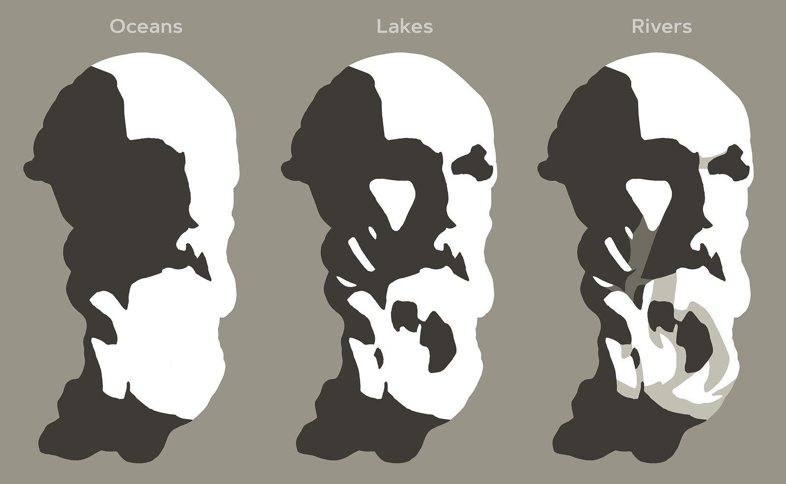
Oceans, Lakes, and Rivers
Think of value groups as oceans, lakes, and rivers:
- Oceans are large areas of light or shadow.
- Lakes are medium-sized shapes from the opposite value family within an ocean.
- Rivers are halftone or reflected light connections between lakes and oceans, guiding the flow and gesture in your composition.
Rivers help to tame down distracting lakes and guide the flow in your composition. This approach helps unify your values, grouping them into larger connected shapes.
Balancing 2D Composition and 3D Form
Don't just copy the shapes you see, think like a designer.
- 2D Composition: Values, their shape, size, and location play a big role in the overall composition and how the eye flows through the drawing.
- 3D Form: Values reveal planes, a change in value suggests a change in plane.
Every shape you design should enhance both the two-dimensional arrangement and carve out the three-dimensional forms. Sometimes, major plane changes help unify smaller shapes, improving the 2D composition.
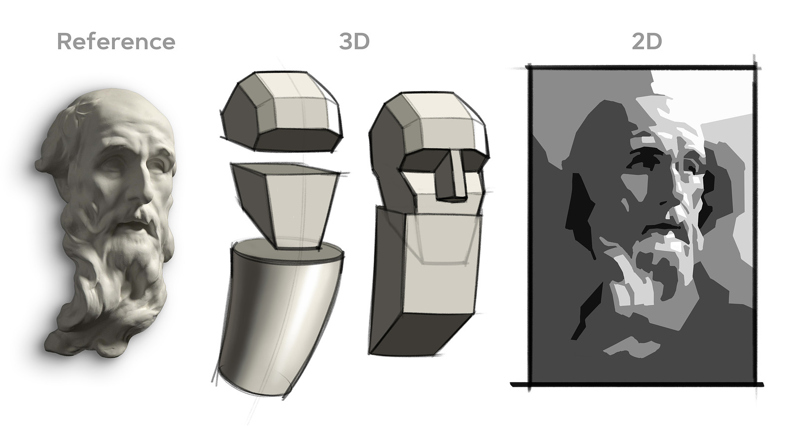
For example, think of big planes on the forehead or jaw, or simplify the hair and beard into cylinders. Small forms can feel cluttered, but if you let the cylinder's major plane changes influence the values of the small shapes, they work together cohesively.

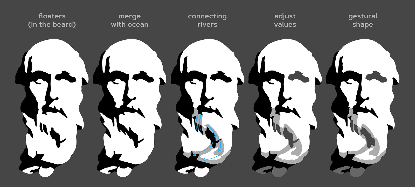
Dealing with Floaters
Be aware of how much each shape stands out, based on its value contrast with surrounding shapes. A common rule of thumb is to avoid floaters, isolated shapes, unless they are intended to draw attention.
When you encounter a floating shape that feels distracting:
- Merge it with the ocean: Modify the shape to make it part of the larger value area.
- Add connecting rivers: Use halftones to connect a floating lake to an ocean or nearby lakes.
- Adjust the value: Change the lake's value to make it closer to the surrounding values.
- Modify the shape's gesture: Alter the shape to flow with the gesture of your composition.
- Emphasize it intentionally: If you want that shape to stand out, let it be an eye-catching element.
Halftones aren't dark enough to be part of the shadow family, but they are dark enough to create a visual bridge between shapes. Consider the planes of the major 3D form and bring smaller lakes closer to the values of those planes.
Want more? Join the premium course and get full access to all lessons, demos, assignments, and critiques!
Remember when you simplified a pear and a portrait into five values? We're revisiting that concept, but now with more knowledge and experience! You know about shape design, gesture, structure, value organization, and the basic elements of light and shadow.
The main objective is to practice thinking of values as interconnected shapes and be intentional about how these shapes work together. A single thoughtful accent is louder than a bunch of accidental ones.
Level 1
Your assignment is to pick one of the provided photos of a sculpted portrait and create a careful study using 5 values (2 in the shadows, 3 in the lights).
- Use the Value Tool: Try the value tool to get an initial read of the rough value distributions.
- Create Thumbnails: Figure out your composition before starting the larger drawing.
- Work Full-Page: Avoid making it too small to control your lakes and rivers effectively.
- Start with a Linear Lay-In: Use what you've learned about measuring and eyeballing proportions.
- Separate Shadow from Light: Clearly distinguish between the shadow and light families.
- Build Up Values: Gradually add all the other values you see.
- Avoid Floaters: Allow only important shapes to grab attention.
- Squint Often: It's the simplest way to see connections and identify distracting floaters.
- Check Your Work: Flip your drawing upside down or look at it in a mirror to spot issues.
Regarding edges, try not to get too caught up in intricate soft edges and transitions. Feel free to attempt some edge work, but if you find yourself struggling, focus on sharp-edged tiles and concentrate on the value shapes.
Level 2
For those looking for an extra challenge, you can use between 7 and unlimited values. These extra values allow for more subtlety and sophisticated transitions between your shapes. Extra values let you:
- Model intricate plane changes. You might need more than 2 halftone values plus a highlight.
- Define shadow all the elements. Sometimes core shadows, reflected light, and occlusion shadows all have distinct values.
- Create realistic illusions of form with more nuanced rendering. For example a core shadow that changes value as it travels down a form.
Feel free to be more interpretive in how you group values and make bold design decisions. Trust your gut and add your own taste to the drawing.
Deadline - submit by June 13, 2025 for a chance to be in the critique video!


