Gradient Map Trick to Improve Your Values
65K views
lesson video
Gradient Map Trick to Improve Your Values
courseDrawing BasicsFull course (177 lessons)
-20%
$127.20
$159
You save $31.8
comments 8 submissions
Josh Fiddler
@Stan Prokopenko Hey! So to get rid of the slight gradation, there's no need to create a new transition point. Instead, just drag that already existing back colour handle alllllll the way over to the right, and nestle it up against the white, as far as it will go without taking over the white Value handle. Annnnnd BOOM! What's happening is that the range of goes from 5 to 95% of the distance between the two handles, so there's always that 5% that will exist between the two values. By moving the black colour handle all the way over to be as close to the white one, it makes the range of values it's compressing into between the white and black soooo small, that that 5%, is %5 of something super small. Imperceptible! (In Vizzini's voice of course.) If you want 3 values, you do have to make another handle for the mid-tone (I used 50% neutral grey), but by doing the same this as above, and moving the black over to the grey, you get the same effect. Since there will still be that 5% of the range that's given over to the blended edge, but as there is also much less of a contrast between the 50% grey and the pure white, it doesn't make a big impact on our perception. Hope that helps! Your friend Josh, (AKA @The.Y.Method)
LESSON NOTES

Check out the Value Study Tool!

Check out the premium course for additional lessons, demos, assignments and critiques!

Let's explore a quick trick in Photoshop that you can use to check your value composition studies. Unlike the Posterize tool, Gradient Maps let you control value thresholds, allowing you to specify where steps between values occur. The Gradient Map reassigns every value in the original image to a different value or color based on the gradient you set.

Add a Gradient Map

Using gradient maps, you can:

  • Check Your Work: Apply the gradient map to your notan master studies to see if your value groupings match the groups produced by this perfectly calculated tool. This can help you catch mistakes early.
  • Study Masterworks: Apply the gradient map to paintings you admire to deconstruct and understand their value compositions.

In your Layers panel, click on the adjustment layer icon and select Gradient Map. This adds a new layer on top of your image.

With the Gradient Map layer selected, double click on the gradient in the properties panel to open the Gradient Editor.

Adjusting Thresholds

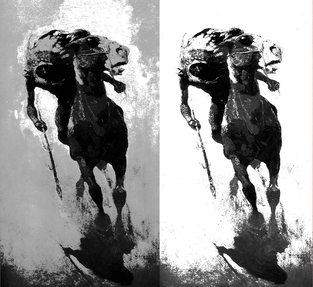
  • Default Gradient: A black-to-white gradient will produce a standard black-and-white version of your image.
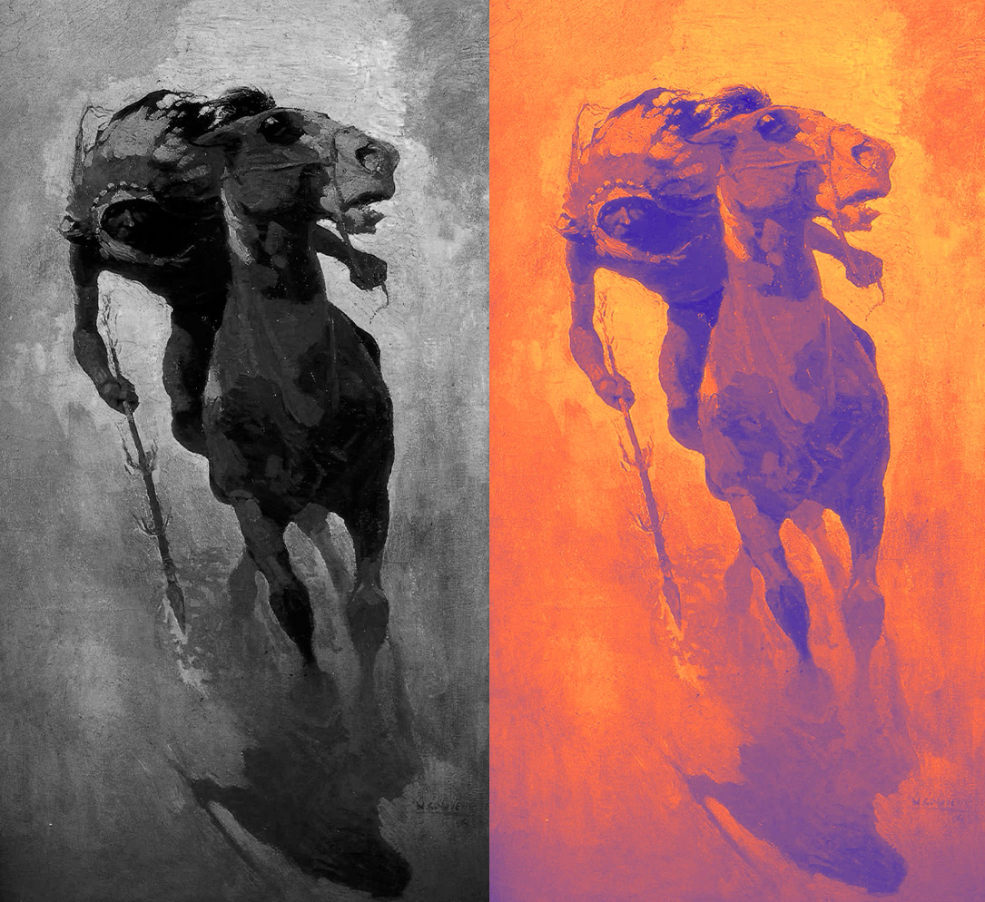
  • Changing Colors: You can click on the gradient strip to change the colors. For example, assigning purple to shadows and warm colors to highlights can quickly add a color scheme to your image.
  • Adding Value Steps: Click below the gradient strip to add more color stops. This allows you to create multiple values or colors in your gradient map.
  • Adding Hard Edges: Between each color stop, there's a mid-marker you can drag to adjust the transition. Moving it closer to a color stop creates a hard edge between values.

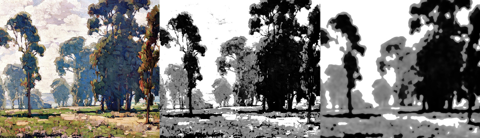
Here are 3 and 2-value versions of the same painting with the thresholds adjusted:

To remove details and simplify the shapes in your composition, simply blur the original image under the gradient map.

Saving Gradient Map Templates

You can save your gradients for future use:

  1. Save the Gradient: After setting up your gradient, click New in the Gradient Editor to save it.
  2. Name Your Gradient: Give it a descriptive name, like "3-Value Study".
  3. Reuse Your Gradient: Next time, simply select your saved gradient from the presets.

The Question of Cheating

You might wonder, "Is using this tool cheating?" The answer depends on how and why you're using it.

Using Tools Responsibly

  • As a Learning Aid: If you're using the gradient map to check your work and get feedback, it's a valuable tool that accelerates your learning.
  • Avoid Overreliance: Relying solely on the tool without trying compositions on your own can hinder your skill development. You're cheating yourself out of growth.

The Professional Context

  • Precision Tasks: In professions requiring precision (like technical illustration), using such tools is acceptable and sometimes necessary.
  • Creative Exploration: For artists and illustrators, overreliance on tools can limit creativity. It's important to develop the ability to explore ideas without becoming dependent on precision tools.

* * *

This Gradient Map trick in Photoshop is a powerful way to analyze and improve your value compositions. Use it to get immediate feedback, catch mistakes, and understand the value structures of great artworks. Remember, with great power comes great responsibility, use this tool to enhance your skills, not to replace them.

Check out the premium course for additional lessons, demos, assignments and critiques!

DOWNLOADS
mp4
bonus-gradient-map-trick.mp4
442 MB
txt
bonus-gradient-map-trick-transcript-english.txt
12 kB
txt
bonus-gradient-map-trick-transcript-spanish.txt
13 kB
file
bonus-gradient-map-trick-captions-english.srt
20 kB
file
bonus-gradient-map-trick-captions-spanish.srt
22 kB
COMMENTS
Stan Prokopenko
Let me show you a quick Photoshop trick to check your limited value compositions. Instead of using the Posterize tool, which lacks threshold control, use a Gradient Map layer to break your image into clear value steps. By adjusting the gradient stops, you control where the values shift, creating hard edges between values. This helps you study compositions, check your work, and get immediate feedback to improve quickly.
Newest
Shubhi Mohta
At 6:42, Where Proko mentions, he couldn't find a way to make the gradation disappear, and created another square to do that. I tried it at my end and was able to make the gradient disappear by bringing the black very close to white. You do not need a third square to do that. You can simply drag both the left black and the right white squares towards the center at the same point where you want the transition from black to white to happen
Max Long
9mo
I got Affinity Photo and Designer last week mainly for the posterize feature as it is so much cheaper than Photoshop. Now, I am going to have to figure out if Affinity can do this? My profile picture was actually done playing around with the posterize feature on Affinity Photo.
Josh Fiddler
@Stan Prokopenko Hey! So to get rid of the slight gradation, there's no need to create a new transition point. Instead, just drag that already existing back colour handle alllllll the way over to the right, and nestle it up against the white, as far as it will go without taking over the white Value handle. Annnnnd BOOM! What's happening is that the range of goes from 5 to 95% of the distance between the two handles, so there's always that 5% that will exist between the two values. By moving the black colour handle all the way over to be as close to the white one, it makes the range of values it's compressing into between the white and black soooo small, that that 5%, is %5 of something super small. Imperceptible! (In Vizzini's voice of course.) If you want 3 values, you do have to make another handle for the mid-tone (I used 50% neutral grey), but by doing the same this as above, and moving the black over to the grey, you get the same effect. Since there will still be that 5% of the range that's given over to the blended edge, but as there is also much less of a contrast between the 50% grey and the pure white, it doesn't make a big impact on our perception. Hope that helps! Your friend Josh, (AKA @The.Y.Method)
Kevin Burfield
Love what you said about the cheating part Stan. I tattoo for a living, and this is a big part of the industry ever since IPads came out. Lots of tattooers rely on these simple quick cheats, but have no idea how to draw. They’re fantastic to save time and be efficient, but too many people rely on them as a crutch to carry them, and not a tool to help them.
Josh Fiddler
I totally agree! These things are great for feedback when you're practicing and learning, or when you already know HOW to do these things (I have a math degree!) and need fast feedback that you're on the right path for what you WANT to achieve but you definitely can't rely on this stuff to be creative.
Dermot
1yr
That's a great tip, I can see the value in it's use to check the tone values just as you explain. Brilliant. I can see that you could also just look at paintings and first work through just outlines of value changes to see if I can determine the different value areas then use the tool to check. Thanks.. :) Off Topic At this time I would only be using photoshop as you suggest because I'd like to work through the course in pencil. I've always been overwhelmed by Photoshop. Could you advise on a constructive Photoshop course that would get you up to speed with photoshop in a logical manner. Any suggestions would be appreciated.
Stephen McLaren
If I'm not mistaken, adjusting the smoothness % will adjust the gradation steps, if you take that to 0% it should be a hard step between selected values or colors.
Juice
1yr
Does someone here know how to do this in clip studio paint?
Tomek
1yr
Right click the layer > new correction layer > gradient map You can then adjust mixing rate curve to give you a step instead of a smooth transition
@marcthenarc
I may be stepping too many steps here but I saw that new video as I've been stuck at "Simplify from observation" lesson struggling with the concept of core shadow, which doesn't seem to be accounted for when I split my 5 values. All I see - visually and what my paint program shows - are stepped values from clearer to darker without the hard band in the middle as explained in the pear demo.
Kevin Burfield
Core shadows only occur when there is reflective light bouncing back up in the form shadow typically. It’s probably several steps beyond this simplification process. Right now I think Stan just wants students to focus on simply identifying and separating light from shadow. I’m sure the specifics of core shadow, occlusion shadows, terminators, snd penumbras, etc, will be coming in future lessons.
Help!
Browse the FAQs or our more detailed Documentation. If you still need help or to contact us for any reason, drop us a line and we’ll get back to you as soon as possible!