
Drawing Basics
Getting Started
Lines


Shapes
How Perspective Works
Intuitive Perspective
Values
Edges
Bonus Content
Course In Progress
Course In Progress


In this demo, I show the "hierarchy of importance" method for organizing line weight.
Check back next week for my demos on the “shadow and light direction” method and the level 2 project!
Newest


Sebastian Mrazek
5d
What pencil is he using?


@justjen
10d
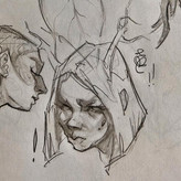
When I originally traced the rhino, I wanted to emphasize the "sadness" of it; I was really drawn to the eyes (reminded me of my gramps ;)). Anyway, so I placed darker lines around the eyes and mouth area (since it was sort of like a frown) and used light and softer lines on the rest of the rhino. I used relatively light lines on the horn bc I did not want to take away from focus on eyes and mouth. Looking at it again, however, I don't think it really worked. It just looks like I gave up or didn't understand the assignment.
After watching the demo, I still wanted to see if I could achieve a clear emphasis on the sadness or worn down look of the animal by making some of the lines heavier, darker and thicker. I'm not sure I achieved it though; it may just look I placed focus on the head. Love to hear what you think.

•
10d
Hi @justjen, I saw your other post and was going to comment on that but saw you posted an update here. This is a great solution to the problem that you mentioned. I was going to suggest something similar.
Looking at it now, it is very akin to the depth and form method, where things closer to the viewer have thicker lines, and things further away have thinner lines. Perhaps you could try thickening lines in specific areas on the underside of the the contour of the rhino to highlight that weight/weariness that you want to emphasize. You want to be strategic about it so that you don't take too much focus away from the face and eyes. You can always go back in and make sure the thickest lines are in the face.


@jonliebers
1mo
Seems like I don’t follow instructions. When I see the demo it’s like DUH!


Jefferson Rijo Cedeño
1mo


Chamii Lekamwasam
2mo
After Demo


Christina Elliott
2mo
After demo attempt, I never realized how important line could be and the diverse ways to use it.


ra u
2mo
Bro I don’t know if I did this good critique my lines 👌


Estel
2mo
My rhino after watching the demo. I can now understand that the line is in fact a shape with it's own little shapes inside. The demo rhino is so beautiful even as just lines! Made me rethink my entire life :D I only knew thick vs thin lines, I never considered the shapes of angles and tempered lines.
•
2mo
Very stylish Rhino, nice work :)


@venusblue
3mo
Following Proko. Can definitely see where I wasn't putting enough line weight/emphasis in my original attempts.


Keith Hayden
3mo
Did this one along with the demo video. Got a lot of good tips for varying line weight to make the image more interesting. Also found myself experimenting a little more with parts I wanted to make stand out.
Great project!
@sillysniper17
4mo
The first 2 pictures are the before and after for Hierarchy of importance, the latter are for Shadow.
This time, I really tried to go crazy with the line thickness because, if not now, then when? That led me to realize a few things:
In general:
Thick outlines, especially with variation in width, look awesome. I know it's too early to talk about style, but I'm definitely incorporating them at some point because they look great and add so much character and information to a piece.
For shadows:
I can understand the main ideas (darker/thicker for areas in shadow, thickness/softness of shadow based on contrast/form), but I'm a little unsure about the, "high contrast = dark" approach. It doesn't seem as intuitive, because high contrast lines now look the same as dark area lines, but maybe this will make more sense when shading is involved.
For hierarchy of importance:
Since there's so many different ways something could be important, I took notes and make a list of some things you could highlight:
1) Focal points: The most interesting/important things in the scene.
2) Moving parts, especially if they're fast or towards the viewer.
3) Parts doing something: gripping, pressing, flexing, etc. E.g. body parts like legs, as even if it's just standing, they're under tension/carrying weight.
4) Lines that make up a large shape. (This is because if it makes up a large part of what you're drawing, it's could be more important than smaller details.)
5) Subconscious/Body focal points: Eyes, mouth, hands, etc. (Maybe originates from body language?)
6) Parts that stick out. Horns, spikes, ears, tails. etc. (Going from thick at the tip to thin/light at the base really emphasizes the shape and adds direction.)
7)...And many more.
As a fun exercise, I then tried to look up artists I knew, break down their thought process, and see when each rule applied. It helped me discover other reasons for emphasis, helped the lesson sink in, and appreciate their art more.
Keith Hayden
3mo
I like your list of forms that could use emphasis with line weight. I plan to apply it to future drawings. Thanks for sharing!
@chary
5mo
The first picture is my own attempt, the second picture is after watching the video.
I tried to keep the distance information with lines.


Andrew Kovachik
5mo
Reminds me of a cooking quote that "cooking is doing a lot of little things very well." And this video made me see how much that applies to drawing. I actually made a lot of similar big descisions as Stan and we were even given the exact same outline but some very small descisions that Stan makes throughout leaves the final design soooo much better. Great video!


Julia
5mo
That's a great way to think about it! Though as a beginner I find it somewhat difficult to keep all of those "little things" in mind still! Shape design, line quality, line weight...hopefully it will get easier with time and practice!


Flo
5mo
Yeah, you are right.


Nancy Larson
6mo
Before and after viewing demo sketches for each hierarchy of importance and light and shadow. Very instructive videos and exercises.
Julia
6mo
I think some of the line weight decisions I made are somewhat random and could probably be more consistent/thoughtful.
Andrew Kovachik
5mo
Wow! This feels stylized in such a cool way!!


@berzerkerh
7mo
this class has helped me so so much


Neo Diamond
7mo
Happy with it.
Sabine Anzenhofer
7mo
2nd attempt after watching the demo


Rafael Rangel
7mo
I didn’t have a printer :/ so I made it digital. Any feedback? :)


Illia Cherkasov
7mo
Hierarchy of Importance Line Weight
Give a gift
Give a gift card for art students to use on anything in the Proko store.
Or gift this course:

About instructor
Founder of Proko, artist and teacher of drawing, painting, and anatomy. I try to make my lessons fun and ultra packed with information.