


What is Line Weight?
We learned that lines can be thick or thin, light or dark, soft or sharp. These are all properties of lines that we can control. The way we combine these properties conveys the weight of the line. Now typically people assume that line weight is the same as line thickness. Kind of, but not quite.. Line weight is more broadly, how heavy or light the line feels.
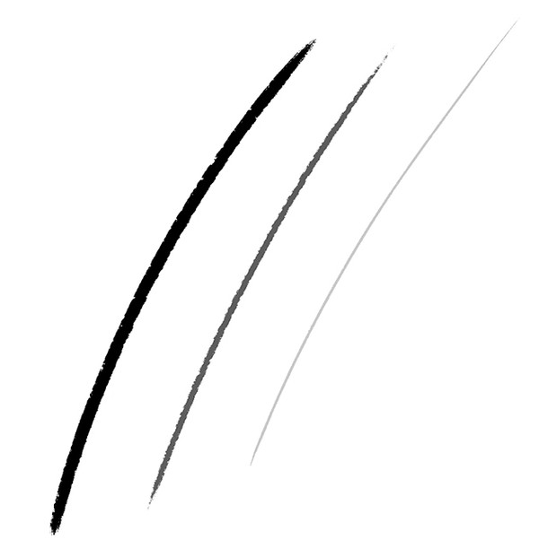
A heavy line is typically thick and dark. While a light line is thin and light in value. Now, this is reversed if you're drawing a white line on a darker surface. The lighter line in this case is heavier because it creates a higher contrast with the background. So, really it’s about the contrast of value.
We can also control the edge property of the line. A soft or blurry line feels lighter. While a sharp line feels heavier.
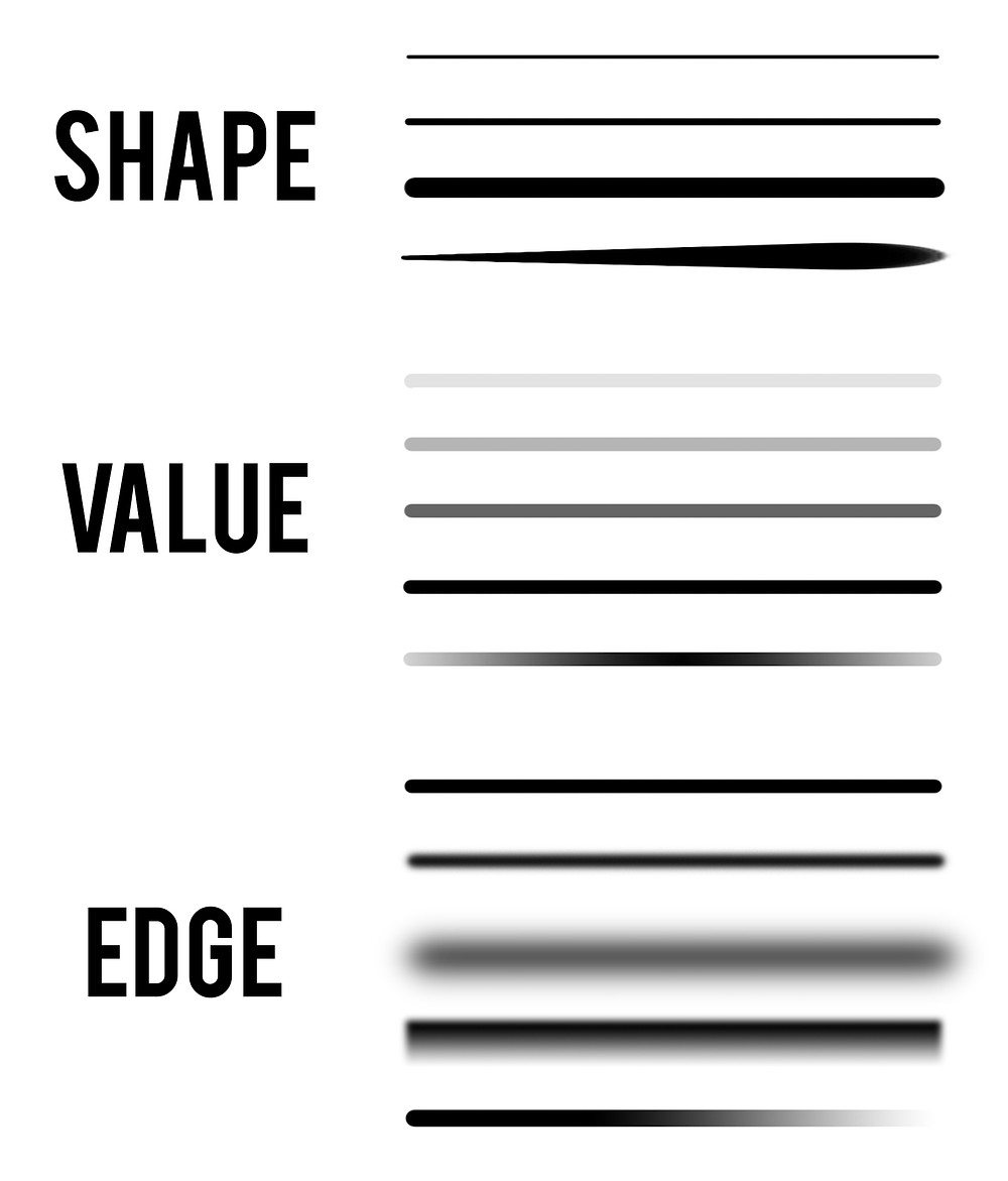
Since we just started learning about line weight, let’s simplify it to just 3 types of lines:
- Thick and dark
- Medium thickness and value
- Thin and light
We can ignore the edge quality for now. And if you really want to simplify it as you’re starting out, you can ignore the value, and think of thick, medium, and thin lines. Even just those 3 can do a lot for your drawing.
Line weight can be a very powerful tool when it’s used effectively. By controlling line weight, you can organize the importance of elements in your drawing, show form and depth, and even give a sense of shadow and light without doing any shading.
Hierarchy of Importance
Our main focus with line weight in the next few lessons is going to be organizing elements in our drawings and conveying the importance of those elements. This is a compositional way of thinking about it.
Emphasize Shape
A heavy contour line around something emphasizes the shape of that thing. The details within become subordinate. Heavy on the outside, medium on the inside, and the lightest lines for the smallest details. If all your lines are heavy - there are no heavy lines because you have nothing to compare them to.
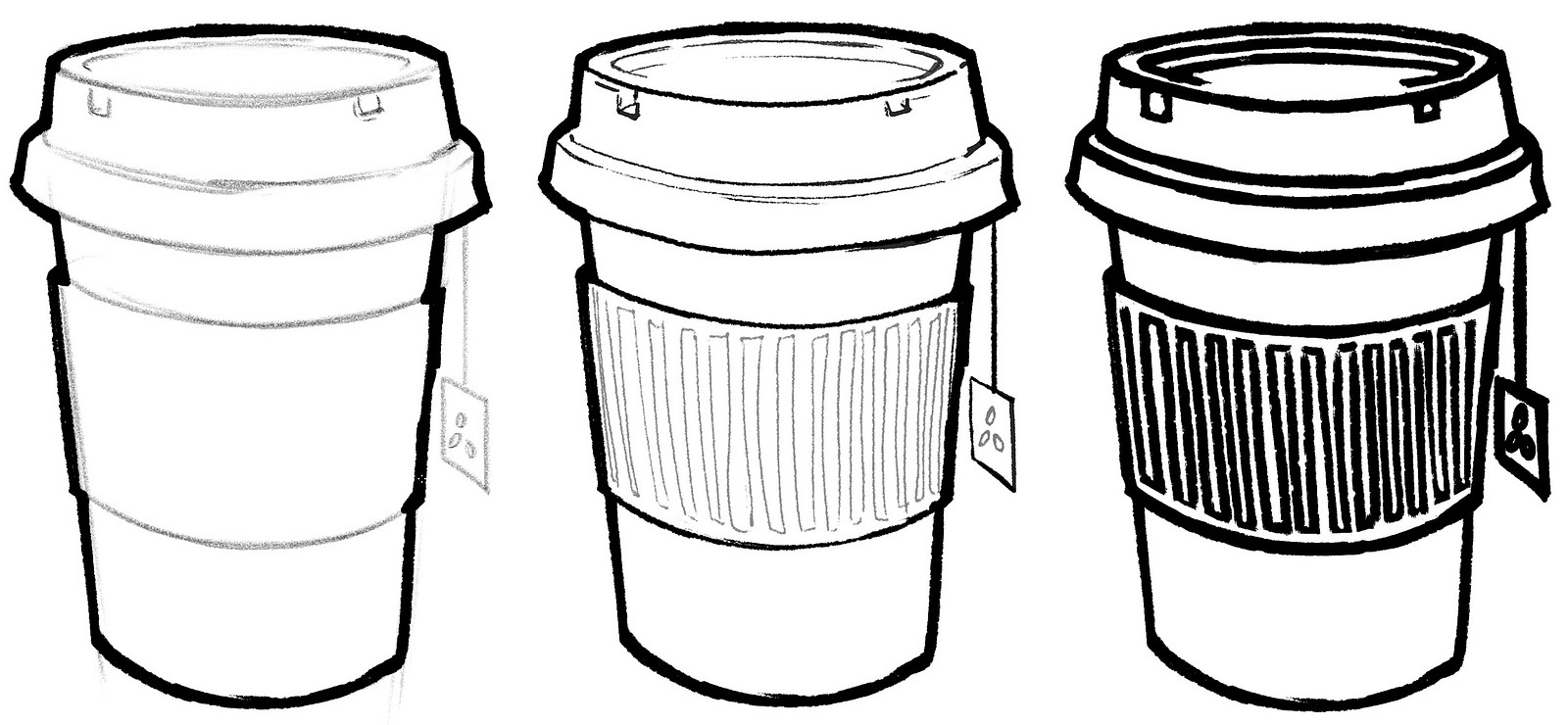
I mean, it still works.. but it’s not as interesting as it could be. Nothing carries importance because everything is the same! With the heavier outline, the cup seems to carry more of a presence and impact. And if the silhouette is an important part of that thing, it makes sense to highlight it.
Heavy outlines create a more flat and graphic look. You are stylizing what you’re actually seeing in reality. We don’t actually see outlines. But it’s still a great tool to quickly communicate with clarity, without shading. We see this a lot in comics. And keep in mind this is just a guide. Of course you can use thick lines strategically within your elements.
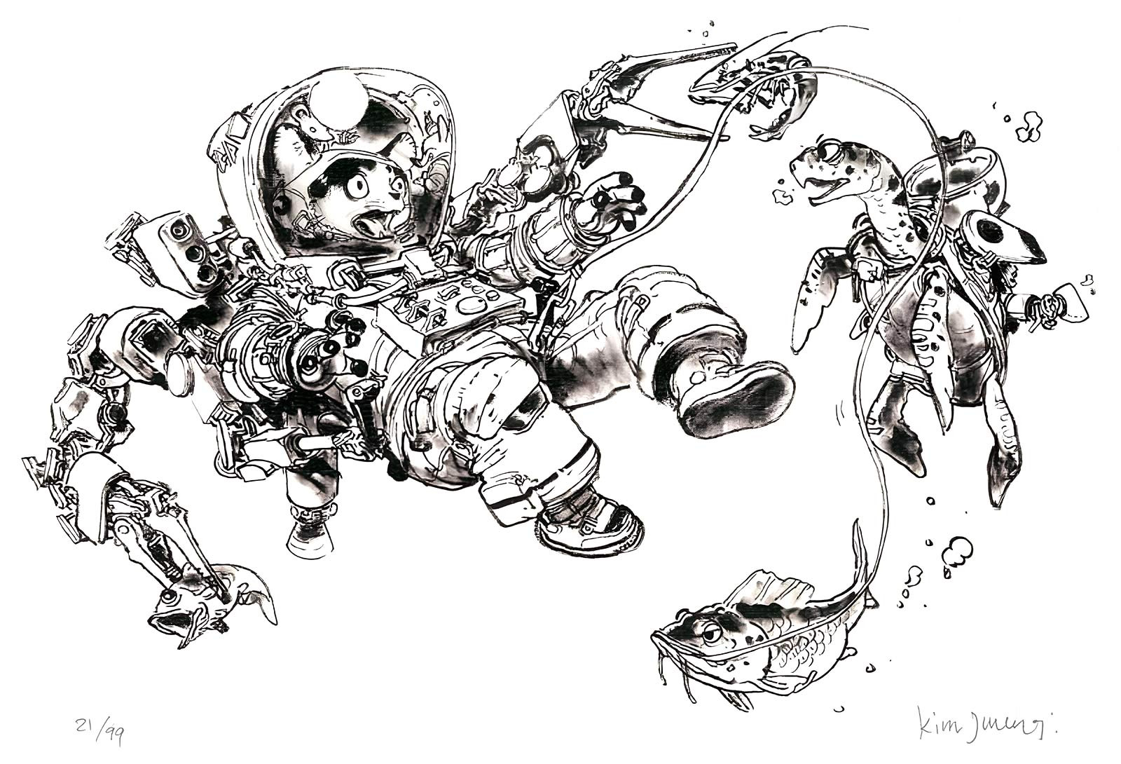
In this Kim Jung Gi drawing he occasionally used thick lines on the inside. So, heavy on the outside is just ONE way of organizing line weight. But it's a very commonly used one, so it’s a good place for us to start.
I said that a heavy outline emphasizes the shape. So, removing or using a light line reduces the importance of the shape and puts greater importance on other things, such as the texture, color, or shading.
Highlight Areas of Interest
By controlling the relationships of line weight around elements in your drawing you’re highlighting areas of interest. They act like a frame around the important elements.
When varying your line weight, I want you to think of a hierarchy. To create a sense of hierarchy, you want to reserve the heaviest line weight for your focal point area because your eye will go to the area of most contrast. So if I want the books to stand out more, I switch the hierarchy. And if I want the image on the cover of the book to be most important, I can give it an even heavier line! I'm using line weight to direct the viewer's eye where I want them to look.
A great example of this is one of my favorite cartoons - Bluey. The characters generally have a heavy outline around them relative to the environment. The lines within the characters are lighter, except the eyes! Those are the focal points.

Unite or Separate Elements
So.. it's up to you to decide how you want to group the elements in your drawing. Earlier I considered the cup as a single element. But I could have separated the cup, lid, and sleeve. We can unite or separate elements to affect their perceived importance.
Let's look at this group of books. I had each book as a separate element. They're united because they're touching, but their individual shapes are just as important. I could exaggerate their separation by making one book more important, with a heavier outline. And I can make the areas where they touch thicker to separate them more.
I can go the opposite way and unite the books with a heavy contour around them. I can make the lines that separate them very light to push the unity even more. Their overall shape becomes more significant than their individuality.

This drawing by Claire Wendling shows how you can unite things to the environment too.
By almost completely losing the edge of her knee into the grass and even breaking it up with the grass blades, it places her in a world. That little detail does so much.
For the next few lessons, we're going to focus primarily on those compositional things. But line weight can also be used to show depth and suggest light and shadow.
So, I want to at least introduce you to these to give you the whole picture. Later in the perspective and shading portions of the course, we'll go into more detail.

Depth and Form
Take a look at Scott Robertson’s drawings. Clear communication is really important in industrial design. So line weight is an important tool to have control of. Scott’s drawings are a great example of this. Not only does he emphasize the bigger forms over the smaller details, but he also uses it to show depth. The line gets thicker as the wing comes towards us. And the line gets thinner as the other wing goes away from us.
The simplest way to show depth with line weight is by differentiating foreground, middle ground, and background elements. Or more generally, lighten the lines of things farther away.

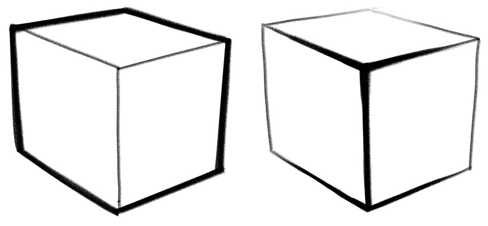
But you can show depth within an object too. Let’s take a simple box. Earlier we talked about making the outer lines heavier. But this flattens it, stylizes it, makes it more graphic. This is great, but what if we want to show depth? Thicken the lines at the corners and edges closest to the viewer, and gradually lighten the line weight as they recede into space.
Line weight can make an object feel like it has mass or form. When you taper a line to be heavier in parts and lighter in others, it suggests mass. You’ll see this a lot in inkings of comic superheroes. The thick to thin line weight shows the forms of the muscles.
But you can even see this in highly stylized cartoon drawings. Check out these Mickey Mouse drawings. Look how Mickey’s shoe is thickest where it pokes out. And Goofy's nose is thickest here.

Light and Shadow
That brings us to the final approach. You can use line weight to indicate the direction of light and shadow. Typically, a heavier line is used on the shadow side, the side farthest from the light source, to make it look like it’s receding into the shadow. A super thin, or non-existent line on the light side, gives the impression of a glow!
As two objects touch, you’ll see what’s called ambient occlusion, and sometimes you’ll see a cast shadow. We’ll get much more into that later, but basically, light doesn't get to those areas...so, there’s shadow. A heavier line in these areas can be very effective to separate the objects while making them feel like they’re close together.

Closing
Clearly, having variety in your line weight makes your drawing more interesting and communicates a more complex story to the viewer.
Figuring out where and when to use thicker and thinner line weight can be confusing, and there is no one way to do it. Try out various methods, get comfortable with all of them, and pick the ones you like. In the end, it’s about communicating your vision through your drawing.
All these methods are just tools you can mix and match to fit your taste. The main goal is to make it look good, and as you keep drawing things the way you like, your personal style will naturally develop. So, just have fun with it!
Want more? Consider joining the premium Drawing Basics course and you’ll get all the lessons, projects, warmups, demonstrations, and critique videos. It’s the perfect course to give you the foundation to draw anything from observation and imagination.
Thanks guys, see you next time.


