
Drawing Basics


Want more? Join the premium course and get full access to all lessons, demos, assignments, and critiques!
Perspective adds depth to your drawings, but proper shading has an even bigger impact on realism. Many students draw beautiful outlines but flatten their forms with incorrect shading. To avoid this, you need to understand how light interacts with form.

Planes
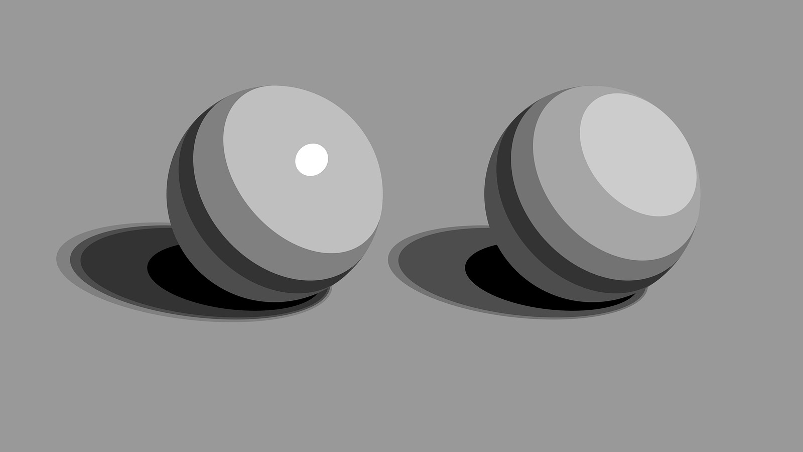
When light hits an object, it reveals the object's planes. Imagine planes as small flat tiles across the surface. Planes facing the light are part of the light family, and those facing away are part of the shadow family. Each value change you make in shading suggests a plane change. Even on smooth forms like spheres, thinking in terms of planes helps you understand how the form turns.
Parts of Light and Shadow
When shading, it's crucial to identify the different elements of light:
- Terminator: The edge where light transitions into shadow.
- Form Shadow: The area beyond the terminator, turned away from the light source.
- Cast Shadow: Occurs when an object blocks light from hitting another surface.
- Center Light: The point facing directly toward the light source.
- Halftones: Light areas where the form turns away from the center light, getting progressively darker.
- Highlights - Reflections of the light source on shiny surfaces, not present on matte materials.
- Reflected Light: Light bouncing from the environment into the shadow, lightening it slightly.
- Core Shadow: The darkest part of the form shadow, usually along the terminator.
- Occlusion Shadow: The darkest value in tight crevices where objects touch.
Value Structure of Form
To organize your shading, group these elements into value zones. Let's look at a common template:
Start by clearly separating light and shadow shapes, no blending yet. Fill in the shadow at about a value 3.
In the lights, I usually think of three values. For matte surfaces without clear highlights, I use light halftones (values 8-9), medium halftones (6-7), and dark halftones (4-5). The largest area is the lightest halftone, with smaller areas for the darker halftones. If there’s a clear highlight, simplify to two halftones plus the highlight as the brightest spot (value 10).
In the shadows, I use two values. First, block in the reflected light (value 4) this is your lighter shadow value. Then add the darker core shadow (1-2). For simplicity you can make the occlusion shadow matches the core shadow, giving us five total values (three lights, two shadows), favoring more details in the lights. But realistically, occlusion shadows are often darker (0). Cast shadows can also get darker or softer as they move away from the object (2-3).
So, shading form isn’t as simple as smudging gradations, unfortunately. It’s not linear, we bounce around. Transitions in halftones are subtle, then quickly darken at core shadows, lighten with reflected light, darken again at occlusion, and finally lighten into cast shadows.
* * *
As you practice, you'll develop an intuition for how light describes form and you'll be more comfortable with all the subtle shifts in value that create realistic depth. You'll start to "feel" when a value or transition is wrong. Light and shadow are tools for creating the illusion of three dimensions on a flat surface. Master these tools and your drawings won't look flat.
Coming up I'm going to do a demonstration going over all of this slowly and in much more detail.
Want more? Join the premium course and get full access to all lessons, demos, assignments, and critiques!


