


I feel like hair is one of the most difficult things for people to draw. A lot of us approach it in the wrong way. We just jump in a start scratching away. Drawing hair takes patience. There’s a lot of little shapes, lines, highlights, and its easy to get impatient and sloppy. But we really need to slow down and approach it one step at a time. And when you get to the details, you need to focus on designing, not just copying as you see it.

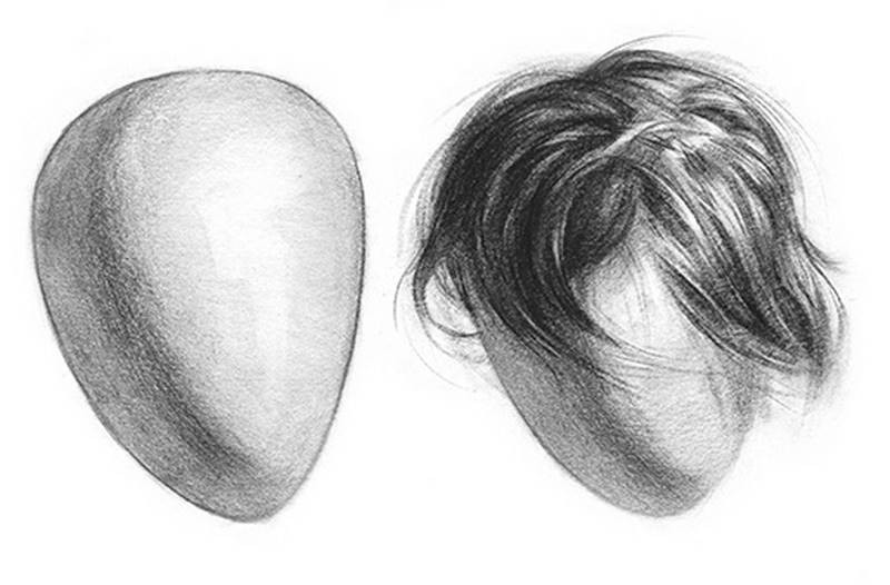
The approach to drawing hair should be the same as sculpting hair. You don’t sculpt hair with individual strands. You find the volumes of the groups. Think of the hair as a 3 dimensional form, just like, the nose. and lips. It has mass. And it has all the same elements of light, although slightly hidden by the texture and all the strands. Ignoring the form and going straight for the texture results in spaghetti hair. it just looks like a bunch of lines coming off the head.
VOLUME
So, the first volume we need to think about actually isn’t even the volume of the hair. It’s the volume of the head. Or, whatever it is that the hair is on. If you’re drawing a Dog, you gotta think about the rib cage or the legs.
The groups of hair wrap around the form underneath and inherit the same light patterns. In this example, I made sure to shade the large group of hair to resemble the rounded form under it, before I added all the texture on top. The left side of the hair mass is all shadow, then it transitions and has a bunch of halftone shapes, and then all the highlights are on the right.
Now we get to the part where we draw the locks of hair. And everybody’s hair type is different. If it’s straight, you’re just gonna get a cylinder. If it’s curly, you’re gonna have a lot of little locks, and that design problem becomes a bit more difficult. But whatever the hair type, figure out what those shapes are and design them as volumes, not strands. So, for example here’s a lock of hair. It’s like a ribbon with some thickness to it. This ribbon has shadow, halftone, and a highlight.
It doesn’t look like hair, but it does look 3-dimensional. To make it look like hair we need to add a 4th element – Texture.

TEXTURE
This includes the separations between the smaller groups of hair, a few lines representing strands, and breaking up the contours. There will be stray strands that soften and break up the edge between hair and background. Make sure to add variation along the edges to make it more interesting and believable. The connection to the skin shouldn’t be outlined.
Show some gradations, otherwise it will look like a wig or clip-on beard.

When adding the texture part, its all about the design. Don’t get too repetitive with the strokes.
Try to create organic and interesting shapes with the overlaps and groupings. There needs to be a good balance of simple areas and complex areas with a lot of detail. Get the illusion of the strands. Don’t try to draw every single strand.
Have confidence with every stroke. It’s better to draw a quick confident strand slightly out of place, then a wobbly ugly stroke in the right place. Don’t be timid. This happens when drawing strands that drop down the forehead. People don’t want to mess up the face. But, it doesn’t matter if it’s in the perfect spot… Hair moves.
Usually you want to start the stroke at the root and let it taper towards the tip. But if you have good control of the pencil, you can taper correctly from either side. make sure you’re holding the pencil like a brush and use the length of the charcoal to get thin lines, and the side to get soft thick lines. Transitioning from one to the other gets you a nice taper.
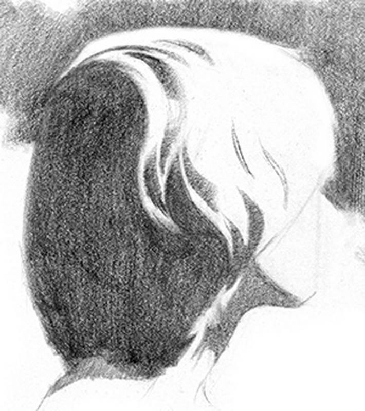
Designing Shadows
I like to approach shadows as flat graphic shapes. It’s important to get an attractive, well balanced separation of light and dark before beginning to render/shade. Try to find ways to connect as many shadow shapes as you can. Even with curly hair, where you have a lot of little shapes, it’s important to connect them. Otherwise you’ll have too many floating shapes which can be distracting. This goes back to good design. Inside the shadows, keep the texture and contrast to a minimum. You want the focus to stay in the lit areas of the hair.
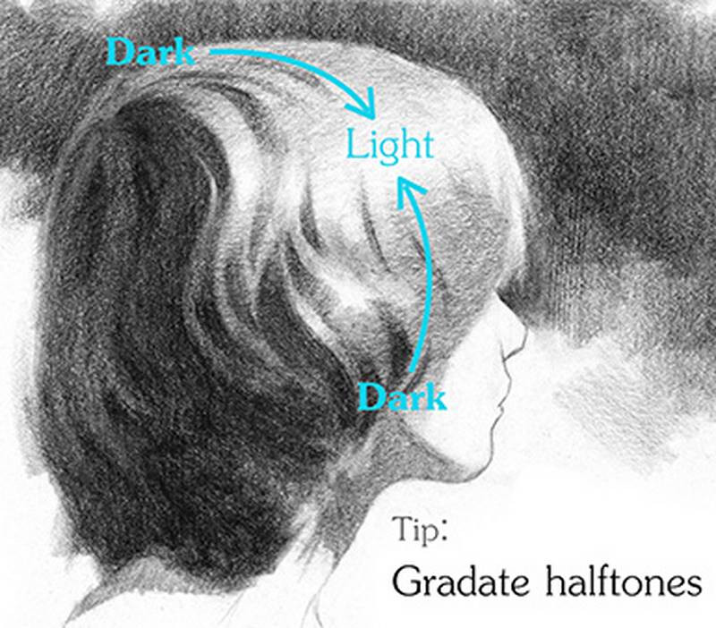
Designing Halftones
The areas that will have the most visible texture is the halftones. These areas get a little bit of light from the highlight side and some darks from the shadow side creating the most contrast and detail in these areas.
Don’t forget that halftones are mostly gradations. They gradate towards shadow on one side and towards highlights on the other.
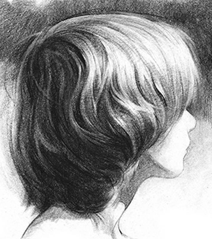
Designing Highlights
Highlight areas should still appear light after the texture is added. That means strand texture should be thinner, lighter, and sometimes remove texture all together. Have the highlights glow. Try to connect them as much as possible only leaving a few lonely highlights. And try not to make each highlight the same. Give them variety in length, thickness, edge, and value.
So, let’s take a quick look at how I broke down this drawing into steps.
As always, I started with the linear layin getting the major shapes and rhythms.
Then I separated the lights from the shadows focusing on the design of the graphic shapes.

In this step I added dark accents inside the shadows to separate the reflected lights from occlusion shadows. And in the lights, I added gradations from halftone to highlight. At this point, the drawing should look 3-dimensional, since we’ve added all the basic elements of light on form.

In the final step, I added the texture of the strands. The strokes should follow the rhythm of the locks we defined in the previous steps. Notice that drawing the strands is the last step, Not the first.
Check out the next lesson on Portrait Drawing in Graphite – Timelapse.
Want to learn more? Be sure to check out the Portrait Drawing Fundamentals course, which includes step by step instruction, real-time demos, 3D models, and Full Demonstrations.
Draw the Hair
Find some good photos online (get some with clear light and shadows). Don’t use photo taken with a flash. Many magazine photos of hairstyles have flat lighting that you should avoid drawing from. Follow my step-by-step lesson to complete the drawing. Capture the major forms of the hair before you add the strands.


