


Drawing Materials for this Demonstration
Paper: Arches 88 Silk Screen Paper
Pencils: Conte 1710 hb and b pencils
Eraser: General's Kneaded Eraser (Any brand)
Charcoal Powder: General's Powdered Charcoal (Any brand)
Sable Brush: Rosemary & Co Filbert Series 276, Size 12 (Any large soft sable will work)
Step 1 - Prepare for the Drawing with Studies
I'm approaching this drawing as a portfolio piece, or something that might hang in a gallery. I think this is a good mentality to have going into a longer drawing because we take it more seriously. With that, comes prep work...

I like to do some small sketches before I jump into the actual drawing. Proportion studies, gesture studies, value studies, and anatomy studies. These give me a running start when I begin the drawing. In the premium version of this demo, I walk you through each one of these studies.
Step 2 - The Layin
Basic Shapes
Since I'm drawing from reference, not from imagination, the first step should be heavy on measuring. Checking to make sure my proportions are correct. In fact I'm going to start this drawing like I start all my figure drawings from life. Identify the largest shapes and rhythms, then add the anatomical details on top.
Shadow Mapping
The next step is kind of in-between of the linear layin and the shading stage. We're going to create a map of the separation between the lights and the shadows. As we do that, we're going to design interesting edges and shapes to the core and cast shadows. I know that might sound confusing. If it does, you probably need to go back and rewatch the shading lessons from the figure drawing course.
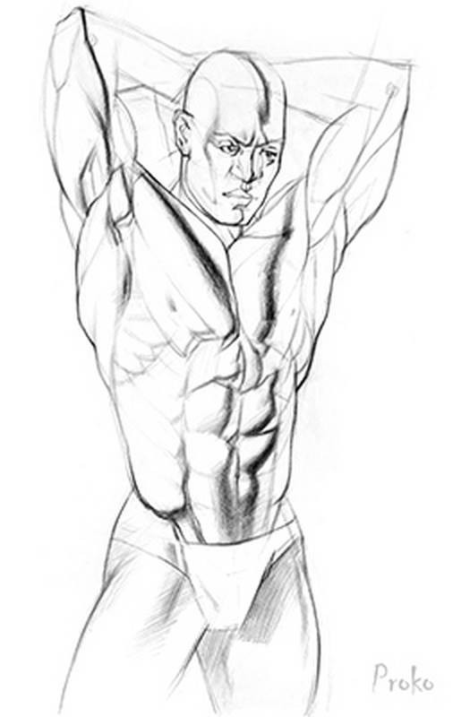
Some muscles like abs, serratus, and obliques naturally have repeating forms. Try to design them to have some kind of variation and rhythm. Look for variations in edges, shapes, values, and sizes.
Step 3 - Shading the Forms
General Tonal Composition
We have the layin finished, now it's time for the shading. I like to start by separating the lights from the shadows. A quick way of doing this is with some charcoal powder.
I dip a soft sable brush into a little jar of charcoal powder. Lightly tap the brush on the jar to knock off some of the charcoal and slowly start spreading it onto the shadow areas. Don't do this too fast. Take your time and keep it clean.
Details
This part of the drawing gets very meticulous. It takes a long time to shade properly. We have to analyze every plane change, every edge, every shape, every value of every core shadow, halftone, highlight... There's a lot that has to be processed and we shouldn't rush it. If we're going to study the human form, then we should actually put in the time to study the forms. This is how we do it. This is where a lot of our time will be spent. If you're like me, this process is absolute joy. It's like meditation. Play some good music and spend your day shading!
The charcoal powder also has a limit to how dark it can get. As I'm filling in and cleaning the shadows, I'm also darkening the overall value of the shadows. If the shadow value is too light, then I don't have much to work with in the lights.
Think of the torso as a simple rounded egg. Think about the light direction and how the halftones transition from light to dark, to coreshadow, to reflected light. This overall egg effect should be present in your drawing even when the small detailed forms are added. The best way to make that happen is to add the large halftone gradations early. Like the dark halftones on the abs.
When shading it helps to think about planes. Not the flying planes. I'm talking about geometric shapes. Instead of blending in a bunch of soft arbitrary tones. I'm observing the value of the side planes, bottom plane, top plane and front plane. I'm looking for clues in the photo that will help me show these forms.
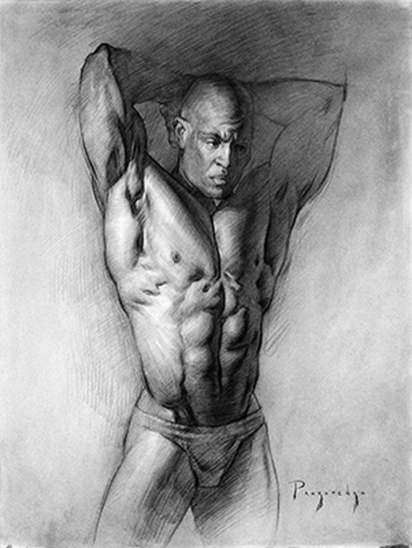
Approach the highlights like any halftone shapes. Don't just erase them. Draw and design the highlights. Think about the shape, edge, and value. You can even use line direction on a highlight to show the form, just like you would with a halftone.
In the light areas I use the tip of the pencil to get a thin line. I also make sure my pencil is nicely sharpened when shading an important light area. Using the tip in the lights adds finer detail, texture, allows you to cross hatch with the forms for a better 3d effect, and forces you to shade slower and make better decisions.


