

Patrick Bosworth
Los Angeles
Editor at Proko!


@blacksmith
added comment inLoomis Method Front View – Real-Time Demo
1d
I'm confused. Draw a circle.Mark the sixths. Got it. Then draw a vertical curved line along one side. How does one know how much of a bend should be in the curve? In other words, how for in from the original circle? Is there a measurement to use for right to left as there is in top to bottom?
That first vertical line creates an oval with the side of the circle. But then, you divide that oval??? In half? No mention is made of that second line bisecting the first oval. I'm missing something here.

2h
Hey @blacksmith What you're seeing there is the oval of the side of the head, but the head is not perfectly flat on the sides. The back of the cranium is wider than the front of the brow, so when you chop off the sides of the sphere you're actually seeing it widen toward the back of the skull, so the side plane becomes an ellipse. Take a look at the 3D Loomis head from above and you'll see how the side planes angle toward the front of the face. As for how far in from the original circle, it depends, everyone has different proportions, sometimes you'll have someone with a very wide cranium, and very narrow brow, so you'll see more of that side plane from the front. Hope this helps!


23h
Hi! Here's some of the gestures I did for the lesson. These are the better ones I drew in the batch.
3h
Excellent gestures!

1d
Asked for help
[Post ONE of TWO]
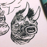
I drew 100 Heads of Hair. I spent 26 days on this, which is way too long, but I had some IRL stuff. This was by far the most challenging of the 100 studies I've done. Hair is bonkers. I've always struggled with it. Making long tapered strokes is physically difficult for me. Hair demands an elegant touch at times and I just cannot get there. That aside, I think I found myself improving throughout them. Thinking of the hair as a sculptor made all the difference.
On an unrelated note: I think all bald people should get a 25% discount on their portrait quotes.
3h
Just 100 more examples of incredibly inspiring work! Amazing!

10h
Asked for help
Really loved this exercise! Mostly went with kind/stoic/evil characters in mind and arrived at rounds/square/triangular shapes respectfully. I guess I was too focused on lines :/
3h
Nice work! I really love the duck explorations, keep it up!
Line quality starts with you! The more control you have over your hand with traditional drawing tools, the more control you’ll have with digital software, so it helps to warm up your hand before you start drawing digitally just like with traditional.
With that out of the way, make sure your canvas resolution is set fairly high. Something around 4500px X 5400px @ 300 DPI is a good starting point. Lower res canvases will pixelate the edges of your lines so that could be a factor you’re facing.
Next, the type of brush you use matters, but not as much as the brush settings. When you select a brush from your Brush Library, tap the selected brush a second time to open the Brush Studio where you can adjust settings.
Each brush has individual settings to help you customize the feel of the brush line. The most relevant setting you should adjust in this case is in brush Stabilization under “Streamline.” Adjust the amount and pressure and test how the brush responds on the Drawing Pad. A little goes a long way with these settings so don’t over do it. Start by adding 5-10% streamline to your brush and test until it feels natural. Generally anything over 20% will start to feel like the brush is fighting against the line you’re trying to make so it takes some experimentation.
The last factor to consider is the iPad screen itself is VERY slick, so some folks like to use a textured “paper-like” screen protector. This will add a slight tooth to the iPad surface and impart a comfortable amount of drag on your pencil tip which can help with smoothing out your lines. Take a look on online for your iPad model to see what is available. The added benefit here is you’re protecting your screen from scratches as well as helping your line quality.
Here’s a video from Lucas Peinador where he talks about how to ink digital art, and covers this Brush Studio Streamline tip! Lucas is an awesome teacher, and has some brushes available here on Proko as well!!
https://youtu.be/CQLdM9OiQTk?si=d5egMTVm1JOTHQu9
Hope this helps!

Asked for help
OMG. This is the first time in my life that I draw from my imagination. At first I was going to skip this task because it seemed too difficult for me. But you really managed to encourage me to try and not be afraid. I am so happy that you did! Because I surprised myself so much. I designed the final pose completely from my imagination. And I'm really proud of the result. Thank you!
6d
Excellent!! These are great sketches, keep it up!
Show all replies (1)
7d
I grew up reading TMNT comics, and listening to the Grateful Dead. (Things haven’t changed much) When I first was introduced to Heinrich Kley I was blown away to realize my first experience with Kley was actually on the Grateful Dead album cover for Terrapin Station. I had no idea at the time who Kley was, and I always attributed the dancing turtles to Stanley Mouse who designed many of my favorite album covers for The Dead. Thought it would be fun to mash-up a bunch of my favorite things for a comic sketch cover, Kley, TMNT, and The Dead! So here’s Mikey and Donnie (rocking out to Terrapin Station) after Kley. Sketched/inked in Procreate. Can't wait to do some more of these, such a fun project prompt!
Show all replies (2)


Much more difficult than I thought it would be. I made these before watching Stan's demo, and now I'm noticing a few mistakes, like having too many angles and details, etc... I'll probably make a few more following Stan's steps. Great fun!
7d
These look great! Your values are very clean, evenly shaded, and well organized! Some of the smaller details could be simplified in the pear's dark halftone but they don't distract. Your core shadow is a bit lost in the light shadow area, you could increase the value of the core shadow to help round the form a bit. (I exaggerated a bit of the core shadow to show what I mean) But overall I think you really captured a great sense of depth and form with each, and you got a really nice likeness with the portrait as well! Hope this helps, Keep up the good work!
Show all replies (1)

Man, Jeff Watts line quality is absolutely incredible! I found trying to get those thin crisp lines almost impossible. This was also my first time using a charcoal pencil, so getting the values correct was very difficult. Any feedback very welcome. Cheers :)
7d
Nice work! This looks like you were able to pull some of Jeff's techniques into your study! Proportionally, the jaw is a bit big for the cranium of the skull, so just be sure to continually check your measurements when laying early stage "scaffolding" guidelines down. The other thing to consider is the size at which you're drawing, and on what surface. Jeff's skull drawing was on 18x24" smooth news print, so he had a lot of room to work, and use his shoulder for fine sweeping lines. Your study seems to be on 8.5 x 11 paper? You'll get much different results with charcoal pencils on different surfaces so be sure to experiment, but definitely try using a large pad of smooth newsprint to try this study again! Check out Stan's warm-up page of lines before he jumps into studying Jeff's piece. Find a way for your hand to replicate the lines you see in the drawing, and be sure to keep your charcoal pencil SHARP. It helps to sharpen 2-3 of each pencil hardness you're using so you have them ready to go during your study and don't have to stop and sharpen during a groove. Hope this helps, keep up the good work!!
Show all replies (1)


8d
Asked for help
First attempt at level 1: Did I simplify enough? I’m going to watch the critique, attempt a few more, and then move on to level 2!
7d
These are very well done, and you chose FANTASTIC references! Each one has such great character and personality and you really captured a great deal in each one of your portraits, great work! I'd say #4 you could push the gesture a bit more to capture of the curve of the torso. Don't be afraid to play with your shapes and change your reference to what you want it to be! Shapes can be stretched, bloated, indented, or curved and exaggerated to capture more personality (I did a little sketch to show what I'm talking about, I couldn't resist sketching this little doofy bird!) and the snout of the boar #9 could use a little bit more clean up to make those shapes more distinct, it's a little hard to read at the moment. I love the stoat #7, and #1-3 are all nicely simplified! Keep up the good work!
Show 1 more replies


12d
Asked for help
This was my best one from this morning. I think what I realized was that this particular exercise is simply to identify, create, design, big flow rhythms that capture the pose in as few strokes as possible. All other pre-existing knowledge of anatomy Would actually slow me down at this stage. I tried to connect the flow of the arm all the way through the torso and into the outer curve of the leg.
11d
Really nice work!
Show 1 more replies

11d
Thank you for this! 😂
Show 1 more replies
13d
This is at a perfect stage to begin adding line weight! There are a lot of potential ways to begin, take a look the "How to Draw with Line Weight" lesson it will give you a good overview of how to organize your line weight. https://www.proko.com/course-lesson/how-to-draw-with-line-weight/discussions
Here's a good overview from David Finch as well
https://www.youtube.com/watch?v=GE7bWfPeYSI
Experiment at this stage, beefing up the line weight of the overall silhouette is a good starting point to solidify the entire figure you're drawing. Then choose a light source and slowly build up the interior line weight where forms turn away from the light, under the chin, under the nose, inside the ear, etc. It's a balance to get the effect you're looking for, but work slowly and methodically and it will start to click, you'll quickly see where you can add line weight to make the lighting feel consistent. Once you do a pass of adding line weight, you can always go over it again to thin out lines with your eraser where lines are closer to the light source. Hope this helps!


13d
I think I'm getting the hang of the digital tools. I usually work traditionally.
13d
Really nice work!
Show all replies (1)
Show 2 more replies

17d
Awesome job! Really clean simplifications, I love the personality of the camel! Keep up the good work!
Show 1 more replies

18d
Asked for help
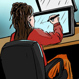
Top: before the demo | Bottom: after the demo. Also mandatory comment on laces.
17d
These look great! Nice job!

Asked for help
For my 1000th post, I thought I would share a project I'm working on. This is for a T-shirt design, I'm working on.
In this case, I did the first draft without checking any reference. If I have a strong idea for something, I'll have a go at it to see what I can pull from my head. At this stage, I'm just looking for interesting shapes and compositions that will work for the Marines in this particular unit.
On my second draft, I'll start bringing in the reference. I looked a few great white sharks for some details and as I'm not that familiar with the vehicles, I had to find pictures for all of those. Because I couldn't find the vehicles in the positions I needed them in, I just had to get a sense of their proportions and apply some simple one point perspective.
All the text is added in Adobe Illustrator.
Still a ways to do before it's done, but for those who like process stuff, these are the steps so far.
17d
This is the Street Sharks + GI Joe mash-up I never knew I needed! Awesome design!! Great thumbnail, you really had a clear composition in mind, and it reads clearly. Awesome to see it translate so smoothly to the next stage, can't wait to see this one finished!
Show all replies (1)
Show 1 more replies
18d
Congrats on your new tablet!
Here's a great Procreate Dreams demo from Aaron Blaise!
https://www.proko.com/lesson/procreate-dreams-animation-tutorial-with-aaron-blaise/discussions
Also check out Alex Grigg's channel "Animation for Anyone," he has some GREAT free tutorials!
https://www.youtube.com/@AlexGriggAnimation
Can't wait to see what your animations!
18d
Hey Mark, great pages! For future assignments, you only need to post work in the lesson assignment page to be considered for the critiques. Looking forward to seeing more of your work! https://www.proko.com/course-lesson/assignment-page-layout-and-thumbnailing/assignments
20d
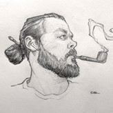
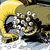
Thought I’d put a spin on the traditional portrait. Sentinel head done on ipad. Did more of an eyeball approach here. Fairly happy with it, a few minor issues.
19d
Nice work!
Show 1 more replies