
$135.15
$159
You save $23.85


Bundle discount Each additional course part in your cart adds 3% off all courses, up to 15% off.
Full course
You will be given unexpiring access to watch the videos online .
$135.15
$159
Give a gift
Give a gift card for art students to use on anything in the Proko store.
Or gift this course:

About instructor
Founder of Proko, artist and teacher of drawing, painting, and anatomy. I try to make my lessons fun and ultra packed with information.
comments 630


Here is my attempt after watching the demo. I used multiple pencils this time and tried to make the shapes more simple than last time. I did forget to shade according to the planes so my pencil strokes are a little bit messy. Now that I am watching the drawing from a screen I notice that I could have given the shirt a light value and that the shading is a bit messy. Feedback is always welcome!
LESSON NOTES![]()
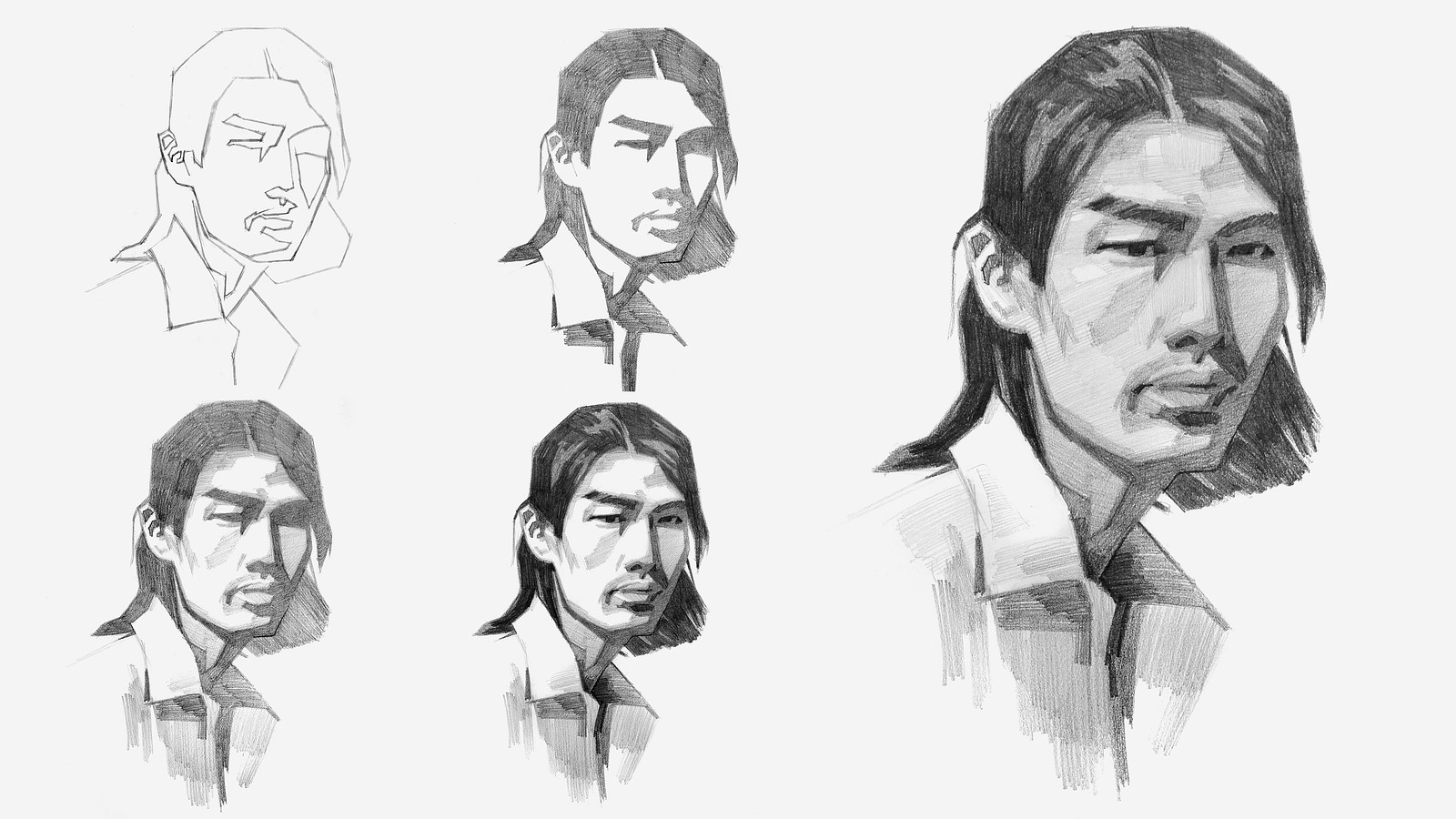
Now that you’ve all had some time to try the first project on your own, you can watch how I do it and figure out what areas you are exceeding and struggling with.
Watch this step-by-step demo on how to properly execute the first project for level 2 students, join the premium course!
DOWNLOADS
simplify-from-observation-portrait-demo.mp4
2 GB
simplify-from-observation-portrait-demo-transcript-english.txt
41 kB
simplify-from-observation-portrait-demo-captions-english.srt
68 kB
simplify-from-observation-portrait-demo-transcript-spanish.txt
42 kB
simplify-from-observation-portrait-demo-captions-spanish.srt
69 kB
COMMENTS![]()
![Stan Prokopenko]()
![]()
![@lwm5]()
![]()
![@greyhound]()
![]()
![Nilsa Rodolfo]()
![]()
![@licht24]()
![]()
![HJ]()
![]()
![Aida Landqvist Souto]()
![]()
![Shohei Yoshida]()
![]()
![Shohei Yoshida]()
![]()
![Svetlana]()
![]()
![Rachel Dawn Owens]()
![]()
![Abdullah]()
![]()
![@enzibenzi]()
![]()
![Breck Polk]()
![]()
![Panga Moise]()
![]()
![Peter Herpoelaert]()


Now that you’ve all had some time to try the first project on your own, you can watch how I do it and figure out what areas you are exceeding and struggling with.
Here is my step-by-step demo on how to properly execute the first project for level 2 students.

Had fun with the face, love the simplification of straight lines, really helpful to capture the basic shapes.
I attempted to draw the model but couldn't let go of the complexity of the image and didn't do a great job simplifying. I went back and followed along with the pear video and tried the pear with the demo to understand the assignment better.
I plan to revisit the level 2 assignment and give it two more tries: once more on my own and once with the demo.

ohhhhhh i didn't like this at all lol. Made this before watching, and the only thing i can do now is laugh. Keep going folks
Hi guys this is my First portrait ever i’m kinda happy how it looks but there are many mistakes especially shading if you have any advice that can help me tell me.
This was pretty difficult. Did this one before watching the demo. It took me a bit longer than expected!
Any thoughts (or general feedback )? Something about the values around his right eye doesn't seem quite right to me.

I know that I wasn't prepares for this level but I just wanna try. Mu first attemp was awful and I didnt finish it. After seen de video critique I decides to try again. I know I haveva lot to learn I would love some critique to imptove. This is my try.


I accidentally painted the shadow of the shirt with the shadow color initially, so it needs to be fixed. For those drawing digitally, one option might be to turn off pen pressure.
Hello. I'm getting different results between the demo and when I set the value to 5 at https://www.proko.com/values. Which result should I consider correct and use for drawing?
Here is my drawing before watching the demo. I really was enjoying the process and I am happy with the end result. I will try later to draw along with video.


•
14d
Wow. I really like how you handled this assignment. The shapes fit together really well.

Here is my first attempt at the level two portrait. I know I do need to do draw bigger. I have a bad habit of drawing small but can someone please give brutal feedback particularly on the shading?

Here are my attempts at simplifying the provided images. This is my first time doing an in-depth value simplification, so there's bound to be errors.
One thing I noticed after looking closely at the photos, was that the pencil rendering is a bit on the rough side. This is most likely because I used rougher paper and also because I have a habit of drawing too small. Additionally, I believe there are discrepancies within my interpretation of the values themselves. In the portrait, the reflected light on the jaw appears distracting and out of place. Also, in hindsight, I should have simplified and grouped the clothing values.
In the end, I'm proud of the fact that I managed to step out of my comfort zone, but I also strive to learn from my mistakes in future studies. If anyone has critiques or suggestions, please comment them down below. I'd love to hear what others might have to say.

Still trying to get the hang of working digitally, but pretty happy with how it turned out! The nose was a struggle.

Portrait level-2 done, but I struggled with shading the halftone and light halftone. Keep working on it. By the way, actually i was surprised when shading. My eyes kept ajusting everytime i was darkening the hair and the shadow. It was like an illusion. Definitely loved the first assignement. I had fun.


Here’s my version. I think I will make a second attempt after watching the demo