
$127.20
$159
You save $31.8


Bundle discount Each additional course part in your cart adds 3% off all courses, up to 15% off.
Full course
You’ll learn the most important foundational concepts for drawing anything and soon you’ll be drawing pictures out of your imagination or from reference.
$127.20
$159
Give a gift
Give a gift card for art students to use on anything in the Proko store.
Or gift this course:


Founder of Proko, artist and teacher of drawing, painting, and anatomy. I try to make my lessons fun and ultra packed with information.
comments 1128


Here is my attempt after watching the demo. I used multiple pencils this time and tried to make the shapes more simple than last time. I did forget to shade according to the planes so my pencil strokes are a little bit messy. Now that I am watching the drawing from a screen I notice that I could have given the shirt a light value and that the shading is a bit messy. Feedback is always welcome!
LESSON NOTES![]()
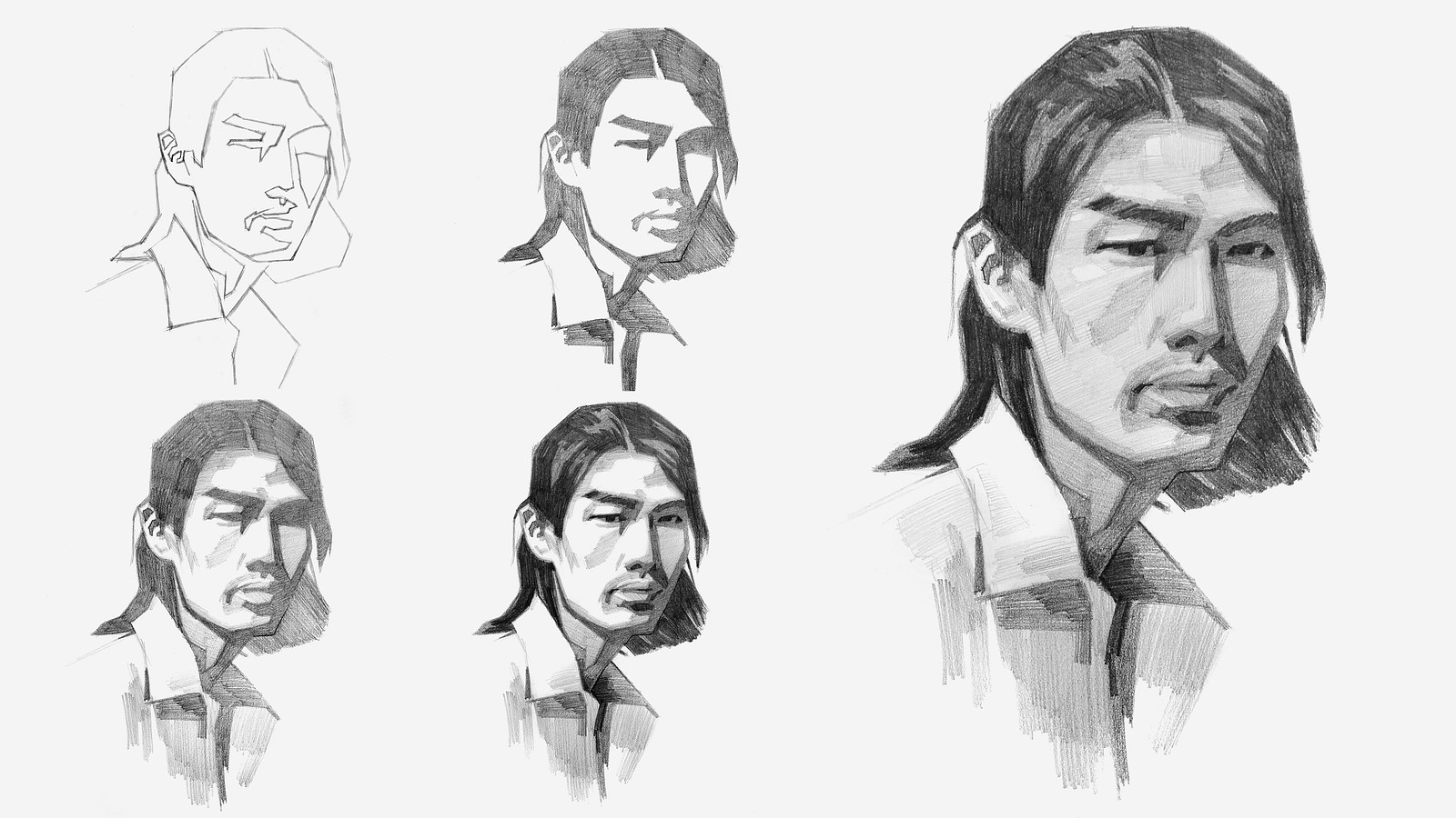
Now that you’ve all had some time to try the first project on your own, you can watch how I do it and figure out what areas you are exceeding and struggling with.
Watch this step-by-step demo on how to properly execute the first project for level 2 students, join the premium course!
DOWNLOADS
COMMENTS![]()
![Stan Prokopenko]()
![]()
![Scarlett S]()
![]()
![Zarkhan]()
![]()
![Cesar Espinoza]()
![]()
![Ben Kraske]()
![]()
![William B]()
![]()
![Ben Kraske]()
![]()
![Vergil Senpai]()
![]()
![Ben Kraske]()
![]()
![Toine Berntzen Ljungberg]()
![]()
![Parag Bhide]()
![]()
![@dutchcourage22]()
![]()
![@sullysarmywife]()
![]()
![Macarena]()
![]()
![isaiah Brace]()
![]()
![@myzhou]()
![]()
![isaiah Brace]()
![]()
![@elenaarmstrong2012]()
![]()
![Henri Wirth]()
![]()
![Fern]()


Now that you’ve all had some time to try the first project on your own, you can watch how I do it and figure out what areas you are exceeding and struggling with.
Here is my step-by-step demo on how to properly execute the first project for level 2 students.


Spent quite a bit of time on this lesson as my first attempts left a lot of desire to improve. For the first I went in before watching the demo, and also before my other pencils arrived so it turned out rather light. The second was done after watching the demo, though admittedly I did copy a bit of what was demonstrated and after realizing that wasn't the most beneficial I felt inspired to do an original photo after seeing a comment using the reference below. I think it turned out a lot better but of course always appreciate if anyone sees areas for improvement!


Hello, all! Like many others, this is my second attempt at the portrait assignment. I defaulted to semi-realism since I have a tendency to hyper-focus, so perhaps it would benefit me to go back and simplify the values again and focus on just the five (three light, two dark) that Stan has been teaching.
None of the values are blended, everything is shaded with a pencil.
Any feedback is appreciated,
Thanks!


Second attempt. After watching the demo, I realized I messed up the mouth and nose proportions. I’ll probably give it another try later to make it look better.

•
4d
Both look good! I can see the growth in confidence in filling in your values and designing their shape.


My first attempt at a portrait. It’s clear I don’t know what I’m doing. 2B, 4B, and 6B
•
4d
Nice trying something new! Remember for this exercise, to give the values distinct, sharp edges, and be intentional when creating those shapes! Keep it up!

•
4d
Great values and those shapes and edges are super clean! Awesome!

I did this before the demonstration. I really realised I need to get a set with different pencils.
2nd attempt after watching the video. Kind of lost the exact location of eyes and nostrils in the shadow area. need to plan it better.


Not sure why I felt Level 2 was within my capabilities, but I thought the exercise might be helpful.
First attempt at the portrait. Definitely aware of the need to work on proportions (in addition to everything else!)
Now to watch the demo before a second attempt…
Definitely a beginner. Decide to try the intermediate assignment, because why not? Not totally unhappy with my first drawing of a person that wasn’t a stick figure 😆


the eyes are awesome depending on one thing and one thing only, if you tried the best you can do at this point, that's the most and least you should as of yourself
working on simplifying with more distinct shapes shapes and tones. I'm still a little confused about shadows vs half tones??
when in doubt... straight lines! Polygons will always have a simpler shape than curved shapes. Shadow are technically any surface that has light obstructed from it but to keep it simple i like to think of it as: The darkest tone is the pure shadow (you can't make out details in it) while the lightest point is the highlight (you also can't make out details in it!) and mid tones are everything in between, Use the midtones to convey depth and detail! I hope this advice helps

Second attempt. It was difficult to limit to 5 shades and make shading consistent within planes

My first Attempt on the Project - Proportions still a bit wobbly but I think it helped me a lot!

I drew two different pears for this exercise because the first picture I attempted was too dark for me to really see what was going on. Watching the tutorial after the first drawing was really helpful because I realized that my process needed Improvement. I over complicated the process. It really helped me to shade the dark when Value First and then the light when value first and go from there. I can see that drawing a third would be even more beneficial than just doing two but I think I'll move on. glad I worked up the courage to post these. I didn't want to.

