
$159


Bundle discount Each additional course part in your cart adds 3% off all courses, up to 15% off.
Full course
You’ll learn the most important foundational concepts for drawing anything and soon you’ll be drawing pictures out of your imagination or from reference.
$159
Give a gift
Give a gift card for art students to use on anything in the Proko store.
Or gift this course:

Founder of Proko, artist and teacher of drawing, painting, and anatomy. I try to make my lessons fun and ultra packed with information.
comments 1080


Here is my attempt after watching the demo. I used multiple pencils this time and tried to make the shapes more simple than last time. I did forget to shade according to the planes so my pencil strokes are a little bit messy. Now that I am watching the drawing from a screen I notice that I could have given the shirt a light value and that the shading is a bit messy. Feedback is always welcome!
LESSON NOTES![]()
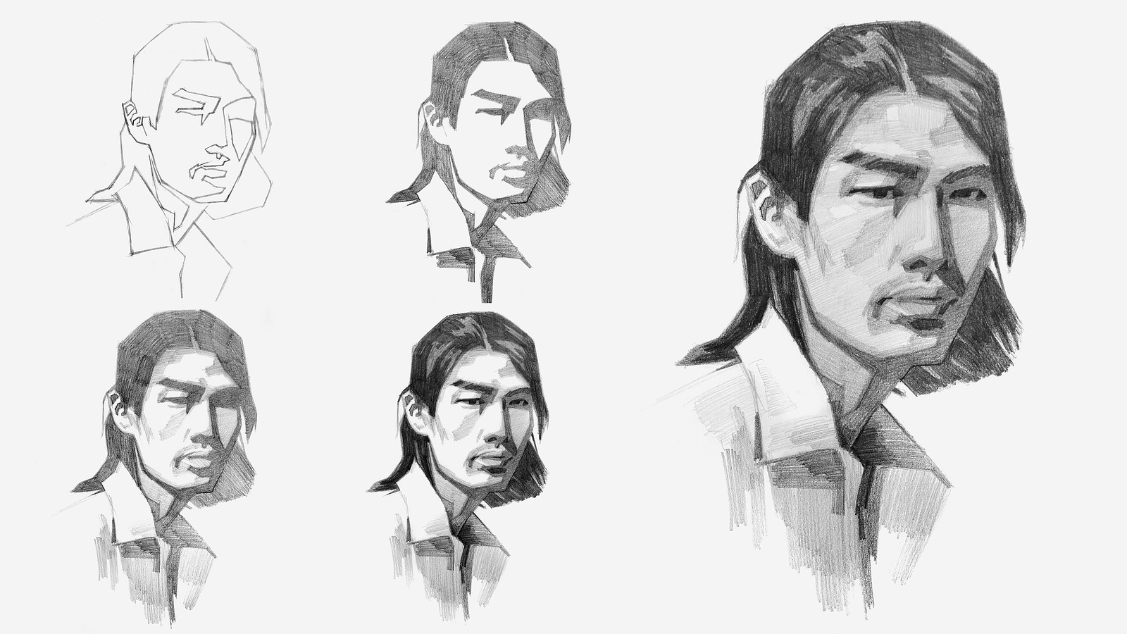
Now that you’ve all had some time to try the first project on your own, you can watch how I do it and figure out what areas you are exceeding and struggling with.
Watch this step-by-step demo on how to properly execute the first project for level 2 students, join the premium course!
DOWNLOADS
COMMENTS![]()
![Stan Prokopenko]()
![]()
![Lyn Umu]()
![]()
![@packingpwanch]()
![]()
![Clayton Shaw]()
![]()
![@almagel]()
![]()
![Umberto Sincovich]()
![]()
![Claire Dobie]()
![]()
![Fannie]()
![]()
![Jasmine]()
![]()
![Caleb R]()
![]()
![Fannie]()
![]()
![R S]()
![]()
![Nachelle Aldous]()
![]()
![@ralk]()


Now that you’ve all had some time to try the first project on your own, you can watch how I do it and figure out what areas you are exceeding and struggling with.
Here is my step-by-step demo on how to properly execute the first project for level 2 students.


Instead of doing it a second time, i decided to try another image. I struggled a lot with the jaw distinction and the light on it. was very difficult to define form when its blinded in light because it loses detail. I kept this timed to 35 min, same as previous. Tried to get the values right without color picking.


First attempt before demo and second attempt after. Definitely seen some improvement for proportions and improved shading quite a bit, but will need to use the tip of the pencils to fill the lines in better so it's not so grainy. Need to also improve the shading on nose and lips. Will do a third attempt after watching critique video.


This one was fun and took quite a while. I think i started getting closer to the reference after each attempt. Open to feedback and critique.

It was very challenging but also a lot of fun. I realized that simplifying a subject is much harder than it looks. It was especially tough to judge and divide the values into just 5 steps based on the reference photo; I ended up with about 6 or 7 steps instead. Even so, this exercise really helped me get a general grasp of the concept.
Attempt #2.
After watching the demo and critique, I tried the level 2 assignment again.
This time I spent more time understanding and building the forms, and I think it turned out a bit better.
I’m still struggling to get 5 clear values, even using different pencils (2H, 2B, 4B, 8B).
Definitely some improvement from the first attempt though.
As always, any feedback is very welcome!

I love that you show us your many adjustments and tell us realistically how much time you took...a masterclass....thank you


Hi again !
This is my second attempt at the level 2 project (as a fellow level 1 person). I think i got a bit lazy at the end with the highlights and the light half tones. Also I was not as precise with the lay-in part. I think i should also go a bit darker in the values. I think i draw to much with the ''side'' of my pencil, which makes it not as dark as in the example M. Prokopenko is showing.
I was a bit nervous because i don't realy never draw faces, but i found it much easier and fun to see things as forms or planes. Thank you :)

Before the demo and following along with the demo. Next attempt will be after the critique video/no demo. This is so challenging!!!!

Gave Level 2 a try. Left is on my own and right is while watching the demo. Man this is difficult. Never thought about values and simplifying shapes like this. And this style is reminding me of Mike Mignola in a big way.
Hello ! Ok so I am more level 1, but I wanted to try a portrait. I really struggle when its time to put down ''values'' I dont know which one to put first and I get overwhelm.

tried to draw geometrically but lost my way somehow. I didn’t like how this turned out. Your feedback would be highly helpful.

I would recommend that you squint to reduce the values into large shapes, and then forget you are drawing a face. No eyes, nose, or mouth. Just see odd patterns of light and dark.

before and after.
i read/DIY'd through Betty Edwards' DRSB, so i could get the proportions/(negative) shapes/basic values, but i didn't know what to focus on.
my cartoon doodling habit also meant i focused on face details far too much when the big shapes are right there.
i think i like the Stan-led draw-along's results a lot better. it really makes the interesting shapes pop because of the simplification of shapes and values.
