


Patrick Bosworth
Los Angeles
Editor at Proko!


@crowlle
added comment inSimplifying Shape Design Livestream
15h
my take on it i tryed

8h
These are awesome! I LOVE the chickens!!


Very eye-opening exercise! I'll be staying here for a few more attempts to get the feel of this, especially after watching the demo.
I'm definitely struggling with holding the pencil and focusing on moving my arm instead of my wrist. Additionally, I need practice with my values.
Now I wanna eat a pear.
8h
Nice work! Great shape breakdown!


14h
Asked for help
After Bill Watterson, Dave Dorman and Heinrich Kley
9h
Excellent studies, love the Watterson!
1d
Hey there, Ale! Great figure drawing, really beautiful work! The Drawing Basics course has a great lesson on drawing ellipses that might help. https://www.proko.com/course-lesson/how-to-draw-cylinders-and-ellipses/discussions


Asked for help
This is an unrelated question to the project but related question related to developing the observation skills. How can we train the eyes to improve the composition of the drawings that we are doing (I know right now its an individual drawing but for the sake of understanding). My main purpose to learn to draw is to improve my design skills (My ability to see and observe). Maybe something to this effect is mentioned in the later videos but if anyone who has knowledge in also improving composition skills while learning to draw. Any input would be much appreciated:) Thankyou
1d
Composition is kind of it's own area of study. Check out this episode of Draftsmen about How to Learn Composition, it may answer some questions for you.
https://www.proko.com/course-lesson/how-to-learn-composition-draftsmen-s2e15/discussions
There's a whole section of the Community dedicated to Composition worth checking out to see how others are composing their work, and the challenges they're facing.
https://www.proko.com/community/categories/composition
Just ahead in the Shapes lesson of Drawing Basics Mike Mattesi talks about shape composition and visual storytelling, a great lesson that uses film examples to discuss shape language and composition. (You can watch this video anytime and get something new from it, so if you're curious feel free to jump ahead and watch it!)
https://www.proko.com/course-lesson/shape-composition-with-mike-mattesi/discussions
Also check out this video from comic artist David Finch on composition basics and visual storytelling.
https://www.proko.com/course-lesson/basics-of-comic-composition/discussions
All that said, Composition is a huge topic. At its most basic, Composition is just the organization of forms and space. A quick way to improve your compositional eye, even for individual drawings, is to plan the placement of your drawing on the page before you start drawing. Stan will cover this soon in Basics, begin your drawing by estimating the top, bottom, left and right most edges of your drawing and mark them lightly on the page before you begin to give yourself an envelope to contain your drawing. That’s always a good first step at composing your individual drawings so you don't run out of room on the page, and over time your eye will develop for how to use the space available to arrange your work.
Hope this helps!


1d
Here's my take on bean gestures 2mins
1d
Nice! These look great, you can really feel the squash in each one. You've made them all feel like they have real depth and volume, they seem to be moving into or out of the picture plane. Keep it up!
Show all replies (1)


1d
This is fantastic! I love your construction breakdown, beautiful shape design, your line weight is well considered, rendering and value control, well done!! I even love your page composition, this study is worth studying!
Show 1 more replies
7d
Asked for help
Referenced a David Finch piece from one of his recent livestreams. Followed his whole process building up the piece from a simple line drawing, then adding line weight, and shadow in pencil. I wanted to experiment with his rendering style a bit so I inked and colored it in Procreate. His original post from after the livestream is included.
Show all replies (5)


9d
Asked for help
Still working on landscapes by Goseki Kojima (his on the left, mine on the right. I absolutely did NOT get the leaf shapes how he does them— still working on that. Probably going to take a lot more tries. I really like how he gives a sense of how huge the landscape is compared to the figures and how his work gives a sense of depth.
8d
Nice study! There's a lot going on and a ton to balance in this Kojima piece, the dry brushing alone is a masterclass! Squinting down while studying the reference can help you see where your values are a little light, and where you can push further into black, but this is a great start! You could start to work up layers on top of this to push it even further. A layer of dry brush in the darker areas will really push elements into the background. The trees you have in the bottom right foreground are working wonderfully, they're really starting to show some depth into the forest. The mountain side of dark tree tops in the middle ground could be pushed a bit further into black. A medium tip brush pen like the Pentel XFP5M can give you a really nice split end dry brush effect if you let the reservoir run low while you're inking. In David Finch's Comic Page Course he covers how to shadow in trees and organic elements which I think could help you here! https://www.proko.com/course-lesson/page-2-line-weight-shadows-and-backgrounds/discussions
Hope this helps, keep up the good work!


8d
These are beautiful, great work!
Show 3 more replies
9d
Asked for help
Super helpful project! Used the timer tool to get the blobs down quickly, and then took some time to refine in passes.
Show all replies (4)


14d
Asked for help
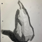
Hello! I am struggling with multiple parts of the assignments, but especially "filling" the shapes. The directions of the lines feels important but I do not understand when they should go at one angle or even if that matters. Also, I find it tricky to draw consistent consecutive strokes: some are too long, others too short, some close and others wide apart. By comparison, I think I see everything that is wrong about my pear, but not how to improve it.
13d
You're doing a good job! The directions of the lines is important. Generally you want to direct your lines in a way that follows and accentuates the form of whatever it is you're drawing. Think about your lines wrapping around the form like a rubber band. You've done a good job of accentuating the form by shading around the pear. As for the consistency in your shading, that will come with time and practice, its really challenging to balance pressure for an even tone, but you're starting to get the hang of it. It looks like you could apply another layer of tone on top of each value to even things out. Take another pass filling in each value so each shape is as clean and consistent as you can make it, but try keep the values you have established. Take a look at the demo for the Pear Project, Stan covers how to layer up each value so it's clean and consistent. Keep up the good work!
Show all replies (1)


13d
These look awesome! Great work!


14d
I love this course, and also learned a lot. Keep going!
13d
Very nice!!

14d
I have 0.5mm mechanical pencils. Is it worth it to get me some 0.7mm and 1mm mechanical pencils. What's the difference aside from the lead width. Is the size difference significant enough to justify the investment?
14d
Hey Robert! 0.5mm is a great all around choice for a mechanical pencil, but you might find it limited in the variety of marks you can make with it. The wider the diameter of lead, the more variety of line you can achieve, for instance a 0.9mm mechanical pencil is wide enough to maintain a chisel edge for shading, or creating thick to thin dynamic lines, but its still a fairly thin consistent line. Theres mostly artist preference between a 0.5 and 0.7mm, but there's a noticeable jump from 0.5 to 0.9mm and up. I'm a big fan of 2mm clutch mechanical pencils to go along with a 0.5mm. It can give you a huge variety of line in one lead size. A 2mm lead is really close to the diameter of a standard woodcase pencil so you get a very close feel to a traditional pencil, you can bevel the edges on a sanding block to get a tapered point which is great for shading. The reverse end of the lead can also be sharpened in a different way to give you some options like a rounded/blunt tip for quick sketching, or sanded to a chisel point to get even more variety in the line. You can switch sides depending on what kind of line you need and only carry one pencil. Hope this helps!
Show all replies (2)
15d
Beautiful work!
Show 2 more replies


16d
hi, are we supposed to do the figure drawing course before this one?
15d
Hey Blanche! It's not a requirement, but the Figure Drawing Fundamentals course is a great companion course to Anatomy! If you're already comfortable drawing figures and just want to learn more about anatomy you can jump right in, but if you are just starting to learn about how to draw figures definitely check out Figure Drawing Fundamentals course, once you learn the fundamentals, you'll be able to get a lot more out of the Anatomy course. Hope this helps!
Show all replies (1)


16d
I hadn't drawn gestures for a long time. I completely forgot how to draw gestures. Since I watched the Proko's videos again, gradually, the memories came back to me.
15d
Beautiful gestures! It's good get some distance from a subject and come back to it with new skills, and fresh eyes. Keep it up!
Show all replies (1)

Asked for help
Drew the pears over three days. I will be doing the portrait tomorrow and then I am gonna do it all on the pc too :) I want to take it slow with this course and really dig deep.
Always had a hard time using the pencil to get different shades that aren't murky since I mostly use around one or two, so using four pencils and just applying gentle pressure gave night and day results:)
15d
Really nice work!
Asked for help
Have yet to learn to see in value, shade, and how to not get anal about every miniscule detail
22d
These are excellent, really beautiful work!