
$127.20
$159
You save $31.8


Bundle discount Each additional course part in your cart adds 3% off all courses, up to 15% off.
Full course
You will be given unexpiring access to watch the videos online .
$127.20
$159
Give a gift
Give a gift card for art students to use on anything in the Proko store.
Or gift this course:

About instructor
Founder of Proko, artist and teacher of drawing, painting, and anatomy. I try to make my lessons fun and ultra packed with information.

LESSON NOTES![]()
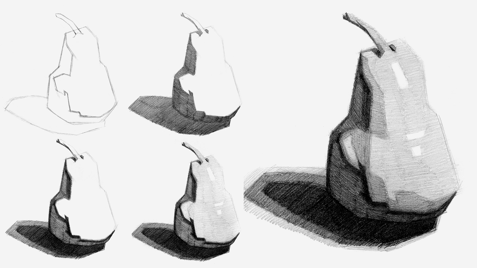
Now that you’ve all had some time to try the first project on your own, you can watch how I do it and figure out what areas you are exceeding and struggling with.
To watch this step-by-step demo on how to properly execute the first project for level 1 students, join the premium course!
DOWNLOADS
simplify-from-observation-pear-demo.mp4
807 MB
simplify-from-observation-pear-demo-transcript-english.txt
24 kB
simplify-from-observation-pear-demo-captions-english.srt
40 kB
simplify-from-observation-pear-demo-transcript-spanish.txt
24 kB
simplify-from-observation-pear-demo-captions-spanish.srt
40 kB
COMMENTS![]()
![Stan Prokopenko]()
![]()
![@licht24]()
![]()
![Holly]()
![]()
![HJ]()
![]()
![@lwm5]()
![]()
![@aevummessor]()
![]()
![Aida Landqvist Souto]()
![]()
![@razom]()
![]()
![@blcoll01]()
![]()
![Cat Dominguez]()
![]()
![Melanie Scearce]()
![]()
![Chuck Ludwig Reina]()
![]()
![Cat Dominguez]()
![]()
![Kimberly Lewis]()
![]()
![Victor6]()
![]()
![Chuck Ludwig Reina]()


Now that you’ve all had some time to try the first project on your own, you can watch how I do it and figure out what areas you are exceeding and struggling with.
Here is my step-by-step demo on how to properly execute the first project for level 1 students.

Hi guys today is my second day of draw ing i feel like my shading could use a lot of work. Like last time if anyone has some piece of advice i would appreciate it.

My second attempt. This time I remembered to include the shadow. Otherwise, I struggled with simplifying the shadows. I think I overworked it and it just looks like a muddy mess to me.
My second shot at the pear. Would welcome any feedback.
I think it maybe could've benefited from a darker shadow (the second-darkest, not the darkest value). Also, maybe more difference between the halftones?
Tried again and really tried to be more boxy. This is really fun, I feel like I need to simplify my shadows and shading.

Attempted the first and second pears today digitally in Procreate. Using the app for sketching and determining the correct brush/pressures/angles is something of an additional learning curve, but I think I'm slowly learning! The first was using a much softer pencil and I relied on using the side of the brush too much, while the second pencil brush had a much sharper pressure curve and no side edge to use as a crutch and so the individual motions are far more visible.
Tried to self critique by measuring after the fact and/or overlaying the reference image and annotating where I deviated on shadow locations and proportions. I feel excited to try more exercises and I'm confident I can keep improving both in the app's operation and in observing / breaking down what's actually there!

Well, this are my attemps! I would love some feedback. I tried the three pears, digitaly. The first one I did it without seen this video and I also did a sketch over the photo, later I thought about it and it feels like cheating so I didnt do it again. After I finish the second I tried to blurry it. For the third I chance colors to ser if i can manage to do it. I know that they arent perfect, but I'm proud.


I would love some feedback on my pear attempts! This is of course before and after the demo. Tbh I think I like the first iteration more, but I also picked at it for longer. What do you think?

I made an attempt at each of the 3 pears before watching the demo. Here they are. I stuck to straight lines for pear 1 but not the 2nd and 3rd. I feel like I got more even tone in the last two drawings.

First Time Posting , Long Time Wanting To Do Art
1st 4 pics where my first "swipe" at this elusive pear. When I couldn't seem to get the overall shape, I'd quit, early, and move on to another attempt. I guess, in retrospect, I could have, at least practiced laying down values.
On the 3rd drawing, I was really trying to push myself to limit to straight lines. You can see the question mark, in the middle of the pear, where I just had to stop-drop-&-roll out. The planes, the angles, etc... too confusing. I couldn't wrap my brain around "the how" to solve it.
After Stan's demo, I ditched trying to create my drawing from the ref pic, and simply attempted to draw Stan's version. On my 5th swipe, I really "spread my wings" (lol) hoping a whole page's worth of drawing space, would be the trick. I learned important lessons around layering. Had I waited to commit to the darkest value, at the very very very end I would have avoided the ghost image of the o.g.-core shadow. As I kept looking at it, I realized the core shadow wasn't close enough to the middle of the pear, so I moved it more toward the middle.
The last pic is my final attempt. I'm realizing that the direction you shade, totally matters, bc it shows the eye how the plane is situated. "I could've had a V-8!" . I also learned that the way you lay down your shading-lines matters, too. Ideally, spaced apart, the same distance, and same pressure on each line.
Allllllll fabulous to know. Can't wait for the next assignment.


•
7d
It looks like you got the right idea. I think studying the demo drawing is a great way to internalize the concepts of this lesson.
I don't have much feedback on your first drawings except that the proportions look good! My advice now would be to find some images of well-lit fruits, or draw from life to apply what you've learned about values and plane changes. Feel free to tag me if you have any struggles or questions along the way!

•
7d
Nice drawings! I love seeing the progression from start to final pear. It’s excellent seeing you realize how the directionality of the shading can matter. It’s another tool in our tool box! The only note I might have, and it is minor, is the shadow side of the final pear could be just a tiny bit darker if you wanted. Overall, really great progress and work. Keep it up!
First time uploader - longtime listener... and computer user.... yet when I go to upload my pear drawings I think I'm slaying: in dashboard, I choose the photo icon, choose my pear photos, choose "upload", ... a. n. d. nothing. The website prompts me to choose my pics to upload, again. Around and around it goes, like a bad re-run of "Groundhog Day"
Any advice for a struggling Mac user?

Hi, @Cat Dominguez! Sorry for the trouble with submitting your images for the assignment! I am going to reach out to you from the support email so we can sort out the issue!


•
11d
Looks good! I like how you got very clear shapes. Well done.
