
$159


Bundle discount Each additional course part in your cart adds 3% off all courses, up to 15% off.
Full course
You’ll learn the most important foundational concepts for drawing anything and soon you’ll be drawing pictures out of your imagination or from reference.
$159
Give a gift
Give a gift card for art students to use on anything in the Proko store.
Or gift this course:

Founder of Proko, artist and teacher of drawing, painting, and anatomy. I try to make my lessons fun and ultra packed with information.

LESSON NOTES![]()
Now that you’ve all had some time to try the first project on your own, you can watch how I do it and figure out what areas you are exceeding and struggling with.
To watch this step-by-step demo on how to properly execute the first project for level 1 students, join the premium course!
DOWNLOADS
simplify-from-observation-pear-demo.mp4
807 MB
simplify-from-observation-pear-demo-transcript-english.txt
24 kB
simplify-from-observation-pear-demo-captions-english.srt
40 kB
simplify-from-observation-pear-demo-transcript-spanish.txt
24 kB
simplify-from-observation-pear-demo-captions-spanish.srt
40 kB
COMMENTS![]()
![Stan Prokopenko]()
![]()
![@cody_allan]()
![]()
![Andrii Stotskyi]()
![]()
![@yungastroart]()
![]()
![Clue]()
![]()
![@jazzp]()
![]()
![Ben Kraske]()
![]()
![@tbesemer]()
![]()
![Ben Kraske]()
![]()
![Wentbankrupt]()
![]()
![Ben Kraske]()
![]()
![@alexsanty]()
![]()
![Ben Kraske]()
![]()
![Marko Pack]()
![]()
![crina fratean]()
![]()
![Lavan C]()
![]()
![Ben Kraske]()
![]()
![@tolgaio]()
![]()
![Monsudari]()
![]()
![Ben Kraske]()
![]()
![@liasbird]()
![]()
![Melanie Scearce]()
![]()
![Darth Bogdo]()


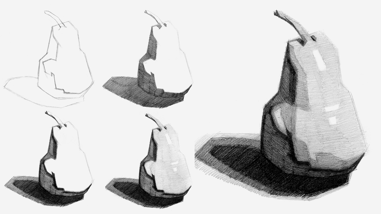
Now that you’ve all had some time to try the first project on your own, you can watch how I do it and figure out what areas you are exceeding and struggling with.
Here is my step-by-step demo on how to properly execute the first project for level 1 students.

Left - Before watching
Right - After watching
This is 20lb computer paper, Tombow 2H, HB, 4B and 6B pencils. I just paused the video on the pear for reference. I had better results relying on the tip of the pencil than the side. Mainly because of the paper texture. Looking forward to more exercises.


Hola! Finally started. It's always harder to start than to just practice. Good luck everyone!
Day 1 of the drawing course. I did the first project and will be attempting the second one soon after


left/right: before demo/ after demon
its still hard to draw distinct, clean line with exact strength i think that makes drawing little blurry


•
6d
Great work getting those shadows darker, and very nice value shapes and clean edges! :)

•
7d
Nice improvement, great work! Remember for this assignment that there should be 5 values total: 2 shadows, 2 halftones, and the highlight. I'd try adding a second, darker halftone in the light part of the pear, next to the darkest shadow. Even though the values are distinct steps from each other, it'll still give a bit more of a natural transition from light to shadow. Great job! :)
•
7d
Nice job! This is great improvement, especially with the shadows!


Being brave, 2nd attempt following the demo. I think my shadow got a little out of hand but pretty happy with it overall!
•
7d
I think you've got some wonderful shapes and great distinct values. Nice work! :)


1st try trying something like this, very happy actually, but ofc happy to hear feedback


Hey there peeps. So this is the little pear that wanted to become an avocado.
I am learning the limits of my paper and the barbarian ways of my electric eraser. Values are interesting and I think that if you stare at an image long enough you'll start seeing infinite values everywhere. 😂
Hope everyone's having fun with their creations.

Hi, everyone, this is my first post! The second try seems more impactful to me, even tho I'm not happy with the transitions and the neatness of my line work. Feedback is much appreciated.
•
9d
Welcome! Nice work on both of these! On your second go, I think you could push the darkest shadow a bit darker, since it's pretty close to the lighter shadow. Your lines and shading look very nice too! Great job!
Before and after the demo. This is the first time I am drawing something on a sketch book and it felt so good to finish multiple pages on a single sit, really looking forward to the next challenge.

Just finished the first project, the first pear is my first attempt and the second was done along with the demo.
•
12d
Great work! Nice growth between your two pears, your values and shading strokes look good!

•
12d
Wow, awesome job! Your first drawing is good, but your value shapes aren't organized in a way that supports the light source, which diluted the 3D effect; while in your second drawing, the pear really pops off the page because the value shapes follow the plane changes around the pear as it turns away from the light. Great work!

Tried to approach the shadows a bit differently and put more effort into replicating the shape tendencies of the pear during this attempt. Would like to hear some feedback.
P.S. Apologies for comments near the drawing :)