


Form
First let’s talk about form, because form is what we are trying to indicate when we shade.

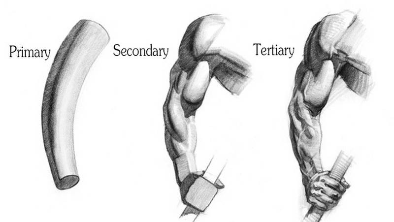
Organic forms found in nature, like humans, animals and trees could and should be constructed from these simple forms to capture the character of the subject. The primary form, such as a cylinder for an arm, should be dominant over any secondary forms, such as the biceps, triceps, deltoid, forearms muscles. And these secondary forms should be dominant over tertiary forms, like a vein or wrinkles.
You don’t necessarily have to draw them in that sequence, just make sure that your shading primarily reveals the largest forms, and the smaller forms act as details - icing on the cake.
Planes
Planes can be thought of as flat tiles, arranged in 3d space to create a form. For example, a sphere has a front plane, top plane, side planes, and many more between that together resemble a sphere. They create the illusion of form. Though really a sphere is rounded, without any flat planes, thinking of it in this way will help to imagine the sphere as a 3d object and aid in the shading process. You can think of each section and imagine which direction that plane faces. Then compare it to the direction of the light source. The plane facing the light is the lightest and progressively get darker as they turn away.
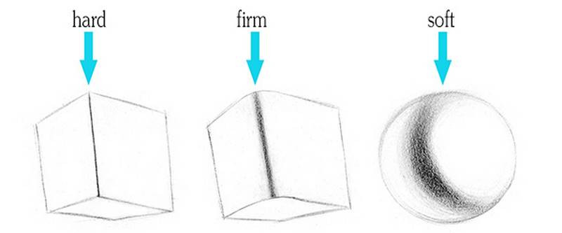
If you want to round out the edges to indicate a softer form, then soften the edge between these planes!Though sometimes leaving the edges between the planes hard even on what looks like a rounded form can help to illustrate the structure more effectively. Consider the 3-dimensional form rather than just blurring edges for techniques' sake.
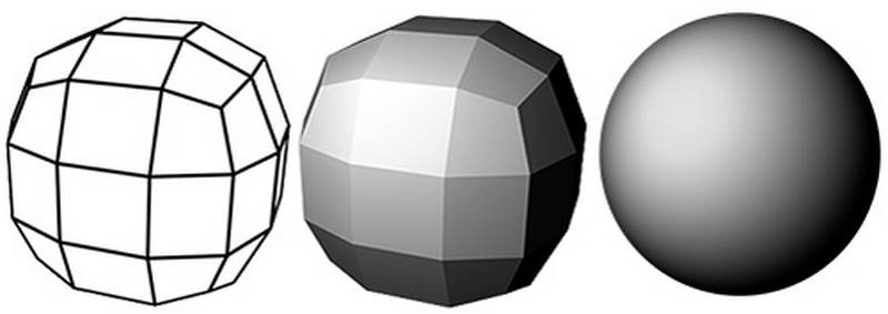
I also want to point out that when you’re simplifying a form, what you’re doing is decreasing the number of planes which that form consists of. This 3d model consists of millions of planes, 3d artists call them polygons. When we lower the polygons down to a few thousand, we get something like this.

Much more manageable for our brains to process. This is the level I'm usually thinking at when I’m observing the planes on an organic form like a figure. Shade these planes with soft edges and it gives the illusion of millions of planes. But in my mind, I’m only thinking of a few major planes for a given area.
If you lower the polycount even further, basically what you have is the Robo Bean and the Mannequin. It’s good to imagine each form as a block and identify each minor plane as either being part of the top, bottom, front, back or side planes. The simple planes of a block are the most important ones.
“Avoid all elaborate and unnecessary tones which take away from a plane appearing to be on one of 4 major sides.” - George Bridgman
Light on Form
When an object is lit by a direct light source, you will get a very predictable pattern of lights and shadows. We can make a form feel 3d by indicating all the parts of the lights and shadows correctly.
Let’s do a little example. An elongated rounded form with some thinner cylindrical ends. This can be a generic muscle, similar to a bicep. You have the rounded belly of the muscle with tendons on both ends.
First determine the angle of the light source. Let’s say top right.. And imagine the planes that make up this form. All the planes that face the light will belong to the light family. All the planes that face away from the light will belong to the shadow family.
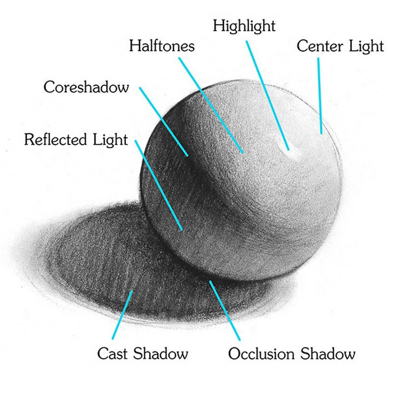
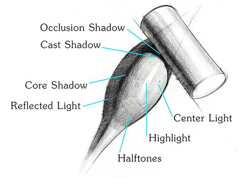
Core Shadow
As a divider of the two families, you’ll usually see a core shadow - a darker strip at the edge of the shadow. This core shadow shouldn't be the same all the way the down the form. In the rounded belly part of the form, the core shadow will be thicker with a softer edge. As the form transitions to the thinner tendon, the core shadow will also get thinner with a sharper edge. Make sure you pay attention to what you’re indicating with the core shadow. Avoid drawing racing stripes down the form. This usually happens when people think in 2-dimensions and don't consider the 3-dimensional form they're indicating. Is it cylindrical, cuboid, or somewhere between the two? Draw a soft, firm or hard edge accordingly.
Reflected Light
Fill in the shadow side with a clean dark value, but lighter than the core shadow. This is called the reflected light. It’s lighter because of bounce light and reflections from the environment illuminating this area. I always start with a flat value first, even if I see variations of value caused by plane changes inside the shadows. The most important part is to separate the shadow family from the light family.
Later in the drawing, we can work on the plane changes within the shadows if they are really important. Though in this example there aren't really any plane changes, just a soft gradation to show the rounded form. On a complex form like a figure, it’s usually a good idea to keep the details within the shadows quieter than the details in the lights. Most of the story is going to be told in the lit areas.

Centerlight and Halftones
Next, identify the point of the center light. This is the point where the plane faces directly to the light. The halftones appear as a gradation darkest near the core shadow and lightest at the center light. So, I’m thinking about how these planes get lighter as they wrap around toward the centerlight. Then down here, the planes start to turn downward, also getting darker. Once we get to the cylinder of the tendon, the planes turn back to face forward.
Highlight
The highlight is different from the center light, but sometimes appearing to fall very close to the center light. Remember, the center light is the plane that faces the light and the highlight is the plane that reflects the lights relative to the position of the viewer.
A simple way to remember the interaction between the center light and highlight is - When the shadow is thin the highlight will be very close to the center light. When the shadow is large, then highlight will be farther from the centerlight, moving closer to the shadow.
So, I’ve established the shape of the highlight and gave it a sharp edge on the side and softer toward the top and bottom.
Cast Shadow and Occlusion Shadow
So far we have a center light, highlight, halftone, core shadow, and reflected light. There’s two more that we’re missing. These elements occur when there’s an interaction between two forms. So let’s introduce a random cylinder into the scene. This cylinder blocks light from hitting the surface of the muscle right here. That’s called a cast shadow because it’s cast by the cylinder. When I draw the cast shadow shape, I use it to describe the shape of the object it is casting on to, not the object it is casting from.
The area deep under the cylinder will get less bounce light and so it will be darker. That’s an occlusion shadow. Keep the edge at the cylinder sharp and the edge going away very soft.
So, those are all the parts. Review all these elements and practice spotting them on directly lit objects.
There are 2 other things that I look for that could affect the value of the form.
Local Value
The local value of the object itself shifts the value range. These 2 eggs are light exactly the same way, but you can see how the value range is different. On the white egg the range from darkest core to center light is pretty wide. On the brown egg the values get compressed and pushed darker

Interestingly, the highlight isn’t affected as much. It still gets darker, but not as much as the other parts. Because of that, the highlight on the brown egg appears very bright. The value of the highlight depends on the reflectivity of the material. A glossy surface will have brighter highlights, whereas a highlight on a matte surface might not be visible at all. The effects you see on these eggs are really close to what you’d see with skin.
Intensity of Light
Detailed explanation of the process
Available in the premium course, I describe my complete process of drawing a figure, step by step with narration. I also include the 5-value rule – allowing yourself only 5 values to shade with.
If you liked this lesson, be sure to check out the next lesson on the Figure Drawing Timelapse of Yoni.
Subscribe to the Proko Newsletter so you don’t miss any new videos.
Use the photo of Yoni or choose another pose from my pose sets to draw a fully shaded figure. I recommend drawing large so that you have room to shade some details. In my example, I’ll be drawing on an 18×24 inch paper. Also, don’t rush it. A student in most ateliers will spend at least 3 hours on a figure drawing. Personally, I recommend longer, especially if this is one of your first long figure drawings.


