


@yucktogram
added comment inProject - Learning to Sketch from Imagination
11d
Asked for help
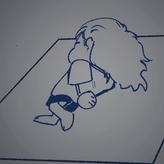
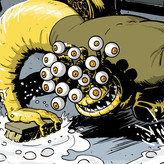
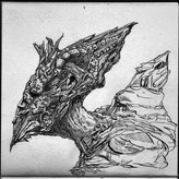
my first attempt at this project. have been holding off because i wasn't so sure if i was getting the assignment then just decided to like be whatever with it i can get back to it later on and its just good that i tried it. decided to focus on borzois because theyre just goofy and i think they got a lot of straights and curves when you try to simplify them.

4d
Nice explorations-- I especially love the poses in the last page, they have lots of personality!

5d
Asked for help
I found it super tricky to simplify to CSI and feel as though I was just sketching semi normally with the CSI in the back of mind, creeping to the forefront occasionally 😅 I do, however, feel as though I have much better gesture than I normally would, having started with the larger sweeping movements to get my initial observations down 👌
4d
Great simplifications, you nailed it! When it comes to line quality, there'll be more practice up ahead to get down confident linework, and incorporating the warm-ups into your routine can be especially helpful to get into the rhythm as you start your practice sessions. But for now, it does help to visualize the mark you intend to make, including the specific start and end points -- and it may even be useful to make a small dot at those points. Making multiple lines to correct yourself is still a good habit, but starting lightly and only ending with a dark line once you find the correct placement can help the drawing appear more clear. You're on the right track, keep it up! :)
Show all replies (1)
Show 1 more replies
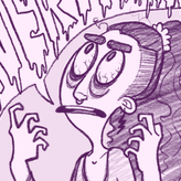

Second attempt after watching the demo and critique video! I spent much more time trying to match the angle and proportions this time around, which I think paid off. Still struggling to see the core shadow—it’s a new concept to me, and even after watching both videos, it was hard to find on my own!
4d
Awesome progress! Typically you'll find the core shadow running alongside the division of shadow & light (think of Values 1 & 2 against 3, 4, 5, counting darkest to lightest), as this will be the most pure area of darkness before other rays of light start to lighten the shadow. I think you're on the right track with this -- keep up the good work!


4d
Asked for help
My pear attempt. I hope i did okay.
4d
Nice work overall! For the dark strip across the pear separating Values 2 & 3 (counting darkest to lightest), think of it less like a line and more like its own value shape representing Value 1. That can continue to emphasize the roundness and volume of the pear which you are already creating with the rest of the value shapes.

11d
2nd post of the day in here.
A little while back @Martha Muniz was nice enough to give me some feedback regarding shading. She pointed me to a video on shading by Dorian Iten on YouTube that was very helpful. I revisited the video tonight and took a crack at it with digital tools.
Shading is a big area of growth for me. I've done a lot of t-shirt and comic book illustrations, but the style I work in is far less subtle than what I'm trying to develop. Dorian has a shading course here with a lot of free lessons. I delved into those a bit tonight as well.
The figures I've drawn after watching a few videos were done with the intent to find the terminator (where the form light meets the shadow shape), which is an exercise Dorian recommends. I'll eventually buy the premium course because Dorian clearly has an approach I want to get deep into, but I'll wait a little while until I finish a few of the open courses I'm in.
5d
Awesome work, Gannon!
Show 3 more replies

5d
Asked for help
Water buffaloes. Buffali?
5d
Great designs! I love the curving and curling nature of your shape choices, though it'd be a fun added challenge to try this out using mostly square and angular shapes as well, to push the design in the opposite direction. Have fun!

1mo
Asked for help
Crosshatching is still such an extreme challenge to me! I definitely can imagine the form, but quickly start to overthink because of neighboring planes. One of Dorian's tips has especially helped set me straight: hatch along the most dramatic change of direction in a plane! I was inspired and immediately did another Asaro head to test my newfound reasoning, unfortunately, I accidentally closed the tab and did not finish the ear and some larger plane. Grateful for feedback!
11d
Nice work applying all the tips! The distinction between all the value groups reads clearly and the crosshatching adds dimension to the planes.


28d
Asked for help
It took me quite a long time to complete this 😭 when I started tracing it became even harder.
11d
Kudos to you for following through! I know it can be quite challenging to get through all the levels, especially as they get more complex.
Something quick to note though would be to keep an eye out for the more saturated colors -- these can throw people off a bit, as they appear darker than we would think when converted to grayscale. The green scarf and the red background in the middle Level 2 picture and the clothing in the middle Level 3 picture serve as examples for this.
Hope this helps, keep up the good work!


2mo
Asked for help
It seems like there used to be more than one reference image in the downloads but for some odd reason all I could find was this fish image. So I just worked with that.
11d
Looks pretty good! I'd suggest easing the harsher dark crevice areas into the soft, lighter shadows, so it's more evenly distributed out. Also, in case you want to try this assignment out again, under the Assignments tab in the Examples section, you can find more images to use as reference, or you can use your own images -- sculptures, figurines, simple 3D models have worked well in my experience.
Show all replies (1)


11d
Loved seeing your different approaches to this assignment -- great improvement and lots of creativity!
Show all replies (1)

28d
Asked for help
Harder than it seems! How do I extrude the wheels?! 😵💫😅 One in the top was easier for some reason.
11d
It seems like you're on the right track! Just how we originally plot in a square for an ellipse, you can think of a box being extruded in the same position for the cylinder. Plot the marks used for the ellipse on both the front and back planes of the box, then connect them together.


13d
Asked for help
This assignment was difficult for me. I followed Stan's instructions, but the ellipses I drew always ended up looking warped.
11d
I think you have some good improvement between your first and most recent attempt. With the headlights in the first attempt, something that helps to think about is the simple version of the cylinder you are trying to draw, so a basic box shape. This helps orient as to which direction the extrusion would go to show the thickness in the right direction.
Aside from that, what may be giving the 'warped' look to the ellipses are the slight changes to the square guidelines. In the last attempt, the front wheel closest to us is slightly elongated vertically, while the front wheel furthest away from us is slightly elongated horizontally, and next to each other the small changes can cause it to appear distorted overall. Keeping an eye out for these incremental changes, double checking their alignment during the guideline phase, can help steer you closer -- keep at it!
Show all replies (1)


2mo
@Stan Prokopenko How come at the demo at 19:32 the slopes go upwards out when we are looking up towards him ? since his eyes are above the eyeline shouldnt they slant downards towards the eyeline?
11d
There is a slight change in angle in their position along that horizontal axis that would affect how their eyes align. But also, if we think about the face even simpler, like an egg shape, we can note that as it turns, the eye furthest away from us reaches a point where it has to turn back down to follow the circular trajectory. That's how I understand it, at least. Hope this helps!
1mo
Asked for help
My first batch of Level 1 practice. I overlayed drawings using PowerPoint. I had difficulty in capturing right angles of the direction of the faces in many pictures.
11d
Good practice! Watch that when you have a box facing towards a particular direction, such as going downwards or to the side, the lines follow that direction and converge (or get closer together) towards that direction. A sign to look for is what side you see of the box, for example, in #1, you can see the top of the box a fair amount, letting us know that the box will be heading downwards and the lines in the vertical axis will get closer together. It can appear rather subtle here, because the perspective is not extreme, but that small change will make the perspective seem believable.
Show all replies (1)

17d
Asked for help
I feel pretty good about this one. Some angles proved more difficult, especially 11, where the hair covered the top half of the box, masking the perspective and leading to me redrawing it multiple times. In the end, however, I decided to fill out 11 for precisely this reason.
I'd love a bit of feedback, as so many of you have graciously provided, regarding previous projects.
11d
Looking good on your angles! Just watch out for the tendency to make the faces of the box too equal, where they almost look like square cubes. Think more of rectangular prism, with the face appearing long vertically and shorter horizontally.


13d
Asked for help
Level 1: Once the perspective lines were in it was surprisingly difficult to draw straight horizontal lines. Has anyone else had the same issue or should I get my head checked?
11d
Yeah, getting in straight lines can certainly pose a challenge, especially for something more precise like this perspective lay-in. I recommend continuing the warm-ups from earlier to help develop this skill Warmups to Improve Line Quality, but also, the Ghosting exercise -- where you place the start and end points as dots on the page, then practice the motion hovering over the page, before going for the final, confident stroke on the page -- can definitely be used in this drawing, too. It just takes some practice, keep at it! :)
11d
Solid work :)
15d
Asked for help
This was far more difficult than I thought it would be. Balancing thinking about the rhythms and flow along with proportions was kind of intense. The third image I attached I think is the best. It is from after I watched the demos and critiques and slowed down more. I had a hard time having peoples torsos come out too thick, or their limbs too long.
I attempted to use overhand grip for most of these. The first few are drawn with an old charcoal pencil I found. It always seemed to come out super dark and didn't have the value variety that I would've liked.
Any critiques are welcome! (As well as charcoal recommendations.)
11d
Something that can help is trying out a simplified, long rhythm line for one side of the section you are drawing (for example, an arm, leg, or torso). Afterwards, you can place in the other side, using more complex lines to solidify the placement of proportions. This can help get a sense of balance between the long and fluid, and the proportionate and more complex. Also, I see this already improving throughout your drawings, but to develop more control with a new medium, I recommend going back to more basic exercises to ease the transition Warmups to Improve Line Quality, Warmup - Mushrooms. And my go-to charcoal pencil is the Conté a Paris 1710 B :)
17d
Asked for help
A few seals (or sea lions I'm not sure)!
11d
Love the fluidity in these! Something to look at next is introducing variety into the types of curves you utilize. While the curves you have already start a nice fluidity, this can be made more dynamic by finding different points to peak the top of the curve at, instead of defaulting to an open, C-like curve with the peak in the middle. It's another tool you can play around with to push and pull the shape. Have fun with it! :)
Show 1 more replies


27d
Asked for help
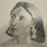
Second attempt at the project. Slightly better but the proportions are still off.
11d
It seems like the ear was too high up and inwards, which may have shifted the placement of the eyes and jaw if their measurements were based on the ear's placement. It's always good to double check against different points when placing a feature. Like how you measured the ear being at the same level of the brow ridge on the outside, this same line can also be used to note that the top eyelid closest to the ear is also at that level. Your accuracy is getting pretty close though, keep at it! :)