Practice: 5-Tone Value Study
This lesson is premium only. Join us in the full course!

The Shading Course

Module 4 - How to Organize Values

Practice: 5-Tone Value Study

2.8K

Practice: 5-Tone Value Study

2.8K
Submit your assignments here
Drop images here to attach them to the message
Newest
cindygs
Write reply...
Drop images here to attach them to the message
Romain Decotte
Here’s my 5-tone value study. Took a tad longer than anticipated 😅!
Write reply...
Drop images here to attach them to the message
Karlo H.
I think I should have worked with a smaller drawing, it would have been easier to keep it clean.
Write reply...
Drop images here to attach them to the message
biancaesteban
Write reply...
Drop images here to attach them to the message
Kwame Alexander
I decided to challenge myself and do this in graphite. It's clear that it got away from me pretty early on (stupid proportions!), but this is actually much better than I expected. I'll probably take another try at it.
Write reply...
Drop images here to attach them to the message
selenitis
Write reply...
Drop images here to attach them to the message
Bradley Forbush
I admire the smooth value tones acquired with photoshop, but I chose to use charcoal pencil on smooth newsprint for this assignment b/c I work with this medium a lot. Consequently it took a long while, and though accuracy wasn't important I tried to maintain some. It challenged me very much to try and keep the 5 values consistent & even. Because the paper value is dark my #2 barely shows. I was tempted to darken all the values accordingly but didn't. I especially struggled with translating & assigning values #3, #4, and #5 in the dark section of the image on the left. All of that said, I learned a lot from this study. (I can't identify the charcoal pencil b/c it was worn down to the nub, and I didn't have another like it in my supply kit.) Comments appreciated and thanks for those of you who give feedback.
Write reply...
Drop images here to attach them to the message
Chris Bodary
Write reply...
Drop images here to attach them to the message
ivat
9mo
Write reply...
Drop images here to attach them to the message
Katelyn Brown
Write reply...
Drop images here to attach them to the message
Carl de Jager
Nice work, Katelyn. It would look even better if you adjusted the shadow value on the face (value #3) to be a little lighter.
Reply
Sharntel Davey
This was my second attempt, down to 35 minutes. I will try again to aim for closer to 20 minutes. I like how you set up these photoshop files for us, thank you.
Write reply...
Drop images here to attach them to the message
Tony Vu
Looking good!
Reply
flugmodus1
Write reply...
Drop images here to attach them to the message
Dorian Iten
Throw your images into the median filter and see if you notice any value choices you'd adjust: Photoshop Filters > Noise > Median or https://www12.lunapic.com/editor/?action=median
Reply
Henri Gerrits
A 5 value study
Write reply...
Drop images here to attach them to the message
Dorian Iten
Very good! The background on the left could go darker to match the darkest value group.
Reply
Félicia Gagnon
That was challenging. Still not sure what to make of the area below the chin. Also, I'm just realizing now that we were allowed to soften the edges in a few places... Oupsies.
Write reply...
Drop images here to attach them to the message
Dorian Iten
You did well! The edges in a value study are better too hard than too soft 👍
Reply
gasyadocro
this is amazing👏😮
Reply
Tony Vu
I did some more value studies this morning. I have also recorded myself doing the first and second studies to determine whether there are any errors in my way of doing things. For my third value study, I didn't use the filter options. Value Study 1 - https://www.loom.com/share/fd6329e8bbff46a1995f7928b8aa3730 Value Study 2 - https://www.loom.com/share/b2b7d5061cad4221a7b34fda87ff8563
Write reply...
Drop images here to attach them to the message
Dorian Iten
Right on @Tony Vu!! So awesome to see the recordings! You're doing great. Your value choices are pretty good overall. In the first image, the reflected light is a bit too bright. In the second image, the form shadow is a bit bright and the ear stands out a lot. The third image is tough. Very soft lighting. You went too dark in the eyes and eyebrows. Well done for staying zoomed out! You're not getting lured in to add details. 👍 A few things to make your process more fluid: - Use a bigger brush more often. You can press ctrl + alt, then drag your brush left to right to change brush size on the fly. Or set keyboard shortcuts for increasing and decreasing brush size. - Work big to small. On the second video, you could move much faster by filling the entire shadow in with one average tone with a big brush, and then adding the darker shadows on top with a smaller brush. 🙌
Reply
Laura Barr
Write reply...
Drop images here to attach them to the message
Dorian Iten
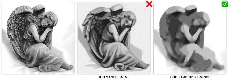
Keep the drawing in your value studies _much_ simpler. Proportions can be way off. The purpose of a value study is purely to make a map for yourself that shows the broad value distribution in the picture. This will save you many hours when you are shading a work. The only thing that matters in a value study is to choose the value relationships between 4-5 value groups.
Reply
Brayden Copley
Not totally happy with this, but will try to practice this some more in the future. I suppose I should give myself some grace for a first try.
Write reply...
Drop images here to attach them to the message
Dorian Iten
It's a really solid start! Give yourself 10 minutes and make a few key changes.
Reply
Tony Vu
I did a few more 30-40 minute value studies. I used the filter tips from Dorian, as to not worry about proportions.
Write reply...
Drop images here to attach them to the message
gasyadocro
I did 2 tris. I know this is just beginning. I feel like I don’t get the concept of effect enough. But anyway, I submit as I committed.
Write reply...
Drop images here to attach them to the message
Carl de Jager
Good effort, Gasy. I think the first try works the best, especially the way you organised your values in the planes of the face. It's only missing the large triangle of the core shadow in the neck!
Reply
Tony Vu
I did some extra 5 value studies. I'm most happy with number 2
Write reply...
Drop images here to attach them to the message
Carl de Jager
You've got the hang of this, Tony. :) In the final image, try using a darker value for the the shadows of the lips.
Reply
Gift Cards
Gift card for art students to use on anything in the Proko store
About instructor
Former program director at Barcelona Academy of Art. Passionate about teaching solid craft and exploring the inner game of art.
Help!
Browse the FAQs or our more detailed Documentation. If you still need help or to contact us for any reason, drop us a line and we’ll get back to you as soon as possible!
Your name
Email
Message