


@morelock
5h
Asked for help
Started with a Buscema sketch of Conan and ended up trying to bring it to a higher render. 602 blackwing, with a stump to blend the clothes. Still very much trying to learn to render a sketch
Show all replies (1)


3mo
one more study- figure drawing and shading
@morelock
3mo
this is really nice
Show all replies (1)
Show 3 more replies
4mo
Asked for help
these are deceptively challenging. Great practice though. My reading comprehension must have been off on the level 2 stuff, not enough straight lines.
4mo
My attempt in digital. Need some anatomy work and some brush work for sure.
Show all replies (1)
4mo
Asked for help
some Frazetta - then (top right) trying it out.
4mo
Dropped the stylus for the pencil today, worked on it in lulls at work
4mo
nothing hurts like 1 minute gestures first thing in the morning
4mo
Maybe should allocate time differently for this. By the time it was laid in there was just a rush to place some armor. Didn't even try to render it. 20 min
Show 1 more replies
Show all replies (1)
5mo
busy week at work, going to try to get some more shorter ones in later. 30 minutes on this one
Show all replies (1)
5mo
only had time to get one in today. I should have spent more of my time measuring proportions, definitely lost the likeness
5mo
Marshall is harrier than Robin Williams knuckles
5mo
a lot going on in this one, still not totally satisfied with the pointer but couldn't spend 24 of the 25 minutes on it.
5mo
25 minutes seems so long right up until there is like 15 seconds left and you aren't even close to finished.
5mo
Hey Jan,
If you watch Med's videos for a bit you'll quickly see although there are quite a few brushes in the pack, he really only uses a couple of them. The textured oval brush (I think in the pack it has it's name in Kanji) primarily, and the soft round.
I think it's normal for all of us to see just how many brushes are out there and think "which one is right" but really, a hard brush, a soft brush/airbrush and maybe one or two brushes with some texture to them if you want that painterly effect is really about all you need. Play around with some of the options in the pack and pick a few you like, if you want to follow along with Med that oval textured thing is what he uses the majority of the time.
Show all replies (1)
5mo
Asked for help
Reworked after taking some of @Martha Muniz suggestions. Also reworked some of the fingers on both hands as they looked a little wonky .
Of course still happy to get any critiques/suggestions :)
Show all replies (4)

5mo
It's a cool composition! I like the idea you have using the hat's holes to bring in rays of light as an effect framing his face. I think for the blade to pop more, I would scale up the hand + blade together and move it towards the right, where more of the blade can be seen. This will push the foreshortening and set it further apart from the rest of the image. I would also suggest adding light bouncing off the edge of the blade, which you can do just with a soft large airbrush lightly over the edge with white.
As for rendering, what I would suggest is to work large rather than small. What I mean is that, instead of zooming closely into the canvas and focusing on small details, try to remain in full view of the image, where you can make larger decisions over the entire canvas. This helps you find a solid structure for all the elements in your picture first. I would especially recommend to start by grouping your areas of shadow and light, as this will be key to clarity and composition as you continue to render. You'll find often that details will need to remain simplified due to light and shadow, otherwise it may break the illusion of the 3D setting or overwhelm the composition. So even after you start adding details, continuously returning to check the picture as a whole will help keep you on track.
If there are any artists/specific styles you are seeking to learn from/emulate, feel free to share, too. It always helps to get an idea of what your goals are as an artist :)
5mo
Hi Martha,
Thank you for taking the time to reply. Pushing the foreshortening sounds like a good idea. I'll play around with your suggestion on the bounce light as well, that might be what I'm looking for with the blade.
On the rendering, I follow meds routine (roughly) but I'd say mostly things end at what I'd call 85% fully rendered out / still a little loose. I've been trying to push a little further into the fully finished phase.
As for artists/styles... Growing up in the 80's/90's I really enjoyed fantasy books / Dungeons&Dragons artists of the time (Michael Whelan, Larry Elmore, Keith Parkinson, etc) and enjoy that sword & board style. I prefer more in that traditionally painted look vs. something like splash art that seems more common these days.
Thank you again, best!
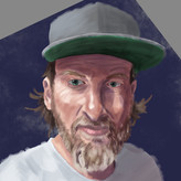
added a new topic
Looking for critique5mo
Trying to push a little further into finishing pieces and improve my rendering. (As well as everything else)
The hat felt pretty weak compared to the rest, and the blade of the sword doesn't really pop as I had intended.
Thoughts, critiques, things to work on all welcome.