Bundle discount Each additional course part in your cart adds 3% off all courses, up to 15% off.
Full course
Learn the basics of portraiture with lessons on how to draw the head from any angle and how to draw facial features.
$65
Produced by
Lessons
35
Duration
8h 10m
Skill Level
Beg. & Int.
Views
48M
Captions
ZH +1
overview
Stan Prokopenko shows an effective approach to drawing the portrait from any angle. Then study the anatomy of eyes, nose, lips, and ears. The information is presented in an entertaining way to keep you engaged and willing to re-watch the lessons. Includes 2 full length, real-time demonstrations of how to take a portrait from start to finish. You’ll also have access to rotating 3D models that you can use to practice and study from. Mini-lessons in the course are the same as the free versions, not extended.
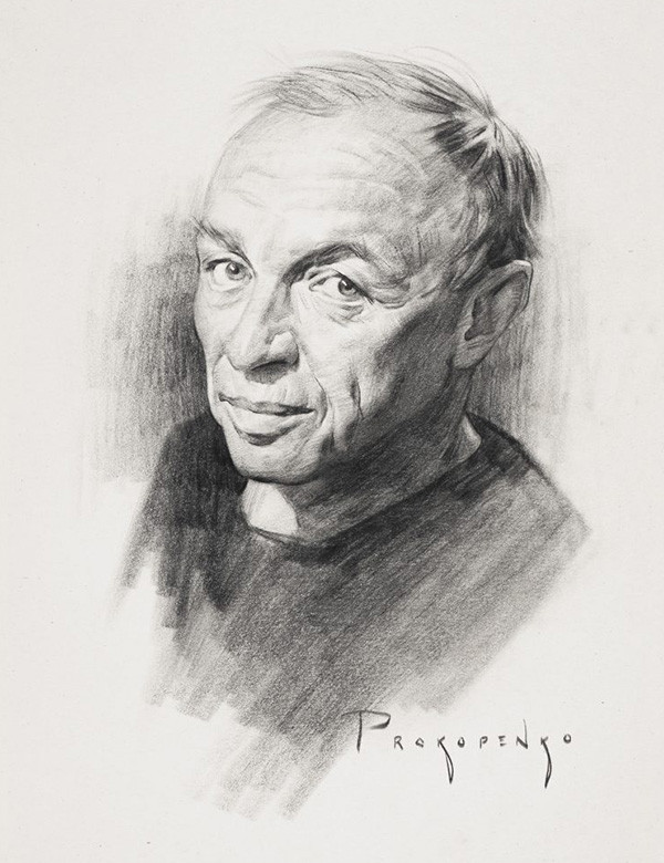
Here’s a couple samples of my own work. The completed portrait is one of the two narrated demos in the course :)
What you will learn
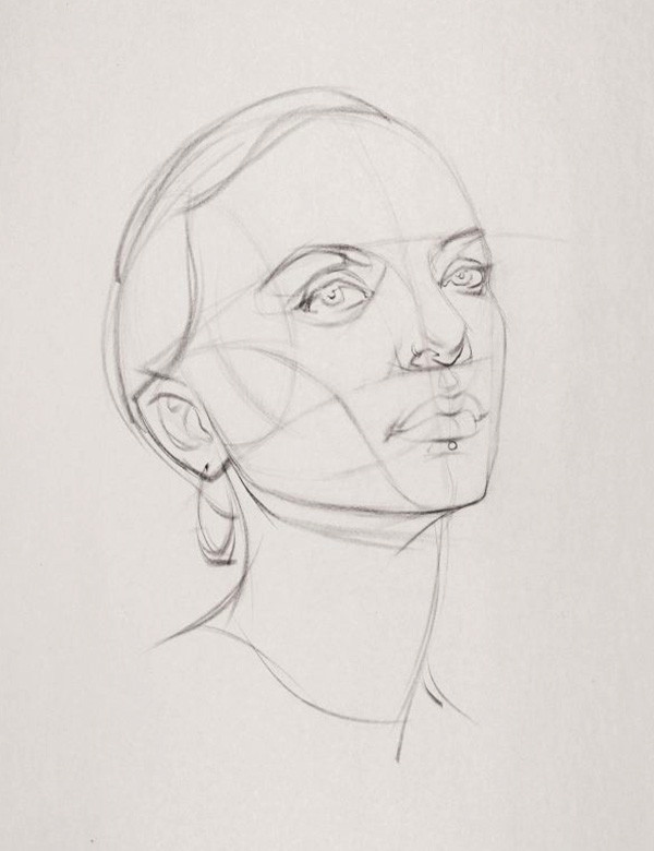
1Loomis Method
Learn how to use the Loomis Method for constructing the 3d forms of the head. This allows you to draw the head in any angle from your imagination or from life.
2Eyes
Learn the anatomy and how to draw realistic eyes step by step. Being able to draw realistic eyes brings your portraits to life.
3Nose
Learn to draw the nose by deconstructing it into major and minor planes. This will help you to shade the forms and make the nose pop from the page.
4Lips
Give your portraits luscious lips by starting with 5 squishy little pillows and then rendering the 3-dimensional forms using tone.
5Ears
Learn how to manage the complexity of the ear with the “Y?” method. You’ll also learn “shadow mapping” to design the light and dark patterns of the shadows.
6Hair
Most people approach hair the wrong way. In this course, you’ll learn how to give hair volume in your drawings. No more spaghetti hair!
Premium Benefits
Money Back Guarantee
Contact support@proko.com within 30 days. We usually don't ask questions, but a request is subject to review if over 25% of content was downloaded. This is to protect our instructors from dishonest wardrobing and ensure a happy and thriving community.
Assignments
A variety of exercises to help you practice what you've learned. After you do the assignments, you can post them in the community for feedback and see what other students are posting.
3D Models
Some lessons include 3D models that you can view right in your browser! No need to download any software. These will help you study further and they’re a great aid for assignments.
Assignment Demonstrations
The instructor includes demonstrations that show how to do an assignment or how to use the information taught in the lessons. Most of us are visual learners (we’re artists!), so hearing it explained is not enough. We have to see it many times.
Downloads
Includes content that the student can download for offline viewing.
English Captions
All videos included in this course have English closed captions you can turn on or off.
Chinese Captions
All videos included in this course have Chinese closed captions you can turn on or off.
What others are saying
James Gurney - Best selling author ‘Dinotopia’
Stan Prokopenko has produced some of the best online tutorials on head drawing.
Marshall Vandruff
I think your Andrew Loomis explanations would make him pleased as can be. I’m impressed. Thanks for doing them.
Richa Singh
I did the tutorial on the eyes and I can draw them better now! You are the best teacher in the world!
F.A.Q.
Is this price a monthly fee?
No, it’s a one-time payment and you have access to the Portrait Drawing Fundamentals videos and 3d models forever. You are essentially purchasing a product. It’s not a subscription.
Can I download the videos?
Yup! Each video is downloadable as an mp4 file at 720p. Please don’t share the videos. Each purchase helps to create future videos like these.
Can I buy this course as a gift?
Absolutely! You can get as a gift for someone.
Are there subtitles in my language?
A downloadable transcript is available for each video which you can translate to whatever language you want using your favorite translator such as Google Translate.
Do I get access to all videos you make in the future?
No, this includes only ‘Portrait Drawing Fundamentals’ lessons. For the list of lessons included, scroll up to the top of this page.
Browse the FAQs or our more detailed Documentation. If you still need help or to contact us for any reason, drop us a line and we’ll get back to you as soon as possible!