

Activity Feed

Charline B.R.
added comment inCharacter Portrait
3yr
Hey very nice blocking volumes here ! Looking at your light I have trouble to understand if it's top or front light ? The face seems to be top-light while the body is a mix and the sword fuly front...
I think you could help yourself by taking a shot at yourself, if you have a miror or someone that can take a picture for you, that could help a lot decide what to render :) Especially with posture like that where shadows will overlap a lot

Jeremias Fritsch
3yr
Thank you! That is my main concern! I will take a better reference image moving forward!
3yr
@Antti Kallinen Hi! The way I was able to see some of the offputting mistakes in your painting was by looking at the small preview before klicking on the Picture! That is something that can allways help with finding issues in Paintings. One of the things is the brigt grey on the dogs face that sticks out a bit too much. Maybe the furr really is that bright in the Photo but it really draws a lot of attetntion. The other is maybe a composition poblem. The Dog basically splits the image in half because on the left side of the backround you have a bright colorfull green and on the right side a much darkger and greyer green. Again Maybe that is accurate to the photo but I think that makes it look a little wierd.
3yr
No I think the colors are good! And generally I think the composition is fine if you were going for that look. Then I would only nag on the cheek value!
Show 1 more replies
added a new topic
Character Portrait3yr
Hi Yall! I´m doing this Portrait on Elric of Melnibone and did a quick shading to get an idea for how I would like the lighting situation to be. Please point out any mistakes that you can find. In general I am happy to take critique on any topic you dont like or could be improved on. Maybe except the Linequalitiy as I will do a Painting and wont be using it in the end (I know the drawing is ugly :D).
Hey Nicole, thats a really good drawing. I couldnt do that at all. The only thing that I think you should add is the same kind of beautifull shading to the face. You have drawn out the facial features but not shaded it so that area seems unfinnished. The only anatomy part that looks off is his sixpack. Particularily the three packs further away may be too bulgy. You might wanna look at the Abdominal Muscles in general. I think the Pectoral in the front doesnt connect properly to them! Besides that I think your drawing is amazing!
Show all replies (1)
3yr
Hey! I agree with Alexander except for one point. The Person in the image doesnt have any contact with the ground. In the sense that there is no shadow cast by his body so he is floating a bit.
Show all replies (1)
3yr
Hi @vakarmalik I like your Study. What I really like about your painting is the loose Brushwork and texture created from it. It looks like you had a lot of fun! Comparing the two I think the reflection on the Towerroof isnt quite right. In the Original that reflection describes the material and shape of the round onionlike arcitecturer nicely. If it were me I whould have also included the birds as it creates a further felling of depth. In the original the castel also becomes lighter in greytone towards the top. This is something fairly easy to acive. If you Painted the Castle on its own seperate layer just use the Airbrush tool to lightly lay in a gradient. I think those are details that really drive the mood of the picture so it should be included.
Show all replies (1)


3yr
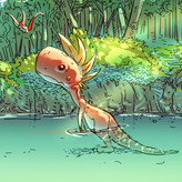
Whoa is that a huge man napping in the mountain crevice there in the second illustration? That is so cool. And scary. I see two people on horseback passing through what seems like a terrain with long grass? I say that because the horses' legs seem to disappear into the grass below. The grass area on the mountain behind them seems a bit flat to me. It looks like they are on a quest to find something or leaving on some dangerous mission because of the foggy environment around them. Also, because it is so foggy all around them the only light patch of land they are on seems a bit too bright.
The second illustration is my favouriteeee. I don't know if it was intended but those two rocky pillars look like the legs of the resting man and that is an amazing effect, I really love how you have done that. The rocks look like folds of cloth and really solid at the same time.
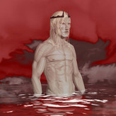
The third illustration caught my attention too, it makes me curious about the story behind these pictures. It looks like the man is stuck on a hostile island and waiting for someone to come or just really downtrodden and beaten. This seems like a really cold place with all that water hitting the sharp rocks and the mist.
The fourth one looks hellish. Like a ruined sky empire (because of the cloud like surface it is resting on). It gives me the vibes that this place has something to do with magic and not the good kind. With those red vein like structures that also seem to resemble a thunder strike. Those red blocks, especially the one on the right seems to be broken but still hanging in air. The piece in the middle of them looks like a clock and a crown because of the spikes. I love your use of red and black, it leaves no question about the mood of the scene, looks like it is about the aftermath of some curse or a war that destroyed a place.
Great work man.
3yr
Hey! Thank you for taking your time with this! Your were mostly right about everything. The last image is a Dimension the Main Characters enter to slay two Interdimentional God like creatures that are sucking the life force out of their Universe. In the books The city is described to be destroyed and in tact at the same time so the buildings remained the shadows they had when they were still in good shape. It is definetly supposed to give Evil Chaotic vibes! Image three is the main Character summoning the Straasha, a waterelemental which took him the entire day. At this stage of the book he is fairly weak and tired so the fact that you saw that in my depiction is amazing! In image one I wanted only the small patch of grass which the main charcters are on to be hit by the sun. I wasnt totally pleased by the effect I was able to create so I get why it seems off. And yes they are rushing towards a dangerous mission :)
Show all replies (1)
Account deleted
3yr
I haven't read the books myself, but I like the illustrations themselves and the dramatic rock formations in them. Great job :)
3yr
Thank you! I struggle a lot with rocks and put a lot of work into painting them so that means a lot to me!
3yr
Hi @Natali Santini! Thats a nice Painting! If you like this style I think you might enjoy J.C. Leyendeckers Paintings. You have a nice variance of soft and sharp edges so if you just keep practicing this you are on a good path. Looking at the Photo I would just say the shadow under your jaw should be darker then the one under the lip.
Show all replies (1)

3yr
Just came here to say I love them!:) The only one that I don't understand is the last one but I'm sure its explained in the books. You have surely piqued my interest in them, might look into them, so great job!:)