The Basic Elements – Shape, Value, Color, Edge
This lesson has a premium version with extra content. Get it now!
984K views
lesson video
The Basic Elements – Shape, Value, Color, Edge
courseFigure Drawing FundamentalsFull course (57 lessons)
-20%
$120
$150
You save $30
comments 3 submissions
jean marc
hi guys... i was soo tired havent been feeling well... i didnt even finish this... im not finishing it. can anyone critic the pose? and mistakes? pliz keep in mind that my anatomy knowledge is like about a 4 or 5 lol
LESSON NOTES

This episode is a really important one. I’m going to introduce to you guys the basic elements that make up any picture.

We see everything around us in 3d. Then we try to draw a 3d world on a 2 dimensional surface. Of course drawing an actual 3d world is impossible on paper. We have to learn to create the Illusion of depth. Any picture can be broken down into 4 elements to create that illusion of form. It’s like the periodic table of elements for artists. And luckily for us, it’s a much smaller table.

We can use these elements to show form and depth if we are realists or representational artists, but it’s not limited to just showing form.  picture, anything you can see can be broken down into these elements. An abstract watercolor painting, a realistic portrait drawing, a photograph of a sunset, anything that you can see can be described with Shape, Edge, Value, and Color. I would even argue that there are only 3 major elements. Shape, edge, and color. Because value is just a sub-element of color. But value is so important that artists have separated it as its own thing. Also, when we’re drawing, we’re usually drawing in black and white. And in a black and white drawing value is the only visible part of the color. So, we put aside the concept of color, and just say value. When we start painting, we introduce the other two sub-elements of color - hue and chroma.

Let’s go over these elements one by one, starting with Shape.

Shape

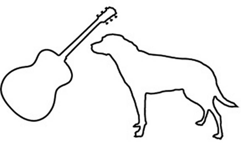
Shape is a concept that’s familiar to most of us. It’s the elements we use to draw as kids. It’s the area that something takes up. It’s the outline, or the contour of all the pieces in the drawing. But it’s not limited to just the outline of the big elements. The smaller parts also have specific shapes.

For the early stages of a drawing you want to develop your ability to simplify a shape. This is important so that you can focus on the composition and the breakdown of the big picture. Getting distracted by the smaller details too early, can hurt you in the long run. Working big to small is usually a good idea.

simplify shapes
When simplifying, think about geometric shapes - circles, ovals, squares, rectangles, triangles, diamonds, crescents and so on.. These are simple shapes as opposed to complex organic shapes. For example this complex shape of a leaf can be simplified in the first stage of the drawing and then the details can be found in the later stages.
Shape is the most important element to convey the identity of an object. These two shapes are very different and symbolize two very different things. They are not 3 dimensional, but its still very obvious what they represent, just by looking at the shape. That’s why “shape design” is such an important skill to practice and develop. Simply put, shape design is making your shapes look good. It’s a bit arbitrary, but you know it when you see it.
different shapes
shape good bad
You could say that shape A is better than shape B because it’s cleaner and more interesting. It does a better job of getting the point across and doing so in a more interesting way.

Color

Now let’s move on to color. I’ll go into more depth on color theory later, since it’s a very complex topic and deserves it’s own episode or even a whole series of episodes. Right now, I’ll just go over the basics.

Color has 3 subcategories. The hue, the chroma, and the value. For example, this color has a purple hue, a number 8 value, and a medium chroma.
color sample
color wheel

Hue

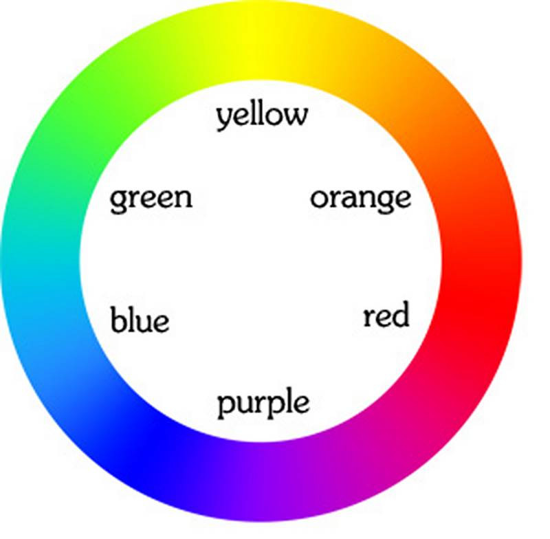
Hue is what we typically refer to when we say color. Yellow, orange, red, blue, green - these are all hues. Your traditional color wheel is an arrangement of hues.. If you shine a light through a prism, it will break up the light and reveal the color spectrum. The same colors as the rainbow. And the same colors as the color wheel.

The terms warm and cool are used to describe the two sides of the color wheel if you cut it in half. The warm family shares orange as a common color and the cool family shares blue as a common color. Think of fire being warm and ice being cool.

Chroma

chroma

Chroma refers to how grey or how pure the color is. On one end are the high chroma colors that you'll see in the rainbow, and on the other end are the low chroma greys with a gradual transition.

color wheel to grey
In some color wheels you'll have the high chroma colors on the outside with a gradation towards grey in the center. You'll often hear people using the term "neutralizing" a color. This just means lowering the chroma and bringing it closer to grey. There's two ways you can do that. The first is just adding grey to it. As you'd expect this will bring it closer to grey. The other way is to add its complement, or the color across from it on the color wheel. Mixing two complimentary colors will result in the color in between them. Half and half will theoretically make grey. Now, pigment isn't perfect.. you usually won't get that exactly perfect grey. But you'll definitely bring it closer to grey. Depending on the ratio you mix, will result in a color somewhere in between the two. If you add just a little bit of green to red, you'll still have a red, just a lower chroma version.

Value

value scale

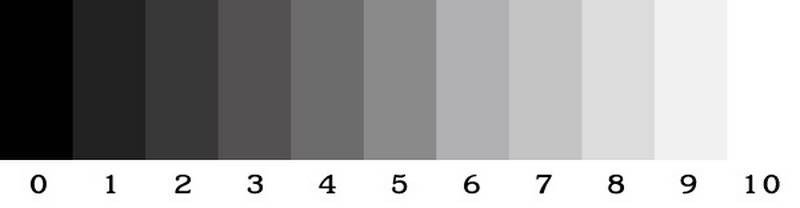
Value is how light or dark the color is. There is an infinite amount of values, but most artists like to think of a finite scale, zero to ten. It's more manageable that way and it makes it a lot easier to communicate. A teacher might say, make that shape one value darker. And you'll know roughly how much 1 value is.

Drawing with charcoal we don’t use color, since everything is grey scale. Or a better way to put that is, we don't use hue and chroma, the only element of color that we see is value. So, many artists have separated value as its own element and say its more important than the other elements of color. You can have a very beautiful drawing without using color - just grey-scale you don't need it to draw a representation of what you're looking at. You don't need it to show form and depth. I think it’s wise to practice drawing without color as a beginner, since that’s one less ball you have to juggle as you’re learning. Once you get the hang of values, then add the colors, and go wild.

But, I don’t want to make it seem like color isn't important. It is! Colors are beautiful and quite often its what will catch the eye of someone looking at your artwork. It could set off an emotional response to a piece of art, that a gray scale drawing can't do. But as the artist you must understand, that if you don't get the values right, the rest of the color won't look right. Focus on accuracy of values, and that will allow you to experiment and bend your colors

That's your color basics 101, maybe not even 101. More like 1-0-half...

Edge

Edge is the transition between two shapes. It doesn't have to be an edge of a volume. The shapes within the volume have edges too.

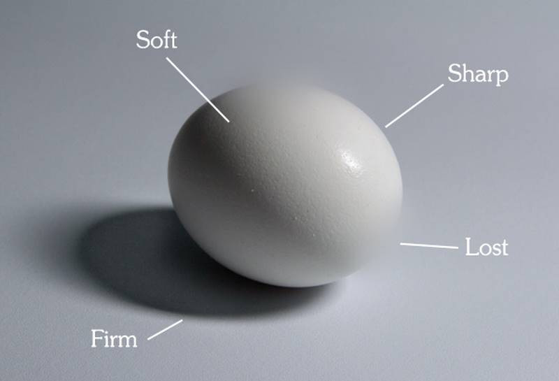
The types of edges range from sharp to extremely soft, with an infinite amount in between. But to simplify it we've come up with 4 types of edges: sharp, firm, soft, and lost.

  1. A sharp edge is a very sudden transition between 2 shapes. It’s sharp like a razor blade. There is no transition, its a sudden change.
  2. A firm edge is almost hard, but it has a very small gradation to it. Think of these as corners that have a bevel or rounded corner. On a figure you’ll typically see firm edges on tendons and joints.
  3. A soft edge is a very smooth transition between 2 shapes. You’ll see a longer gradation. Soft edges are like clouds or baby butts.
  4. A lost edge is one that is so soft, that you can't see it anymore. It’s frequently used in areas where the values of two forms are close together and a really soft edge would merge the two volumes together.

edge sharp firm soft lost

Putting it all together

Every time you're drawing or painting and you look at your reference, you need to have an intuitive checklist of elements to identify. What’s the shape, color, and edge? And within color, what's the value, hue, and chroma? To make this intuitive you have to train your brain by intentionally thinking about these things while you're analyzing the subject. Eventually you don't have to force it anymore, it becomes part of your observation process.

clementine

For example as you look at this clementine and you observe the shadow, you ask yourself:

  1. what is the shape? is it circular, rectangular, triangular etc. In this case, its a crescent if you simplify it.
  2. What is the value on a scale of 0-10? And more importantly what is the value in relationship to all the other values in the picture? The occlusion in the cast shadow, is the darkest part of the picture. If you want your picture to have the full range of values, from 0-10, you have to make it a value 0. The top part of the shadow on the clementine is about 1 value lighter than under the clementine The reflected light below is another 1 to 2 values lighter. Instead of the full value range of 0-10, you can choose to go for a narrower value range, say 3-7. The darkest part would be a 3 and the highlight would be a 7. And accommodate the other values to fit within that range. It’s the relationships between all the values in the picture that really matter.
  3. The next question is, what is the hue? Even though it’s an orange clementine, not all the colors on it are orange. I’m seeing a transition from orange on the light side, to a redder hue on the shadow side.
  4. What is the chroma? Ehh, it’s somewhere in the middle, probably a little closer to the high chroma side..
  5. And the edge is firm on the left side of the shadow and softer on the right (at the terminator).

The ability to see and properly identify all these elements is a skill, its a sense that you need to develop. At first you will struggle to see the subtleties , but just as a musician tunes her ears to hear notes and compose the notes into a symphony, you too can develop your ability to see these subtleties and view the world through an artist’s eye. As with most things, it’s about repetition through practice.

DOWNLOADS
txt
the-basic-elements-transcript.txt
10 kB
mp4
The Basic Elements - Shape Value Color Edge.mp4
479 MB
COMMENTS
Stan Prokopenko
This episode is a really important one. I’m going to introduce to you guys the basic elements that make up any picture.
Newest
jean marc
4yr
hi guys... i was soo tired havent been feeling well... i didnt even finish this... im not finishing it. can anyone critic the pose? and mistakes? pliz keep in mind that my anatomy knowledge is like about a 4 or 5 lol
@lppt87
2yr
so clearly without doubt I am not as good as drawing as you are, this took me 20 minutes and the anatomy is all off. But I cant put into words clearly what I want to point out, and I loved the face of your model so I made a copy of your drawing. Here is what I see off. Your shading is off, you put too much emphasis in making difference in each anatomy part, I personally notice it in the abdomen area and the ankle: I am not sure where your belly button is, but I imagine it should be around that drape its wearing, but since you made so much emphasis on the dorsal muscles it looks like the (chocolate bar) abdominal muscles are off center. Also, the muscles below that drape should be darker. This is where I learned this from Proko and Gonzo, the values are important. See my image? I made a 4 value grid. 1 black, 2 grey. 3. light grey. 4 white. obviously since my drawing is bad my shading is bad, but bear with me... I shaded in 4 that part of the body, the muscles below the drape, and if you want to make the muscles popup, maybe choose a 2. and on the other side where the light hits, the muscles shade it with 3. so in the dark muscles are 1 and 2, in the light 3 and 4. Makes sense what I am saying? the ancle is similar, you made the figure of the bone protution in the ancle truly pop up beatifully, but forgot to shade that area, and sometimes you loss lines when you shade. Also, the shadow of the hand and of the face are in complety different dirrections. I shaded the head, but i didnt know where to shade the hand so i didnt in my drawing. but yours is a diagonal in the head and a vertical in the hand over the leg, and that doesnt fit. What do you think of my opinion? I am not as good as drawing as you so I hope you dont get offended. we can help each other.
Jesper Axelsson
Hi, and thank you @Liandro Roger for answering my previous question. Here’s another one: When practicing shading, do you aim to copy the exact values you see? The problem is, when practicing shading something as white as your paper, like an egg, you won’t be able to do the highlight which is even lighter.  This question came up first when I was practicing shading myself, but also when I read the chapter on light and planes in Hale’s book Drawing Lessons From The Great Masters where he says: ”Begin to make sketches of the movement of tones on the cube, and the cylinder and the sphere. (...) Make a few hundred sketches of such movements, particulary that of the cylinder, until these movements of light and dark become part of your subconscious equipment.” (p. 59-60) If you do these excercises without copying the exact values, going a litter darker to afford the highlight, won’t that mistrain your subconscious into interpreting all values as darker? @Marshall Vandruff, you seem to be a fan of Hale’s book, maybe you have something to say about this?
Liandro
5yr
You're welcome, @Jesper Axelsson! About this question, my take is that there can be various ways to approach values in practice, and it mostly depends on your goal. If you want to train observing values more accurately, it can be helpful to copy the exact values you see; but if you want to do an intentional application of values in a composition, you can tweak, change and design as freely as you wish and are able to without worrying about straying from the reference. If you're drawing on an "off-white" toned paper (almost white, but not quite), you could use things such as white gouache or acrylics or a white marker to put in the strongest highlights without having to tweak the whole value range. Another thing to keep in mind is that all materials have specific limitations and this often requires deliberate concessions: graphite pencil, for example, might not go as dark as charcoal - so if you want to shade something black, but for whatever reason, you only have graphite to draw with at that time, you'll have to settle with the darkest dark your graphite gives you, even if you're aware that what you're seeing isn't that exact value. Hope this helps! :)
Jesper Axelsson
Value scale question: When seeing a value should you be able to name it from 1 to 10? Is it decided that "this value is number 4 no matter what the context is", or should it be given a number in relationship to the decided darkest dark and lightest light in each painting? How do I get this numbering skill, drawing value skales over and over?
Liandro
5yr
Hey, Jesper, good question. I'm no sure if my thoughts about this are in consensus with what other artists think, but I'll share anyway. I think it's always about relationships. If you're painting with a full-value range and you have 10 values to work with, then you can say 1 is black, 2 to 4 are dark grays, 5 and 6, middle grays, 7 to 9, light grays, and 10 is white. You could also be painting with a full-value range, but only have 5 values to work with, then you'd have only one value for each gradation: 1= black, 2 = dark gray, 3 = middle gray, 4 = light gray, 5 = white. In the same way, you might take the 10-value scale and turn it into a 20-value one by adding "in-between" values, then you would have 1 as black, 2 to 7 as dark grays, 8 to 13 as middle grays, 14 to 19 as light grays and 20 as white - or instead, if you prefer, you could keep the same original numbering and call the added "in-between" values 1.5, 2.5, 3.5... The numbering for itself is merely conventional and contextual, and it's only important as long as it helps you, the artist, to better understand how to organize the values in your painting. But, in the end of the day, what really matters after all is how the value relationships are visually applied in your composition. Personally, I prefer to think in terms of range (lights, darks, middle...). But if you like working with numbered values, I'd say having a basic 1-to-10 full-value scale in your mind as a parameter might be a good general "rule of thumb". Hope this helps! :)
Help!
Browse the FAQs or our more detailed Documentation. If you still need help or to contact us for any reason, drop us a line and we’ll get back to you as soon as possible!