

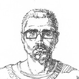
Patrick Bosworth
Los Angeles
Editor at Proko!


@badicecream
added comment inLearning from Inking Pros
7mo
I'm really into the more Janson/Romita classic kind of comic book inking! I love that kind of looseness and energy. What are some tips to go more in that direction? I'm getting brush and bold lines, but is there anything more specific to think about/try?

2d
@badicecream Klaus Janson is awesome!! Check out this livestream where David Finch had Janson on to talk about inking! https://www.youtube.com/watch?v=05iHm8o4ctk
Show all replies (1)
It helps to do studies of the particular dynamic scenes you're interested in and try and reverse engineer the perspective for your own use. Take a look at this video from David Finch where he shows how he uses other comics and even movie stills to create perspective grids for dynamic shots.
https://youtu.be/GcXv_scq6UM?si=eQsjBfYZIMQLtmmN
David has a lot of free perspective videos on his channel worth checking out. He also has comic course here on Proko where he draws three full comic pages and he covers how he tackles perspective. Hope this helps!
There's no wrong time, or wrong way to study masters! Many artists (myself included) got started doing copies of comic and manga artists they admire. The only way you'll start to pick up on the techniques used by artists you admire is to try to reverse engineer them yourself! You don't need anything other than your current skillset to jump into a master study. Each study you dive into will help you grow as an artist. Just be open to the learning process, studying masters is difficult!! It helps to have a reason you're approaching a particular master study before you begin, so you can maximize the takeaway from a particular study. Working on gesture? Try to draw some gestures from Yusuke Murata, and then draw some gestures from Tite Kubo's work. Then compare the two, notice similarities, differences, etc.
The point of a master study is not just to replicate a piece exactly. It's to begin figuring out your process of how to complete a picture using what you know of drawing fundamentals. Try not to think about drawing the finished piece as you see it. Start with studying the gestures, poses, or portraits you see in your favorite Manga. Do thumbnails, do quick sketches to figure out the poses, try to exaggerate them, push them, play and experiment with them. Have fun! If you start to get close to a gesture you really like, take it to the next step, try to add structure and form on top to give the gestures depth. You're just trying to build the piece step by step using your current knowledge and skill set. You don't need to take it all the way to finished each time. You can work up to that as you start to develop your own process, one element at a time, until you're comfortable taking it to the next stage.
It helps to do some research to find out how a particular artist works, what materials, or techniques they use in the process, etc. But you don't need to adhere to their exact methods or materials. You could easily do a graphite study of an inked piece, and try to replicate the look as best you can in pencil. Also vary your master studies! If you like how one artists draws characters and how another artist draws vehicles or environments, study both!
Don't focus on trying to "find a style." Focus on executing what you know, and what you can do in the moment. That's all an artist's "style" really is. The more you practice, the more it will develop over time. Whatever you choose to study will start to become part of how you draw, and your style will evolve and emerge with each study you do. Hope this helps! Looking forward to seeing your studies!
3d
Also check out the Project and Demos on Line Master Studies in Basics for some more info on how to begin Master Studies! https://www.proko.com/course-lesson/project-line-master-studies/assignments
Show 1 more replies


Asked for help
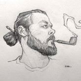
Here is the work I’ve completed for all ginger-related cross-contour practice. I really found this assignment insightful. I ended up applying all of the skills we’ve learned so far, twisting forms, designing shapes, perspective and line weight. From this I feel I still need to work on generating shapes and poses without reference, but more so keeping my mind’s eye strong to better visualize the end result. I still have a lot to work on but I think things are going well.
3d
Really nice job on the final ginger character, you did a good clean-up job with the line weight on that one, and there's a very nice sense of balance and poise, almost like a ballet dancer or Tai Chi master. Keep it up!
Show all replies (1)

3d
Definetly feel like I need more practice for all the information to settle down. But I learned many new things and useful approaches, I didn't know of before. Thank you Michael for this cource! :)
3d
Beautiful work!
Show all replies (1)
Show 2 more replies

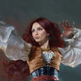
More progress on this Alex Ross gouache master study.
I'm a little late to the party on master studies. I had essentially done them when I was a kid--copying various comic book covers and the like--but it was something I felt I needed to grow out of. Now I realize that it is a great way to help understand process. While I want to work my way to doing original compositions, I think I'm going to keep master studies a permanent part of my regimen. In addition to the learning that occurs, it's a wonderful way to simply appreciate art I enjoy.
3d
This is really coming along beautifully! I'd love to hear your rundown on the process/materials. Are you locking your value painting down with fixative before layering colors?
Show all replies (1)
Asked for help
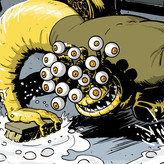
Sketchy ginger dudes! This was a fun little puzzle, I kept my starting gestures/blobs pretty close to some poses I was familiar with but I played with the proportions more in the blob phase, and started to explore different ways to exaggerate the shapes and contrast character types. I think I could have kept them a little more abstract, and root-based, but I found this exercise very freeing!
Show all replies (5)


16d
Design based on the Transformers G1 Warpath toy. I drew this from imagination, so some of the perspective will be off. I did ink it traditionally, but then realised the drawing was too big for my scanner, so I took the photo of the pencils into Clip Studio Paint and re-inked it. I also changed the position of the arm and pistol. I then added an explosion I'd drawn from a previous project, and coloured the whole piece in CSP.
7d
Awesome job!! I've been obsessed with Daniel Warren Johnson's Transformers run lately!
Show all replies (2)
Show 2 more replies


9d
I think I’m going to move forward in the course, but keep working on these!
8d
This looks great! Nice, clean lay-in!

Asked for help
The lobster. I Had a hard time to understand what happens in front of his head. Not sure if I attached all the paws in the right place
8d
This is awesome, great job! I love how you simplified the antennae/and front of the head. Very clean, organized line quality. Excellent!
Show all replies (1)
11d
Oooooh, nice taper on that Monolith! This looks like a great way to sharpen woodless graphite pencils! I've started using 3M Extra-fine Sanding Sponges to sharpen charcoal and graphite. They're fairly cheap, about $2/each, and you can rise them out and re-use them which really helps cut down on the vector spread! Since they're not taking a beating from honing graphite or charcoal they last for a really long time! I'll have to find one of these bastards next time I'm at the hardware store to add to the sharpening drawer, thanks for posting!


12d
Asked for help
Used photo references for the female and male sets of heads, but not the first two individual ones.
I studied a bunch of photos and looked for differences between the average female and male head, but with so many combinations of different camera angles, focal lengths, and facial features, it was difficult to get any clarity on that. The main differences I found were the angles of the jaw, shape/width of the chin, and size of the ears. Did Loomis also come up with a way to construct the average female head but we just didn't get a demo for it? Or do you simply adjust as you go along? 🤔
11d
Really great studies! You captured a diverse range of faces and features! Overall, you found excellent areas to hone in on when constructing different face types. Subtle changes to the angle of the jaw and shape of the chin will yield dramatic differences in likeness. In Loomis's Drawing the Head and Hands he does cover a way to construct an average female head, but the rhythms and method of construction are nearly identical to male heads. His focus when drawing female heads is mainly on how to handle the subtle differences in the proportions of the underlying structure of the male and female skull, and how to use those differences to guide your portrait construction. Take a look at the 3D male and female skull models in the "Features" section and do a few studies from the front, side, and 3/4 views. Keep an eye out for proportional differences particularly in the jaw, chin, cheekbones, brow ridge, nose etc. In general, Loomis suggests softening the angular/broad features of the male head when approaching female portraits. So if you learn the blockier more angular male head construction as a base, you can use that as a framework to whittle it down and soften it until you reach your desired likeness for a female character. A more slender, rounded jaw line, pointier chin, smaller nose, with a slightly more slender, graceful neck width will quickly visually separate the female characters from the blockier male head/neck. Keep up the great work, the more studies you do the more you'll start to piece together how you like to show differences in your portrait construction methods. Hope this helps!
Show all replies (1)


11d
These are freakin wonderful! Great job!
Show all replies (1)
12d
Asked for help
Ginger and a trial with a reference pose
12d
Very nice!!
Show all replies (2)
Show all replies (5)


Asked for help
Hello there! I made a pre demo and a post demo attempt of the pear (I used a different photo for each), It was interesting seeing the difference watching the demo made. I think the post demo drawing was a lot more successful, though I could have simplified more. Would love to hear some feedback if you have any, thanks!
14d
Nice work! These look really good, the one after the demo almost looks like it's chiseled from stone, very cool shapes. You achieved a nice sense of form and wrapping with your values, and you picked up some great tips from the demo and I can see it implemented in your 2nd work! Moving forward try to even out each of your values, especially the dark shadow area of the cast shadow and core shadow. Right now the cast shadow is a little patchy which draws attention. Evening out that cast shadow will solidify the pear's connection on the surface and make it feel more grounded. Keep it up! Looking forward to seeing more of your work!
Show all replies (1)


Asked for help
I love cross contour.
15d
These are awesome, really nice job!
Show 3 more replies


15d
Really nice work! The blobs and creatures look fantastic! You could tighten up your cross contours on the ginger, the searching lines are a bit hairy so you could lock some of those down like you did in the other two. You have some really fantastic forms in your "Simple Blobs" exercise, and the creatures all look awesome. Nice handling of line weight, and form! Well done keep it up!
Show all replies (1)


My pear 😆 the paper I used was too thin so I couldn't do shading very well
15d
Nice job! Clean shapes, organized values, even shading! Your light shadow area could be a little darker to further separate it from your dark halftone and give more of a rounding effect to the shadow, but overall this looks great! Keep it up!
Show 1 more replies


Asked for help
Had the most fun doing an assignment since the dynamic shapes and rhythms days! I tried to implement what we learned in the shapes section and hoping to get some criticism about my shapes, too along with the contour thing. I am getting a bit confused at the spots where the contours are overlapping or changing (like the one I have marked in the first image). I am trying to imagine that surface but while drawing the contour lines, it somehow feels wrong. Any tips for that?
16d
Great advice from Melanie! Overall, nice job, these are looking good! Really fun organic shapes, and your cross contours are wrapping nicely! That speedy turtle is ready to roll! As for the overlap confusion, you have all of your cross contours leading to the same pinch area which doesn’t give a hierarchy of importance to what’s happening. If you want to clarify the overlap try to more find “T” intersections rather than sending your lines to the same place. Hope this helps!
Show all replies (1)
Show 1 more replies