

Activity Feed


@kemon
added comment inAddition Subtraction
1yr
Asked for help
Critique not needed but welcomed if you feel like critiquing
It's been a while. I guess the comment section is gone now? I don't want a critique even though I'm posting using the "request critique" button. I'm posting because I want to share my progress.
I will ask for critiques eventually, once I get to the later, more advanced level modules. But critiques for these beginner level modules aren't helpful. If you really want to give me feed back on them that's up to you.
drawing 20 twisty boxes with no repeating designs required pushing the twists past 45 degrees. there's only so many ways you can draw a cube with a slight twist after that you're just drawing the same thing. only variety comes by including rectangle instead of box and perspective but even then you'll be repeating or very close to repeating the same shapes. It might seem like some of them are different until you rotate one (which essentially shifts perspective) and see that its exactly like a different twisty box. I added my own variety of twists. I understand twisty boxes are used in drawing imaginative characters so its good thing to be able to do,. But as an assignment the number of boxes that can be created (without repeating shapes. Mirrored or rotated its still repeating) If the assignment did not require only unique twisty boxes and repeating boxes then I misunderstood the assignment. I thought the assignment was about drawing the twisty boxes well, which I can do, so I went for variety instead. In Imaginative drawing variety is a good skill to have and so that's the goal I set for myself.
2yr
Me: The Terminator couldn't stick around but said "I'll be back"
Everyone: Boooooooo. We have read better jokes in those free news papers.
Show all replies (1)
2yr
Well nice use of shapes, especially on the squirrel. Your shading is blocked out which for a sketch and practice is exactly the approach you want. Most of what I'm going to say is just me trying to show you how you did very well and only a slight shift of perspective will help you see where you need to focus on improving. I hope to show you that. There are many approaches to drawing, you have to figure out what works best for you.
Hair should be approached the same way. get the whole figure worked out made out of big shapes then proceed to smaller shapes, like shadow shapes and then other landmarks within the figure. If you're drawing long hair on a persons head you'll want to draw hair in "clumps" the Head of hair will be divided into chunks and those chunks will be "worked" to look more like the style you're going for.
A stumbling block for people learning to draw in pencil is we think we're drawing objects. Look up Observational drawing, it teaches the artist the difference between perceptual drawing vs drawing "things" or "objects". drawing what you perceive instead of objects will help you out a lot.
1) there's not much fur to draw here. even though you know the animals have fur. 2) remember you're not drawing animals with fur your drawing shapes and tone (light and dark) and utilize the direction of your pencil stroke as well as the thickness. Some shapes you wont want any visible pencil strokes just a flat tone, other times you'll want clearly to see pencil lines going in a direction, sometimes uniform sometimes not, it depends on the texture you want to create. 3) what you drew gives a sense of fur, you did well.
Show all replies (1)
2yr
James Gurney is a legend. His works is an excellent choice to study. I'm not going to offer a critique though.
I'm hoping you would critique this for yourself - but to me.
(psss I do think you did a good job but don't let that go to your head)
You're doing this for study, so what did you learn?
You wanted a to try and get a full range of colors with your triad,
Do you feel you accomplished that task?
What could be done to make your painting look more like his?
What areas do you feel confident in your ability?
What is it about his work that you like and would help you develop your own style?
Did you choose Gurney because he's a master or because of something in his style?
Show all replies (2)

2yr
Hello gunter, you're question is a little vague, but I'll answer my interpretation.
First off, I don't understand what "no practice" means. My assumption is means you've drawn nothing, and have only been taking notes. If this is the case, I'd recommend doing timed gesture practice such as line-of-action.com. Gesture is so so so important, and will make or break your figure drawings. These timed drawings should ignore anatomy, and only focus on what the body is doing.
Your mental hierarchy should be gesture, proportion, then smaller gesture. Allow me to explain. Gesture means 1D/2D shapes to describe the motion. At this point, your drawing should be only a handful of lines. Next, proportion refers to the relative size of one body part compared to another. This is not as important at first, especially if this exercise is your starting point. Still, it's something to be aware of. Lastly, as you hone the first two skills, you should be able to start putting smaller gestures into your larger gesture forms, such as the Traps or Lats. These still 2D shapes can cut into or bulge out of your larger whole body gestures, but when viewed from afar, still keep the silhouette of your gesture the same.
I'd only use anatomy if you're
1. Practicing to remember the form of the anatomy.
2. Making a finished piece.
3. Are satisfied with your gesture practice for now.
I'm curious to see you're drawings, and to figure out where you are right now. None of what I put above is really my idea, just my personal summary of Stan's figure drawing course. He, of course, adds mannequinization and shading, but I think 2D is where to start.
If I underestimated your skills or would like to know more of my opinion, feel free to ask some questions.
- Dwight
@kemon
2yr
I also don't quite get what you're talking about but I understand a little but I've had to assume a lot. I recognize that a lot of what I said may not apply to you. To put it another way most of this are shots in the dark with the intention of helping you. essentially only you can help you. And the gist is just keep drawing, reading, and trying. Even if you give up for months always try again. If you're learning by your own drive to learn, this can be a blessing but it sure doesn't make it easier, if anything it's going to be harder for more reasons then I care to list. This was already long enough to write but I wanted to try to cover everything.
1)Most important message here is take Dwight's suggestion and work on gestures.
2)Some artists have high expectations from themselves. If you're one of these people just keep that in mind and remind yourself to be easy on yourself. Not just because you should be kind to yourself. Don't believe being easy on yourself will make you lazy. If you hold high expectations for yourself then you're being unrealistic and going easy on yourself is a way to bring you back to accepting limitations. You wont loose your drive, especially when you see progress. But it will take time and you're better off accepting that now. As a beginner it will seem like it's taking for ever, but 2 years from now if you keep it up you'll be amazed at your progress. Just be realistic about where you're at and that a slow steady pace will foster real lasting progress.
3) Whatever you learned is not a waste of time. People starting out don't really understand how complex art is. How much is involved. People just look at art without realizing what's involved. Master artists can be appreciated by all but only artists with some first hand knowledge of what it takes to create that level of work can truly understand the craftsmanship involved.
4) you're going through what all artists go through. Its a struggle you just gotta go through it. Skilled art is not finger painting. it's work, but consistent work and practice will provide you with the skills to have fun with what you learned. Learning itself can be fun but it's mostly work.
5)The books you're using should have exercises, Do them. and do them again and again until it becomes second nature. If you're bored of that book or video, try a different one.
There are mountains of books for beginners, and few books for advanced artists.
6)There is no one single type of artists or style, Don't forget to find yours. But get the fundamentals down to a science first.
7)Drawing a figure will be overwhelming if your mindset is that the figure is made up of details. Art has an order of operations. It generally starts out from big shapes and works down to small shapes (details) Anatomy is not something you need to learn if you don't know the fundamentals of drawing.
8) Art should not be approached like what you would find in a "how to draw a horse" book. If you want to be an artist you need to understand what it means to draw, not how to draw a thing but how to draw anything. You may be drawing something but what your focus should be is how to draw, not what you're drawing. The object doesn't matter. it could be an arm it could be a head or the whole body or a landscape. If you get the drawing fundamentals down you'll be prepared to tackle any of them. But if your focus is trying to draw a person from the very beginning without knowing what drawing actually means, you're just going to be fighting yourself.
9)You'll do fine if you start with Gesture because that's working on the big, the whole, before you get to to anything else. But Details will always be the last part of the drawing. Never start with details, you'll just be left with a mess.
10)You may want to consider ditching figure drawing for now and focus on drawing shapes in 3d and lighting and values. Then learning how shapes are what all art is built out of.
When you're drawing something you want to see the thing as abstract shapes that your mind interprets as objects. There's still so much you have to learn if you want to see real progress.
11) you need better books.
I do hope this helps. I wish you the best in your journey.
Show all replies (1)
Show 1 more replies
2yr
I can't. hahaha. I'm just here to admire your good work. Hope you don't mind.
When it comes to improving my guesture drawing. THIS is what I want to see in my own work.
Show all replies (2)
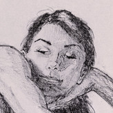
Hey Tuna, what you have is nice with plenty of room for growth. The image you here is a sketch that's colored.
The sketch is well done proportions and it looks 3d. It's like you've been practicing sketching this front facing head for a while and got really good at it. But it's still just a sketch with color. Your painting color is actually decent. You haven't made any mistakes unless you count not trying things you haven't mastered yet. You some how mastered your skill level. That's actually impressive. You have made something unfinished look really well done. My only advice is to start doing art that pushes you in directions that are new for you. There are lots of directions. start making mistakes and struggle at improving. Then people can give you helpful critiques. This sketch you have looks like it could have been done by someone whos actually very good at art but wanted to be super lazy and leave it unfinished hahah.
take care Tuna, keep on painting.
Show all replies (1)
2yr
Hi Ziwei, I wont be able to help that much but I have something to share. Image #1 you ask how to continue.
You absolutely could continue. But is that the best use of your time and ability? I don't know. I would think not.
You tried 4 different styles of the same painting. That's exactly the thing you want to try. I would say the picture works in all 4. it's been a few years right? why not just draw something else?
Maybe you're really attached to Image #1. I would say paint her again from scratch. You get to draw it again differently and with a bit more experience in rendering and all things art.
A few things that prevent smooth flow in image #1
Starting from the background. Those dark window dividers are too dark. If you want to keep the atmosphere light then you would want to lighten those window dividers. If you're starting over from scratch you have the chance to maybe do some more variations on lighting in the background give the light and dark a chance to dance. Just keep in mind the background will have less contrast then the foreground.
Something about the hair hanging down on the right side of her face. it looks like its closer to us then her face is. I think it might be to much detail and contrast, it overwhelms her face. Someone else might have a better idea what to do there.
Her right arm is to much like her left and looks painted on. Its almost like the problem a tangent would give you. her left arm grows into her right. like fixing a tangent you would want to change the positions of one or both arms. If you start from scratch you'll be have more options.
Her right arm is fantastic though. Great job.
Oh well except that its floating on the table. I think if her hands rested on the table it would work better.
I don't know there's a few things that could use adjustment but common you did a great job. I love that metallic lamp.
Image #4
Theres a huge improvement in your abilities. just amazing work. you should feel good about this one. There's a lot to like about it. You even have the green light from the plants bouncing on to her dress ever so slightly.
the fabric looks fantastic. I literally could go on complementing you that's how good this is.
But I really miss critiquing. However there's not much I can say.
2 things that stand out to me are her right arm and her clean feet and the pristine dirt.
That arm could be a little smaller. The angle of this shot would make her arm shorter. If we were looking at her at eye level and she had the same pose you would have the proportions spot on, but at this angle and that hand being the farthest part of her body...the foreshortening would make everything from her hand to her elbow ever so slightly smaller. I don't think I would be able to get it right the first time. I would have to try different lengths before it looked right. while your at it give some attention to the spot were it looks like her chin is touching her right arm. I think it would be fixed by adjust the saturation and contrast values in that area. I might be wrong but to me that arm looks bigger than it should be. It would be because of the angle, you're proportions are spot on but the angle distorts things a bit. It looks like you took that into consideration when you painted her left forward leg. That thing is massive but it looks right because of the angle. Because of foreshortening
The ground should have scuff marks or foot prints, tire tracks, puddles? I dont know how you should do it, but it needs some evidence that its ground, I mean other then the color and sunflowers are growing out it.
Something else that might be neat. Spots of lights peaking through the sunflower leaves and hitting the ground. don't make them too bright though. I think it would open things up under there. That might be nice.
And her foot is too clean. Probably don't need to say anymore about that.
Lastly, isn't a big deal, It falls into the category of composition. Ill tell ya my idea but it's not hurting your image by ignoring this suggestion. along the line created by the sunflower garden, in front of her the plants are sharpened and the plants behind her have been blurred. My guess is you wanted to push back farther the area behind her and bring the area in front of her closer without changing the angle of that flower line. I would say that's an excellent thought. I think you can push that blur even more. She frolicking through the garden, hopping and skipping. Shes moving fast. you can use that blur more to push that back in a compositional way Making that area more blurry would make it less interesting to the viewer and that makes it to fall back .
Just make sure you're using the blur as motion blur, not distance blur.
If I were you Id consider doing the same thing to her back foot/ lower leg area.
Show all replies (1)