


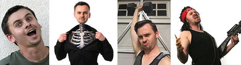
I figured a good way to end the course is with a caricature of Stan the Man himself, Mr. Prokopenko.
Stan’s likeness is a little tricky. It could go many different ways. Even with his heavy eyebrows and manly stubble, he still has kind of a baby face. So to help me out, I decided to use the Spirit Animal technique to come up with the exaggeration. After some thought, I’ve determined that Stan’s [Spirit Animal] is… a beet.
Now I know what you’re thinking, it’s just because he’s Ukrainian and I’m stereotyping. And that’s not true at all. Stan is actually a huge fan of beets. Every time I see him at lunch, he’s enjoying pickled beets or beet salad or just a big ole’ bowl of borscht. His favorite song is Beat It. The man is beet-crazy! If you see him at a convention or out on the street, feel free to just give him a handful of beets. He’ll eat them raw.

Thumbnail Sketch

Of course Stan’s large cranium and thin neck coincidentally worked really well with the beet shape. So I begin with some thumbnail sketches, to try and figure out how to make Stan’s face work on this beet. I soon realize his features should sit low on his head, because his forehead and hair take up more real estate than on the average person. I think the concept here is a good start. But the features aren’t executed in a way that’s accurate to him. So I end this one and try sketching from a different angle.
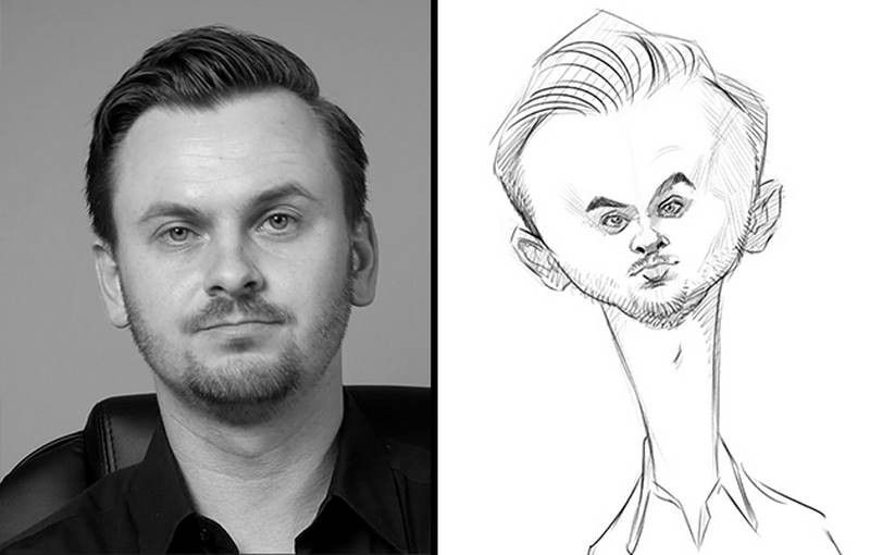
For this second sketch, I maintain the same basic concept of the inner beet spirit, but I thicken the beet-neck just a bit at the top. I also like the idea of really small features set into a large wide head. It’s funnier. This one is working much better than the first sketch. Although I’m not a fan of straight-on views. I prefer more dynamic angles that allow me to show the three-dimensional quality of a face. So I move on to a photo with a more interesting angle.

Again, I try to maintain the beetroot proportions for the head shape and then place the features on top of that. In this thumbnail sketch, I’m able to draw a more dynamic angle which I push even further to give it more visual interest. And there’s even a slightly sassy expression on his face that I try to make more obvious in my sketch. Because of the interesting angle and expression, I feel like this is the one that I can take to the next stage. The likeness needs some work, but that’s what the rough sketch is for.
Rough Sketch
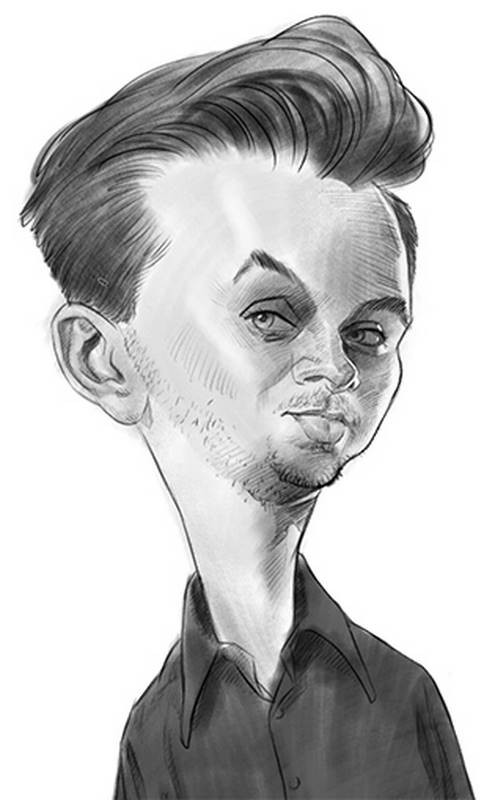
I begin the [rough sketch] by tracing directly over the thumbnail. I use some simple guides to align the features in perspective on the head. And I slow down a bit to give more attention to each feature. More time than I allowed in the thumbnail sketch phase anyway. One of the distinctive traits about Stan that isn’t strictly physical is the darkness around his eyes. His eyes are heavy-lidded, but also a slightly darker tone than the rest of his face. So I try to indicate that in my rough sketch.
At this point, it feels pretty good, but I’m not entirely sold on the likeness yet. Something I’ve learned about likeness is that it’s usually easier to see with the use of light and dark values, rather than with just lines. I could continue crosshatch shading to darken the values, but for the sake of speed, I add some more shading with a large brush. It’s pretty rough and simple, but I think it does add some visual information to define the likeness which wasn’t there before, like the volumes of the forehead and cheeks. When I squint down and blur my eyes, I really see it. So It’s just enough to confirm that I’m on the right track even if it’s not perfect yet.
Abstraction
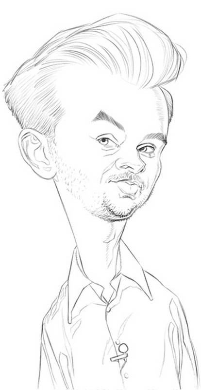
For this next stage in developing this caricature, I flip the rough sketch over to better see any structural problems and then draw a [Reilly Abstraction] on top of it. The rhythm lines of the Abstraction are drawn from one side of the head to the other to help check if things are lined up or if they need to be moved. Some features, like the eyebrows, are going to be asymmetrical, so I allow for that and look for unintended distortions and asymmetries. I discover that the ear I drew on the rough sketch was too low. But for the most part, everything else was in a good spot. Even if all the features are determined to be well-placed, these geometric rhythm lines are most helpful because they act as an idealized template of Stan’s head – sort of a cleanser, washing away the rough lines of the earlier sketch, so that I can trace much more nicely designed shapes and features in the right locations at the next stage.

Oh, and besides the ear being too low, the Abstraction helps me figure out that the head would look better if the forehead was more bulging in front.
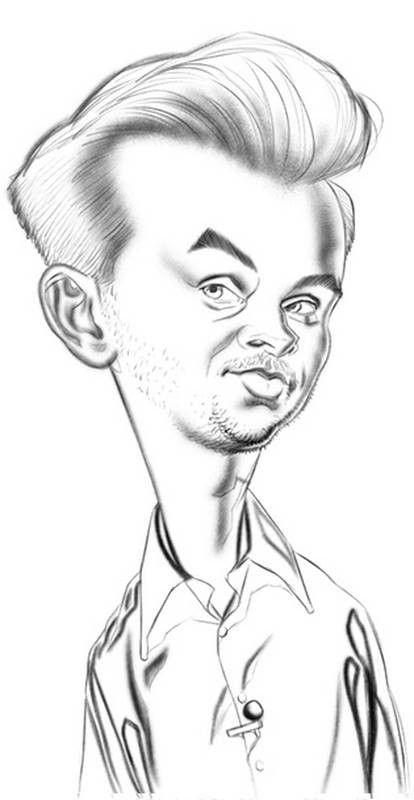
Final Sketch
After a quick check, I flip it back around, dim down the Abstraction and begin my [final linear drawing] on new layer, tracing over the Abstraction, but with much more attention to the exact shapes of the contours and features and also to the quality of my lines.
This lesson is all about drawing caricatures with special attention paid to the visual design. As I’ve said, a good exaggeration and likeness is not enough. To draw at a professional level, you need to slow down and spend time creating a refined look or visual design. It doesn’t have to be realistic and based on anatomy, like my work. You can draw abstractly or simple and cartoony. But whatever it is, you need to figure out what you want the finished style to be and then keep working on this until you’ve achieved that look. Tracing over the previous drawing is a great way to do that.
Now, the problem with being the judge of your own progress is that while you’re learning, your artist’s eye may not be able to see all the flaws that a more experienced artist may see. As you continue your studies, your eye will improve, followed by your hand’s ability to make the right marks. But during this time is when it’s important to have a teacher, mentor or at least another artist at a higher level of development help you and let you know where you can improve. Eventually though, you’ll be able to look back on your older work and wonder why you missed all those drawing problems the first time around.
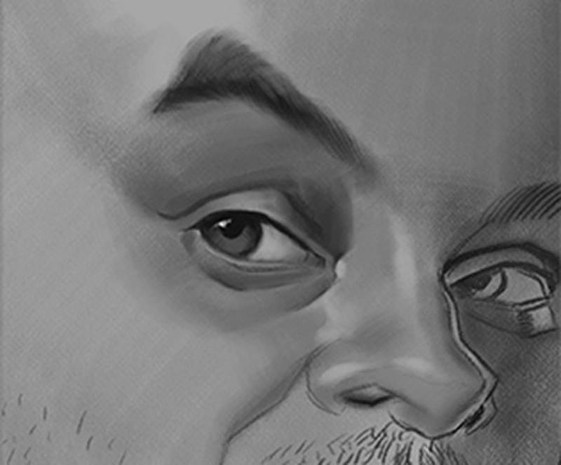
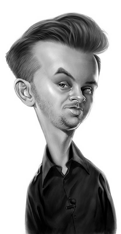
With my linear lay-in finished, I now add the soft edges. Wherever a form transitions from a light to dark value, that transition will be either a hard, firm, soft or lost edge. Once those transitions are all in, I finally start to add the values, which is the final stage of this drawing.
I always seem to have the most success in a drawing or painting when I work on a middle grey background. In the premium version of this course, I demonstrate shading drawings with different strategies. On my David Bowie caricature, I shade on a white background, which shows how it negatively affects my perception of the values on the face. Working on a white background prevents me from shading as darkly as I should because the bright white fools my eyes into thinking a value I use on the face is darker than what it really is. A light-middle grey, as I’ve used here, sets me up right in the range of what Stan’s caucasian flesh tone already is. So even before I begin, I’m in the right value range.
Most of the time in a realistically shaded portrait like this is spent working in the middle range of values. Or the halftones. The dark accents and bright highlights are fun and give the drawing more visual punch. But they wouldn’t work if the the middle values aren’t properly figured out and correctly placed first. The meat of the portrait is in the halftones. They are what’s going to sell it to the viewer. And the halftones are usually all within a very narrow range on the value scale. So there’s not much room for error. If you shade the halftones with too much contrast, the subject will look shiny or metallic. If you don’t have enough contrast, the portrait will look dull and flat. And if you don’t shade and cover the shapes evenly, you may get spotty or streaky effects where bits of light or dark peek through your strokes. So make sure you’re using the right tool for the job.
Most of the Photoshop brushes I’m using to shade here are very subtle brushes already. One stroke from them doesn’t cover much because they have heavy textures applied to them. I have to keep on adding stroke on top of stroke to lay down a value. It’s similar to using very light pressure with a hard charcoal or graphite on a rough paper. In fact, I think my main brush here is called “Shady Graphite” by Kyle Webster. It comes standard with the latest version of Photoshop. But you can find or even create similar brushes in other painting apps.
Also, it probably goes without saying, but when shading a drawing or painting, use the largest brush for an area that you can. You want to be able to cover broad areas with less brush strokes. But to get hard edges or for textures like the hair and stubble you’ll need a smaller brush. But those should be used sparingly, lest you end up with a streaky and sketchy rendering. Most of your time in a drawing like this will be spent using large brushes.
Some final bits of advice to create professional quality caricatures with a strong sense of design are: First and foremost, keep working on it until you can’t make it any better. Push yourself to draw and paint like the people you admire. If you get to the end and aren’t sure if it’s a success, get up, walk away and come back to look at it with fresh eyes. Or flip it in reverse one more time to examine it backwards. If there are any structural problems, they’ll be much more obvious. If you can correct those problems, then do so. If there are just too many problems to fix, you may need to go back a few steps and start again from your rough sketch or Abstraction.
Thanks everybody for watching and a big thank you to Stan for allowing me to be a part of the Proko family.
There are several more in-depth demonstrations for this lesson. To get access to extended versions of the main lessons and all of the extra fully-narrated caricature demonstrations, be sure to get the Premium Course.


