Art of Caricature
After mastering the caricature fundamentals and learning advanced techniques to get better exaggerations, what is there left to do? The short answer… the hard work.
This is the final lesson in the caricature course. And it’s not actually a caricature lesson. It’s a general drawing lesson. Whenever I’ve taught caricature, most students have a hard time making their final sketches look clean and professional.
Elements of Design
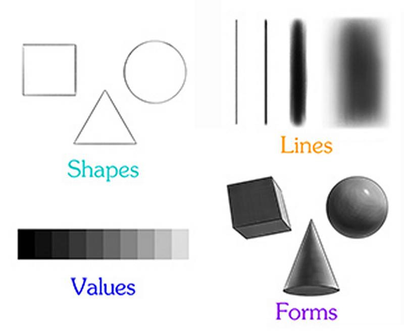
Regardless of whether you're doing a caricature or a traditional portrait, it takes a lot of work to bring a drawing or painting up to a high level of finish. So the hard work I'm talking about is applying a good and strong visual design to all of the caricature lessons I've taught you. There are several elements that go into design. The way I see it, they are: lines, colors, shapes, textures, values, forms and composition. But in this final lesson in the art of caricature, we're going to create stronger design by focusing on shape, line, value and form. And then applying those efforts specifically to the features of the face.
Bad Design
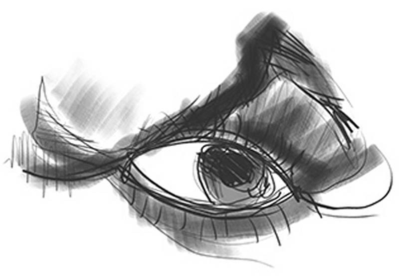
Now, of course judging good design from bad can be tricky. There's never just one answer that everyone will agree looks good or bad because everyone has different tastes.
But in drawing, a design is bad is when the lines and shapes are sloppy, unbalanced and look like they are not the result of intent, but of carelessness. The values are spotty and they don’t help describe the forms three dimensionally. However, a caricature can certainly be loose and sketchy, like Jan Op De Beeck’s work, and still have a beautiful design. Jan’s loose technique is intentional and not a result of carelessness. The only reason he can make his quick and rough shapes look good is because he has a lot of skill and experience under his belt.
Good Design
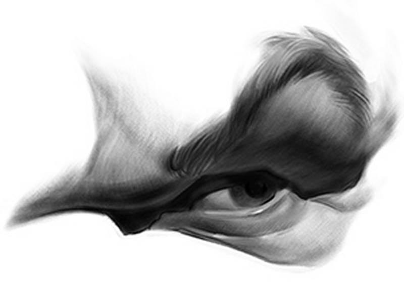
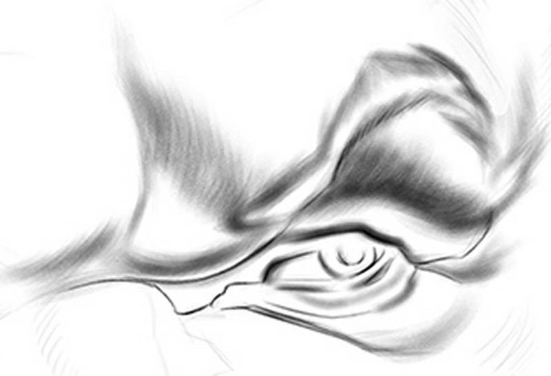
Let’s look at what I think makes for a successful design. To me, this eye has a good strong design. And it’s not about anatomy. A drawing doesn’t have to be rendered realistically and anatomically to look good. Just on an abstract level, the design has to have a pleasing shape and outline. Also, there’s a variety of line types and edges, from hard to soft and even lost. And there’s a full range of values and smooth transitions that create the illusion of three dimensional form.
The best way to get to this point is to draw your caricature in stages, starting simple at first, improving upon it each time you redraw the design. And slowing down at each successive stage. It’s really just about putting more time and effort in and following the procedure of starting simple and building complexity on top of it.
So let’s take a look at how I created this eye on my caricature of actor John C. Reilly. This rough caricature was originally done as a demo for [premium] students as part of the [digital paint sketching lesson]. There was no line drawing here. All the shapes were created freehand using a large Photoshop brush. I think it’s a funny sketch and it has a good likeness. But there are some problems with the construction and alignment of features. So, my first step is to flip it over to better see where the problems are, and do a [Reilly Abstraction] on top of it. Be sure to check out my lesson on the Reilly Abstraction for more information. This legendary drawing method was not actually invented by actor John C. Reilly but by 20th century illustrator Frank Reilly.

Shapes (The Lay-In)
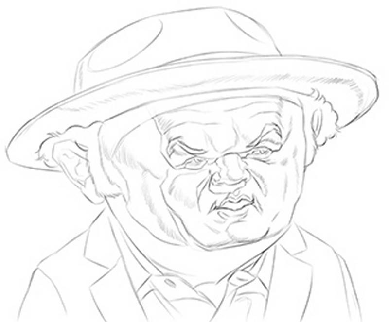
With the Abstraction finished and the features lined up more correctly in perspective, I now redraw the sketch more carefully with just lines. On my first pass over the Abstraction, my lines are light and thin to keep everything as clean as possible. At this “Lay-In” stage I'm only concerned with my first element of design: Shape. I'm drawing the actual shapes of the head and features, but not yet concerned with realistic forms, values or the line quality. This step is simply about shape. Pure abstract shape.
So that if you were to zoom in on any section, the abstract breakup of the space would have a quality that most people would find pleasing to look at. I try to keep my lines made up of simple straight lines, C curves and maybe some S curves. Edges and borders that look hard in the photo reference will be drawn as hard lines here. And it’s up to you if you want to indicate the softer edges and form shadows with crosshatched lines as I’ve done here or just another hard edge. If you use hard solid lines everywhere, it will give your sketch a more graphic posterized look, which could be cool. That’s just a personal style choice.
Lines (Calligraphy and Edges)
Now let’s zoom in to just one of the features to work on the next step. If you’re working digitally at home, you should also zoom in close for this stage because it will require some precision and dexterity. With the shapes clearly defined with simple lines, I redraw the shapes while focusing on the quality of the lines. Hard edges are required where there’s a cast shadow or a sharp change in the direction of the forms while softer edges are necessary to show a gradual transition from light into dark. Here, my pencil brush has a bit of line variation, going from thick to thin. So I’m employing a type of calligraphy.
But I’m not just using a pencil brush, I’m alternating between that and a larger, rougher brush for my soft edges. This variety in line types from thin to thick and hard to soft will give the design more visual interest. The same quality of line everywhere can look monotonous and boring. And once your viewer is bored with what they’re looking at, they’ll move on to something else. Good design in a drawing will keep your audience more interested and continue to look for things that will surprise them. And they’ll want to see what you’ll do next.
Value (The Illusion of 3D Form)
With the forms and shadows mapped and outlined, I now add the shading. Filling in the values is what gives your 2D drawing the illusion of 3D form. It’s what makes the shapes seem to pop off the page. I’m working digitally, which is pretty forgiving. Any mistakes can be quickly and easily corrected. If you’re using charcoal or graphite though, you need a steady hand and even pressure to do the shading smoothly with total coverage. Because fixing mistakes on real paper isn’t as easy.
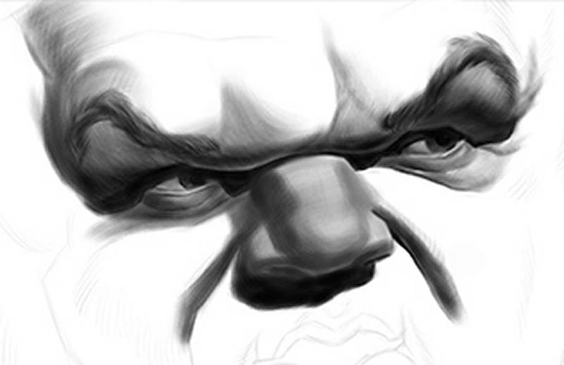
When shading in a drawing, I find it’s best to build up to the darkest values gradually rather than trying to achieve them right away. So I’ll do one pass over the shadow areas with a single medium value and then get progressively darker where needed, while leaving some areas lighter where there is reflected light. Stan made a great video that shows the entire process of [drawing an eye] in his course on drawing the portrait. If you want to do good caricatures, you should check out [Stan’s portrait course] and learn not only the anatomy of the head, but his steps for drawing and rendering it.
Now, you don’t have to always break down your drawings into these distinct steps – especially if you’re more experienced. But if you do have trouble creating good solid design in your caricatures, this attention to process can be really helpful.
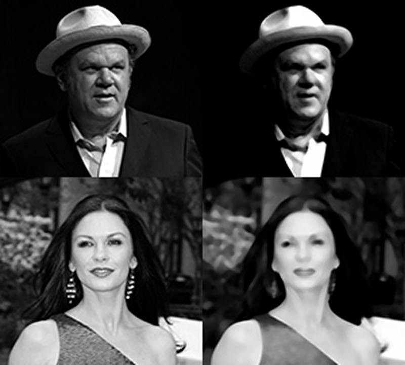
By the way, I didn’t choose this photo of John C. Reilly by accident. It has a strong separation of light and dark forms, which go a long way to help me create a better design in my drawing.
There are clear indications of the shadows, halftones and highlights. Compare that with this flatly lit photo of actress Catherine Zeta-Jones where there are no dark shadows. Squinting your eyes at your photos will make them blurry but will help you better judge if there is good contrast. When you squint down at the Reilly photo, the values become even more dramatic. While the values on Zeta-Jones’ face get all mushed together into one light mass, which make it much harder on the artist to create an interesting design. So try to use photos with strong shadows on the face whenever possible.

In Conclusion
Remember that design is not the same thing as style. There's room in the world of caricature for every type of visual expression and style, from abstract, sketchy, cartoony or realistic. All of these caricatures have vastly different styles but show all the elements of good design. What this lesson tries to address can be reduced to one basic problem: Carelessness. Caricatures with otherwise decent likenesses and exaggerations are ruined when you don't take enough care to make sure that your hand follows through on your original stylistic intentions, whatever they may be.
Premium Content
In this lesson, I showed you just the eye. In the Premium Version of this lesson, I’ve included the rest of the John C. Reilly caricature as well as several more videos where I focus on a careful and disciplined procedure for creating drawings with a strong visual design.
What's Next
I'll actually be back with one more video to share some final thoughts on practicing the Art of Caricature.


