Value study
4yr
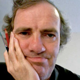

Izak van Langevelde
Trying to improve on the subtleties of light and shadow.
Comments and critique are welcome!
Asked for help
I incorporated your comments to the best of my abilities.
What do you think?

before even thinking about shading, i believe you could first get the proportions down first. you can easily do a comparison by layering it on top of the photo and decrease the opacity of your painting. for the value part, at this stage you could just simplify it down to 2 tones. This way you are forcing your self to think more about the proportions of the subject matter. Though if you want to juggle one more ball than that, you could be more mindful about the design of those shapes. That's it for my critique. hope you'll do well !


I think the shadings are nice...but exaggerate these highlights to make the painting more interesting...keep it up..

You're on the right track, there's a soft and sort of... "smoky" quality to this that is very appealing. The hair in particular is very nice, it reads as a different surface / texture than the rest of the face. The "solidness" of the head is also pretty convincing, this has the appearance of depth and volume which is something I always struggle with. Love the features as well, you packed a ton of detail into the eyes, lips, and nose and they look great. The proportions might be a little off, but that's not your focus and you got the essential bits right.
Looking at your reference, I think the biggest issue for me is the lack of a soft edge between the side of the face in shadow and the side in light. Not to say some hard edges aren't warranted, just that you need to be selective of where you use hard edges based on the geometry of the skull. For instance, I would give the cheeks a softer edge and maybe keep some of the hard edge around the jaw. Value is light, and light reveals form, so value studies really test your knowledge of your subject as a 3D object. Doing a face is especially unforgiving in that regard. I think referencing the Asaro Head would be really helpful here for figuring how the light is interacting with the face.
Hope that helps! Good luck on your art journey.


Your lights need highlights for sure and I think it would help to post your reference as well in order to see if proportions are correct.
Proportions are not my main focus here, but it never hurts to check. Picture is from https://assets.televizier.nl/upload/a/t/Annechienjurk.jpg

Seperate the lights from the darks more.
I think it is not so much the separation, but that the lights can be pushed further. I'll do this tomorrow to see where it brings me...