

Activity Feed


Ralph
added comment inDemo - Portraits in Perspective - Level 2
5mo
Just wanted to point out that I feel these things were sorely missing in the portrait course. Facial expressions too, although those could be a course of their own. Loomis only gets you so far. Do you ever intend to update the portrait course with newer videos or make a new/advanced one that goes into facial plains, expressions, maybe the asaro head, etc? (Sorry for posting this here. Feels like there is a way better chance that somebody from the team will read it in a newer class)

Ralph
7mo
Show all replies (2)
Show 1 more replies
7mo
may I ask why you use moving along the y axis but rotating around the X axis as examples in the first minute? I know they are just examples, but given how much confusion exists around perspective and how much I struggled with it myself, wouldn't it be better to first show movement along the three axis to indicate how the foreshortening changes and THEN show that you can also rotate things around any axis? Otherwise that can already start out the video with some confusion on why the "change" on the Y axis is so different from the X axis. Maybe I am overthinking it, but given that it is the very fist example for the subject, maybe that would be helpful? Just my 2 cents. I doubt it will derail someones art career to leave it as it is.


7mo
Asked for help
This was hard but fun. Struggled a lot with 6, 8 and 9. I was drawing lines parallel to the 'eyebrow line' and the 'lip line' to find the box edges.
7mo
I don't really have much to add. You are not drawing rectangular boxes but rather planes wrapped around the head. This often leads to wedge or pyramid-like shapes. (e.g. image 4, 5 and 7). In other images, you may have figured out how one set of lines through visible landmarks is supposed to look (e.g. image 9) but you made all lines going in the "same" direction pretty much parallel to that rather than actually converging them. It is more of a parallelogram than a box around the head. (same with picture 8). Rather than just moving the lines up and down, try to find some obvious easy to find lines (top of the ear to eyebrow, eyebrow to eyebrow, center of the forehead to middle of the mouth/chin) and then use what you know about perspective and how lines should converge in 3D space to construct the other lines, rather than "finding" them in the image. If that is hard, try drawing a lot of randomly rotated boxes floating in space. Also draw the lines you normally would not see as if the box was made from wires. When you have about 4-6 boxes on the page, elongate the edges and see if "parallel" edges actually converge to one point to check yourself (essentially the drawabox 250 boxes challenge). it is tedious but will give you an intuitive understanding of boxes in 3D space over time. Then you don't have to rely on just the image to find a box but you can rather use what you see in the image to construct the box with what you know about perspective.
In picture 9 you also have the edge of the box that faces the viewer go through the corner of the left eye. Yet the outer edge of the box goes through her hair rather the the outside corner of the other eye. This the box is not centered on the face.
Show 2 more replies


7mo
Asked for help
Hi everyone !
After few attempts on paper, it felt so difficult I chose trying tracing over pictures first. Even like this it was quite a challenge. I did all the picture this way but posted only a few. As the picture number grew, I felt a little more confident.
Please let me know if it feels right to you.
On most picture, it was really difficult to find convergence between the lines because I was really influenced by parts on the face. When I switched my mind into “cross contour” mode, it helped in my opinion.
Waiting for your opinion on these and I’ll try again on paper without pictures underneath !
Thank you guys for your help !
7mo
I'll try to put into words what I see, but I often struggle to explain what I mean in a foreign language, so please bear with me if my thoughts on your work seem tedious or messy.
In general, you seem to have a rough grasp on how perspective should work, However when putting the boxes over a photo or a head, you seem to struggle between following the rules of perspective and what you see in the photo. Also you are using parts of the face as reference for where your lines should go, that would protrude past the box, like the tip of the nose.
What do I mean by that? If the eyebrows represent a part of your box and the forehead represents a part of your box, then the ROOT of the nose or the chin would be on the same plane for the front face of that box. The TIP of the nose however is not on the same plane as the eyebrows, forehead and chin. In your picture number two you start the line in the center of the front face at the forehead, but then you go through the tip of the nose and therefor miss the tip of the chin. You can try that in real life. If you put your pencil on your face in a way that the tip touches your forehead and the other end touches the tip of the nose, you will see that you are holding that you are holding your pencil at an angle that does not follow an imaginary box around your head but rather points in a "diagonal" direction compared to that imaginary box. (I attached an image in a profile view of a head to illustrate what i mean. The blue lines show how a box would roughly wrap around a head and the red line shows how a line going through the tip of the nose deviates from that.)
The other thing that sticks out to me is that once you established a correct line, the other lines that should follow the rules of two or three point perspective ignore the foundation you put down. Again in picture two, the line going from the top right of his fore head (top left from our perspective) to ho the bottom right seems correct to me. That we can see the top of the box indicates, that the person is looking down a bit (which he does), but then the line from the center of the forehead through the nose leans AWAY from the first line. The rules of perspective would dictate, that these lines should converge towards the bottom somewhere. Yours spread apart. Again that is probably because you drew the center line through the tip of the nose and the next line was oriented towards that already wrong center line. So rather than sticking to what you know about perspective, you let what you see in the image deceive you and broke the rules of perspective to follow that second line you put down.
Another smaller thing is, that most boxes seem to ignore the upper portion of the head. In image 18 we clearly see how the box does not include the rounding of the top of the head. Also the Box is skewed because you stick more to how you interpret the image. Try to use some easy to find refrence points (line trhough the eyebrows, line from the middle of the forehead through the middle of the chin, line from the top of the ears to the eyebrows) and then try to use what you know about perspective to construct the box around the ehad, rather than letting what you see in the image confuse you.
This basically keeps on going. In image 19 you correctly drew a line form the top of the ear to the eyebrow. it is angled slightly upwards, therefor indicating that the man is looking slightly up. However the line above that is angled down. This likely happened, because it is very hard to tell what a box around a rounded surface would look like or what direction it should go. The top of our head is pretty spherical so it is hard to find a box around it that matches the rest of the face. That is why you should rely on the points that are easy to tell (in this case top of the ear to the eyebrow) and then use what you know about perspective to understand how the line above should be angled. In this case the line from the ear to the eyebrows is angled upwards. The line above is angled downwards. So much in fact that the top plane suggests the box was angled downwards rather than upwards.
So bottom line:
Try to find lines that are easy where you can tell for sure, in what direction a line would have to go. Then construct the other lines with what you know about converging lines in perspective rather than letting the rest of the image distract you.
Show all replies (3)
Show 4 more replies


7mo
Asked for help
Pre-demo & Critique attempts. The laces on the boots were definitely a struggle. If I were to do it again, I would break them up into more curves and strokes, as well as making them lighter.
7mo
I believe the main focus of the exercise was doing exactly that. Also using CSI lines and doing them in one motion. From what I see in your line quality for the boots, you seem to join a lot of very small strokes together which is exactly what the exercise is meant to teach you to avoid. Don't try to copy every detail exactly how you see it. Nobody will be able to tell if the laces of the shoes were a few millimeters further to the left or the right. People will be able to tell if you used clean confident strokes or insecure short strokes.
In my experience these short strokes are the result of two things
1. Insecurity where the line should go so we do a lot of short strokes and correct the direction with every stroke
2. Being afraid of making mistakes.
If drawabox was good for one thing for me, then it was helping me with getting rid of those habits to a degree. Essentially the exercises there, while often tedious, teach you to not value every practice drawing you make as if it was something you wanted to put on display.
They essentially make you draw things so often (e.g. 250 boxes in perspective) that at some point you stop caring about how one individual box turns out. Ironically your lines look better once you stop caring that much, because you stop overthinking it and don't worry about every little stroke anymore.
Later lessons in this course will also focus on how to measure and construct things, going from big shapes to smaller ones. That may help with the "avoid errors" mentality as well because you will learn how to build a lightly drawn rough orientation construct for where to place your lines before you actually put down your final darker lines. It removes some of the uncertainty.
In the end my recommendation would be to just draw a lot while trying to focus on doing confident long CSI lines. If you sit down and do a lot of animal drawings or a few every day, eventually you will stop worrying about placing every line perfectly and use longer strokes without thinking about it (maybe even to just save time, given that this approach is a lot faster than doing all these small strokes)
hope there is something in there that helps you a little.
Show 1 more replies


How can I better this please
10mo
Place what exactly? The jaw/chin? from what I can tell with my own limited experience, the jaw in the left one is a bit off center. Drawing a middle axis onto your sphere might help you better understand where the middle of the face would be. Also drawing the parts of the form that you do not see might help with that, especially when you are starting out.
The lines that halve the sphere ends in a 90° angle to the outline of the sphere on the left for example. That however implies to the viewer, that there is actually a 90 degree angle there, rather than the round form continuing.
If you look at the sphere here:
https://study.com/cimages/multimages/16/sphere_cross_section7245140437775505592.jpg
you can see how the cross contour lines wrap around the sphere and do not just end in a T shape when they hit the outline of the sphere.
You also seem to skip the rough sketch/underdrawing for these heads. The line quality is a bit restless, because it consists of many short lines being joined together.
To be perfectly honest, a lot of this implies that your grasp on 3D shapes, representing them on a 2D piece of paper and other basics is not that firm yet and I would suggest you practice that first alongside more interesting topics like drawing heads and portraits. I am not saying this to discourage you, but to save you a lot of the headache I cause myself by taking a similar approach to yours.
A few years ago, I jumped in at the deeper end of the pool and basically tried to learn how to draw by taking the figure drawing class here on Proko, because it was way more interesting than the basics like drawing straight lines and geometric shapes. I had to find out the hard way however, that I lacked the basic concepts to really learn from the figure course. I learned something, sure, but certainly not as much as I could have and I did not understand why. What really helped me to get a better grasp on 3D shapes in the end, was doing the first lesson(s) on www.drawabox.com as well as their 250 Boxes challenge. (just be vary of the texture exercises in lesson 2)
Maybe taking the drawing basics course here on Proko might be an even better alternative as it begins with a better understanding of 2D shapes, line quality and other basics rather than jumping directly into the more complex 3D shapes.
So in summary:
I would suggest that you get more practice on the basics like line quality, loose sketches/underdrawings and 3D shapes, while also practicing the more interesting topics that actually interest you (because doing only basics is boring.) Try to keep a 50:50 ration between drawings that are fun and practicing the fundamental skills. Otherwise you risk losing the joy in drawing.
Show all replies (2)
Show 1 more replies
11mo
So for the earlier lessons we got warmup exercises for every concept. While I get that it is difficult to keep calling it "warm up" the more these basic exercises are combined to arrive at more complex concepts like gesture, I was wondering if there still were good warm up exercises focused on gesture? Or is that too advanced already and we should just stick to the simpler line and circle exercises for warm-ups?
Show all replies (1)
11mo
This is about the best explanation of the subject I have ever seen/heard. Everybody else is just like "Draw gesture" and every demonstration from every artist is different which makes it that esoteric concept you have to "feel" rather than understand (Including your other gesture video to be honest.). Putting it in perspective with the explanation at the beginning that there are tons of ways to capture the same concept and then giving examples of what that concept actually is, really demystified this for me a lot.
I have some catching up to do on the course since life (or rather work) has been pretty stressful lately, but I am looking very much forward to trying this myself. Thank you for sharing this.

1yr
Asked for help
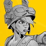
Try to learn the style of Jamie Hewlett, but failed. 😅 So...this is only a line practice.
1yr
So you studied from Jamie Hewlett by using… a photo? And you managed to produce that drawing as a result? Anatomy, changed clothing, good line weight,… and you have the nerve to call this a failure? Dude, you need some advanced class, not a beginner class…
Show all replies (1)
Show 2 more replies