

Activity Feed


added comment inSome drawings that I need help with
9mo
Hey, @paper, long time! Cool sketches!
About the drawing of the guest at the restaurant, I can see how you’d think the hands have become too small. One way I can think of to solve this problem is to bring the drawing into Photoshop and simply increase the sizes of the hands using selection and transforming tools. Not sure if you’re already tried this, but that’s how I’d attempt to solve it. I also think that the character’s head may have become a bit too big, so if you’re going for realistic-ish proportions in this drawing, I’d try reducing his head a bit, too (not that you necessarily need to go for realistic proportions, of course - only if you want to).
The quick gestures of arms and hands from Sargent’s work look pretty nice to me! If your goal is to improve proportions though, I’d suggest to develop these sketches one pass further and spend more time doing adjustments based on some careful measuring (rather than leaving them just as quick gestures). I’d also recommend studying hands from photos and - even better - from life, is possible (rather than studying just from other artworks).
Concerning the drawing of the waitress by the railing, I believe that practicing the construction of the body with exercises such as the one suggested by @Jesper Axelsson is the best path for you to understand how to solve this kind of foreshortening problem. For example, you could visualize her whole torso as a cylinder and consider how that cylinder would be seen when foreshortened in this perspective - its length, its depth, how much of each plane would be visible. This skill requires some abstract thinking and spatial reasoning, but, given time and practice, it becomes much easier. If you need more information on how to simplify the human body into simpler pieces, make sure to check Stan’s lessons and assignments on the Bean, Robo-Bean and Mannequinization:
. @How to Simplify the Motion of the Torso – The Bean
. @How to Draw Structure in the Body – Robo Bean
. @Mannequinization – Structure of the Human Body
Hope this helps!


@paper
8mo
Also p.s. I have another comic done and would like some critique but it ended being 60 pages long, would it be okay if I just send some odd pages that I feel unsatisfactory and ask for advice?
@paper
8mo
Hello @Liandro , thanks for the feedback! I'm sorry for the late reply, I got burn out after I posted this had started out college soon after, so I had to take a break >_<
Anyway,
On the topic of drawing the guest, thanks again for the feedback! Though I think I did try to shrink the arm in clip studio alongside making the head smaller (Wait no, I think I found it!), but even then, I still find it "Wrong", it's very confusing. Would appreciated some secondary opinion.
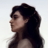
Thanks for the compliment on the Sargent study! I follow your recommendation and did some more study based on Glen Keane and Milt Kahl (I didn't save the reference picture so it's just the result, sorry >_<) I swear also threw in some life study from my own hands in there (I even wrote it on the paper for God's sake!!) but I don't remember which one. If you see any common mistakes in these, please tell me. Would really be grateful for it.
Also did the exercise Jesper Axelsson asked below their comment, if you're interested you can see it below.
Also also I think I misremember when you say studying from life, I must've forgotten you were spcifically talking about hands and just drew this drawing of my grandpa sitting half naked. The value's really crude (Maybe I didn't go dark enough?), and I think the composition isn't that striking (didn't do any thumbnail either, he was about to go take a shower so I had a limited time), I did take a photo of my grandpa as reference in case I ran out of time, please tell if needed so I can send through private text if needed.
Again thanks for the feedback, don't worry it was really useful! I'll try to find time to practice my drawing though I'll probably have to finish all my college work first >_<
Edit: I couldn't shake off the last picture study of my grandpa, so I try to fix in clip studio paint, I think it looks better, (particulary the composition) Feels more emotionally right. Though it also looks like an Ivan Loginov painting, hopefully it doesn't stay that way and I find my own voice in this medium. Would probably try to tone my paper next time to get better result. (Would also hope to make it less "Digital" when doing it on paper)
Show all replies (1)

10mo
Hi! :)
1) I think with the examples of Sargent and Repin, my guess is that the figures were placed slightly off-center and the painters utilized the surrounding elements to counterbalance the asymmetry (e.g. the trees, mountain, signature in Repin's). This would maintain the focal importance of the object placed center while still keeping the overall image dynamic and interesting.
2) I don't think the bow detracts from the painting's tone. If anything, I think it makes it more interesting against the setting and creates a more interesting silhouette, but I think this is more of a subjective opinion.
On the side, I would also like to ask if you are aiming for something completely realistic or a blend of representational painting mixed with the character's original anime style. I've seen artists do both before, one that comes to mind would be RossDraws, so I'm curious as to what your goal is.
A more general tip I would have is to watch the readability of the image, with an eye towards the simplification of values and the readability of the silhouette. With paintings, it always helps to do a small value study beforehand to have as a guide. It's also an incredibly valuable exercise to practice notan studies off the masters, in order to gain an understanding for their composition and control of the image. I included one for the original painting you mentioned along with some notes I hope are useful. I realize your scene is a bit tricky given the blizzard, but the Bama snow painting can too be simplified into basic values so it can be a very useful reference as to how to approach the snow.
8mo
Hello @Martha Muniz , thanks for the feedback! I'm sorry for the late reply, I got burn out after I posted this had started out college soon after, so I had to take a break >_<
1) Hmmm, I see, yeah I never noticed that. It's been 2 months since I last posted this and I actually did went back and try to fix it just because every time I looked at the non symmetry it annoys me. My attempt at a solution is making the lower left be darker to mirror the cliffs of the lower right. I also realized the photo I send of my painting 2 months ago was shot using natural warm light, and I found that this made the painting worse, since it made the base white of the panel warm, and making the snow warmer. This cause it the contrast of cool background and warm dress to be slightly off. It's not the biggest mistake, but I try to fix it, by this time taking a photograph under cool natural light (Though I'm not quite sure if it works or not >_<)
2) On the topic of if I want to paint stylized or realistic, I didn't
really had an answer when this by question was posted but I'm
starting to realized I'll probably do the former. Recently I went to
my grandparent's house and had a plan to paint them when I was cured
of my burnout. When I had taken enough photo reference, I decide to
start sorting out the shapes using charcoal. At that point I began to
realized how boring it was to paint so literally. Maybe it was because
most of the painter I looked at, such as Sargent, Repin, Serov (and
actually even Fechin) was realist and the more I look at it, even if
they have style, the more I got bored at looking and doing them. I
think at this point I started to stop looking at them and more at the
artist that leave reality. 2 in particular are Hokusai and J.C.
Leyendecker. I was aware of both their work for a long while, but only
recently rediscovered and fall in love with them, especially after
looking at this blogpost about the Leyendecker exhibition
https://www.muddycolors.com/2023/08/leyendecker-under-cover/ . (Oh,
and I should also probably add Takehiko Inoue, but I was always
looking at his work even in my realist stage) I guess what I'm trying to say is I want to paint calm stylized painting.
Really sorry that it took that long to answers that question >_<
Also thanks for the advice! I actually don't do thumbnails on my painting so that's probably why most of them are hard to see. I'll try to do more, though to be honest it's really hard for me since imagining what my painting would look like in a small thumbnail is almost impossible to me, I feel like I can only imagine it when I draw it to at least an a4 (also the knowledge that I've been this exercise for a year now and still having the same problem https://www.proko.com/s/WwMU), though I never try to draw my thumbnail bigger than a postage stamp size, maybe something less than a playing card could do? Oh well, hopefully one of these day I'll finally get the concept
.........Actually, I kinda been meaning to ask for a while now (but was too embarrassed to ask it). What does clarity mean?
But beside that, thanks again for the feedback! For someone to take the time to critique my painting is very nice :D

10mo
Hi @paper, cool drawings. I like the attitude in the characters, and the drawings feel clearer than some I've seen you do before.
Since the struggle is about posing the parts of the figure in a convincing way (right proportions and foreshortening for example), I'm going to suggest an exercise:
Pick a reference photo of a figure.
Draw the figure with clear and simple pieces.
Try to get the pose and the proportions of the pieces match the reference.
When you've tried the exercise, post your drawing and the reference, then tag me and I'll try to take a look :)
8mo
Hello @Jesper Axelsson , thanks for the feedback! Sorry for the long reply, I got burned out >_<
Here's 2 drawing I did based on the sculpture "Rape of Hippodamia" by ALbert-Ernest Carrier-Belleuse and Camille Claudel's "The Waltz"
I thought the piece on "The Waltz" look fine, but the "Rape of Hippodamia" Looks off, particulary the torso and the foreshortened knee. Would like some tips on these two.
Show all replies (1)
10mo
Oops, I accidentally uploaded the digital version for the final image, where I try to fix the painting, here's the original oil without any edits >_<

11mo
I am no proffessional but I really like the style. I find it very sorf and pleasing to look at .
10mo
Oh hey it's you.
Thanks a lot @W.I.M.U , really appreciate it! I'm glad the style is at least appealing to look at >_<
added a new topic
Another request for critique10mo
Hello, alongside several drawing I had just posted, I would also like to ask critique for this remake of an old painting I did a year ago (it's here if anyone interested https://www.proko.com/community/topics/hello-i-made-another-fanart-would-like-some-critism) But the original was done with gouache/ acrylic/ watermixable oil on acrylic paper. I frame it behind glass but I realized a year later that the glass wasn't uv protected, meaning it would darken if left exposed to any direct/ indirect sunlight. I wanted to change the glass but the glob of watermixable oil stuck to the glass, meaning it might rip the paper off if I try to dismantle it ;_:
So in light of this, I remake my old painting in oil (The medium that I actually wanted to create it in the first place but got afraid because of the toxicity of the solvent)
I already mentioned James Bama as one of my influence for this painting in my old post, his thoughtful costume design and his respect for the sitter, to give each of his subject a dignity with their own problem. Even though the character I'm painting isn't real, I want to give them as much humanity Bama does.
But also, I don't think I mention Valentin Serov, whose color palette really attract me. This part may be a bit more general than what this post is discussing, but I really want my painting to be as varied in color as Serov does. When I look at James Bama work, even though the thing he is painting varied from painting to painting, and the texture and application is different, I found their color so similar that it started to annoy me. Serov's work are also kinda similar (at least, if you compare him to someone like Jeff Watt or Fechin) but I found there's enough variation to make his body of work interesting. Something I strive for in my work.
Speaking of Fechin, this is probably the final artist whose work is most noticeable here. In term of this painting, it probably is the biggest influence, since I wanted to simulate the viewer being in a blizzard and looking at this girl and Fechin's brushstroke I found perfect. Though in term of overall career, I'll probably move away from his work, considering the more I look at it, the more I feel it gimmicky >_< (Also, this may be unrelated, and I'm sure the man I'm tagging is busy- so I'm very sorry about this, but I wonder if Mr @Stan Prokopenko would like this, considering he's a big Fechin fan)
Anyway, going back 50 sentences, the 2 biggest critic I would like to know is if the figure of Reimu (the girl in the painting) not being directly in the middle and not being symmetrical annoy the viewer, I try to fix this asymmetry in csp but for the love of me couldn't make it perfectly balance, it always either made the painting boring or when I flip it, it became asymmetrical again. I'm asking because I wonder if this is something I should be worried about or if it's all in my head, I saw John singer Sargent's Lady Agnew (https://upload.wikimedia.org/wikipedia/commons/thumb/f/fe/Edinburgh_NGS_Singer_Sargent_Lady_Agnew.JPG/800px-Edinburgh_NGS_Singer_Sargent_Lady_Agnew.JPG) and Ilya Repin's Autumn Bouquet (https://ru.wikipedia.org/wiki/%D0%A0%D0%B5%D0%BF%D0%B8%D0%BD,_%D0%98%D0%BB%D1%8C%D1%8F_%D0%95%D1%84%D0%B8%D0%BC%D0%BE%D0%B2%D0%B8%D1%87#/media/%D0%A4%D0%B0%D0%B9%D0%BB:Repin_bouquet.jpg) And I don't think people care about the fact that both of them are off center (But then again, I don't know how much people notice that or if these painters were still alive today, would they groan at this fact? Would they want to change it if given the opportunity? I wonder)
Secondly, I ask if the bow on her head is distracting. I added it there because the original design of Reimu had it there, but I'm starting to wonder if I should downplay it more considering the rest of her outfit is very down to earth, and also not to mention that her expression is so serious, that I ask "will this ruin the tone of the painting? Is this not consistent enough?" I try ridding of it when the oil paint was still wet (hence the thick paint above her bow) but in the end it made the design less interesting and more boring. So since I can't fix it now, I will just ask for some opinions and see if I can 'fix' it for my next painting
This post had become too long. I only thank the people who have read this from start to finish and had given their time to write a feedback for my work (thank you a lot >_<)
(Oh also, I know this is rare, since I usually only tag you guys once per month, but @Liandro and @Jesper Axelsson any thoughts?)
added a new topic
Some drawings that I need help with10mo
Hello, I recently did this study from life, I drew this in a restaurant and drew one of the guest there. I only had about 15-20 minutes to draw him, since he and his family ended up leaving early. But what I would like to ask for critique is proportion and foreshortening, When I looked at it, I feel the arm and hands are too small, almost like a child, but when I try to fix it, it kept feeling wrong. I even tried fixing it in digital and I still for the love me couldn't get it to work.
After that, I began to try to improve my arm and hands proportion/foreshortening by copying a lot of John Singer Sargent's arm, these were done quickly in pen just to get a feeling of the shape of the arm when foreshortened.
The next day, I attempt to do another figure drawing from life, this time of a waitress resting her hand on a railing. I found the arms and hands better, they're not as foreshortened as the first figure, but I still see some subtle foreshortening (particulary on the forearm). But now the body isn't foreshortened correctly! It's driving me nuts! If anyone out there could lend a helping hand in figuring this out, I would really appreciate it.
(P.s. I know it's been a while, but @Liandro and @Jesper Axelsson any tips on solving this drawing problem?)
11mo
You know, guys, by reading your comments, I can’t help but get thoughts popping all over.
I’m comparing the AI phenomenon with the invention of photography back in the late 1800s. Until then, only artists could make images, and they had literally no other way but to go through the hard path of dedicating their entire lives to learn, practice and hone their craft.
But once it was possible for basically anyone to record an image within seconds through the click of a button, what was the point of painting anyway? This is the premise that triggered modern art and launched visual languages to unprecedent levels. Although representational painting was out of museums, it eventually found a new fruitful territory in the entertainment industry. And artists eventually found, in photography, a handy tool to help them do their work.
Now, with AI, it feels like another historical roadblock. It gets me thinking: what exactly does it mean to be creative? What’s the difference between a human and AI when it comes to being creative? ChatGPT tells me that AI “can generate outputs that mimic creative elements", but it "struggles to generate truly original and unique work” and "lacks the intuitive leaps and inspiration that come naturally to humans". It says that the difference lies in the fact that humans have intuition, a personal bias, subjective experiences, emotional judgements and unique perspectives based on their particular life histories.
Is this the time to embrace, strengthen and value our singular selves? Not just be creative, but be creative in such a way that only I (and you, and anyone individually) can be? Embrace each one’s originality with all their unique sets of biases, limitations, judgements, flaws and insights?
Maybe.
There is a real threat AI is bringing upon artists (and several other jobs) on a macro, social level in our “money-must-come-first” economy.
But is AI enough to alienate humans from making art altogether? I truly doubt it. I believe art in the core of our species existence. Whether by rejecting AI or by integrating it somehow, I think humans will always want to make and experience art.
11mo
Dear Mr Liandro,
I think you made an excellent point and your final point on creativity is highly excellent.
But I can't help but be cynical at this fact. What I'm about to say is probably bad and maybe even distateful, so I am very sorry about it.
To me, I don't think people will embrace their creativity. I feel with the rise of A.I we will have a very specific type of art/writting in these ages, and that is art/writting about sexual abuse/violence. Not because A.I could not make such stories/art, but just because such topic is banned in A.I.
(Excerpt from an article talking about midjourney "Midjourney strives to make its content PG-13, and hence, it has implemented a filter that automatically forbids and bans exact words or similar words related to violence, drugs, harassment, adult content, gore, aggressiveness, and abusiveness."
https://www.google.com/url?sa=t&source=web&rct=j&opi=89978449&url=https://www.greataiprompts.com/imageprompt/list-of-banned-words-in-midjourney/%23:~:text%3DMidjourney%2520strives%2520to%2520make%2520its,gore%252C%2520aggressiveness%252C%2520and%2520abusiveness.&ved=2ahUKEwiqpNjMj4yAAxX28zgGHccvDvsQFnoECA0QBQ&usg=AOvVaw0TEJxPVrHpHTXkNwKdhUcM
An article on wikihow on things that is illegal in Chatgpt- I have not confirm if this is true but I have a hard time believing that it isn't considering chatgpt had become so comericalble
"Disallowed usage includes: illegal activity, violent content, adult content, fraudulent activity, and more"
https://www.wikihow.com/Can-You-Get-Banned-from-Chat-Gpt)
I speculate with these filters (and if the two website I had mentioned will still be used by company in the future and reach a point where the product of these and of humanity will be no different) that the most popular art/writting (atleast of the human kind) will be focusing on more taboo subject. (Though A.I. have already produce countless gory subject matter, so perhaps in the future the prominence subject of art will be that of dealing with sexual abuse/rape?)
I would likke to mention the artist Hiroaki Samura as an example (I have attached an example below on image 1), an artist who create art that touch on sexual abuse. If one were to type in "Hiroki Samura A.I. art", he is one of the artist that the A.I. cannot replicate the feeling of (Example of A.I replicating Hiroaki Samura's art on image 2). Most of the other artist, who drew/paint dark subject, I.E. Andrew Wyeth, Zdizlaw bekskinki, Kathe Koltzwitz. Though the A.I. could not copy their draftsmanship, it can copy their feeling. Hiroki Samura is one of the few where I couldn't feel it. Unlike the other three, That feeling of hopelessness wasn't present in the A.I. (Of course, one could also suspect the other weaknes of A.I. art, which is it cannot create Black and white ink drawing, Only painting. But hopefully these point still stand- I should also mention that inking could also be a sign of authentication in what an A.I. generated world, where one can tell which is art is created by humans if one of post an artwork made entirely by ink/Black and white, though of course this is thinking that the A.I. would not just get better)
Conclusive thought
Perhaps these restriction will encourage artist to create more dark masterpiece. Art that is in line with Silent hill 2 , the house in fata morgana, Clarissa, paranoia agent and berserk. Works that showcase the horror of the world in it's entirety without fear of what people think. (Though I do find it interesting that if my prediction is correct, the only art that human can truly produce that is original, are art that's we seem to want to look away from)
In the early 21st century, with the rise of mental health issue and psychology, we found ourselves with more introspective story. About characters fighting mental illness and trauma. Just like that, I speculate that in the early middle of the 21st century, we will continue this topic, only it will become more apparent with the rise of A.I.
Apologies for such dark topic. Would like to know if you have any thoughts on this.
Show all replies (4)
Show 2 more replies
Hello @Dudts Draws, sounds like a neat idea! I don't post much of my studies on instagram (Though feel free to look if you're interested :D https://instagram.com/confusepainting/) but I do know some that you may like, here's a selection from my saved post (mostly students of Watts Atelier since that's where I got most of my study)
https://www.google.com/url?sa=t&source=web&rct=j&opi=89978449&url=https://www.instagram.com/cheeky_monkey_travis/%3Fhl%3Den&ved=2ahUKEwiIxv79q4KAAxV6yzgGHUoHB_EQFnoECA8QAQ&usg=AOvVaw2Oqypf1wTB4EUlSpNM8Mka
Instagram
https://www.instagram.com › kierac...
Kiera Coyle (@kieracoyleart) • Instagram photos and videos
https://www.google.com/url?sa=t&source=web&rct=j&opi=89978449&url=https://www.instagram.com/brianknoxart/%3Fhl%3Den&ved=2ahUKEwj_w67YrIKAAxVe9zgGHfBEDE4QFnoECBIQAQ&usg=AOvVaw1Y7RpXL0h2_PiJyZM25kcv
https://www.instagram.com/jtown755/?hl=en
hopefully these would proof satisfactory >_<
1yr
Not really just because I feel like it make my improv skill worse. I learn Bashing your brain for 10 hours to make the perfect punchline is a nice exercise and give contrast compare to having to make a joke in a convesation and having about 30 seconds to either land the punchline or having awkward silence all around you.
I feel like using chatgpt is just going to end up being a clutch for when I can't make a joke and at some point probably use it more than what a normal person do.
I also have a fear that it would probably just create something that's already done. An A.I.'s job is basically just taking everything that had been done and repackaged it. The only way someone is going to make something new is (or atleast for me) when you're so exhaused that you start getting delirium and don't care if the idea is good or not and just write it down. And I don't know if I can reach that point with A.I. , since it would probably be too easy.
Show all replies (1)