


Ben Cayton
added comment inProject - Measure Proportions
7mo
Asked for help
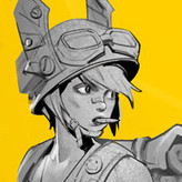
I know this assignment was specified to only measure the eyes, mouth, and nose on the subject used… I went a little overboard on this one and decided to do a full render. I realize there are many problems with this piece, but I’ve gotten to the point where I’ve learned enough from this one and need to let it go.
Any critique is appreciated.
I know he’s got a turkey neck, btw. ;)


André Machado
7mo
Don't be so hard on yourself. Even if the proportions could be polished, you captured the likeness of the subject very well. I also like the cyan blue rim light he has on the nose altough the one on the shadow side should be more discreet.
For the mouth, you could add some darker halftones in the interior to showcase more of the roundness of the lips and add a bright highlight to indicate the moisture of the lips.
Good job.
Show 1 more replies


8mo
Asked for help
Here is the 1st half of the poses. I like how some of them turned out. I struggled a bit with how to make the feet look OK, and I don't think I succeeded. I also should try to get a better line quality for these.
8mo
Hello.
The most important thing in this exercise is the flow of the rythms and these look like a success for me. For the feet, I usually just use the envelope shape of the whole foot and dont worry about the anatomy for this.
You also used very few lines but captured the action of the pose very well. I still struggle with simplifying and add too much unnecessary information.
Also usually in this step, you should use confident strokes with very light pressure since the goal is to add structure on top later with more defined lines. It's just an exercise so it's ok to use hard strokes, Just something to keep in mind.
I think you did a good job with these.
Show 1 more replies

9mo
Before I watched this demo video, I really didn't know how to draw some seal lions' photos. They are cute but lack of details. So I picked some a little more complex ones to draw, thinking they are easier to handle. Now I have more ideas. Thank you!
These two photos below are the most simplified and hard to draw I ever thought.
Show 1 more replies


9mo
Asked for help
Hey ,I've tried my best with this project. All critiques are welcomed
9mo
Hello. It's a good effort but I think you sometimes struggle a bit do add a dynamic flow to your lines when the seal is laying flat on the floor and some poses come out stiff as a result like the 3rd and 4th. Try using more asymmetry to guide the viewers eye through the gesture. Also make sure to warmup your hand first to improve your line quality. I can see some scratchy lines, particularly the 6th and 7th, and it makes the lines look insecure.
What I do is exagerate the gesture up to the point it where it doesnt break the form and nature of the pose. This will make the drawing more dynamic but requires a shape design that supports the exagerated gesture.
It's very important though that you watch out for line quality. It makes a drawing look worse regardeless of how well you master the other fundamentals. Use your elbow and do the ghosting technique Stan demonstrated to get a nice clean strokes. You'll see the difference is night and day.


11mo
Asked for help
Level 2 assignments, took my time with designing the shapes and making sure the line weight is informative. I feel like the latter ones look better as I got the hang of it.
Show 4 more replies
11mo
Asked for help
Did shape manipulation of an elephant and octopus. I think I managed to convey different personalities to each subject but I think I could have gone a bit more wild with the shape variety.
Learned alot with the line videos but I feel shape design is so important to make drawings look unique and professional. Can't wait for the next videos.


1yr
Asked for help
Hi all,
I ended up finishing another Figure Drawing & tried to apply whatever i learnt with the master study of Stan's own work.
I think @mrfrar you mentioned to start off with 6 values or less in my last one, I'm pretty sure this is more than 6. I found it difficult to simplify down to 6 values as simple as it sounded. If you see this & you don't mind, would you send an example of a figure drawing minimized to 6 values so I could use it as reference for my next?
Beside from that, Any feedback would be much appreciated as usual! I'm planning on finishing 1 more for this course before i move on.
1yr
Hello.
The shading on this one looks much more clearer and readable. If you want a figure with only 6 values, the figure drawing demo of Yoni from Stan applies this principle. If you want more of a challenge, you could try to replicate one of Michael Angelo's anatomy studies. It's a very complex drawing but the shading is only reduced to 5 values. I've attached it to the post.
Something that might also help is doing a compositional study where you just do a quick drawing of the figure but with the flat values and assign the 5 of them to the figure before starting the real drawing (2 for the shadows, 3 or 4 to the lights).
Try to make the core shadow darker than the reflected light. You did this well on the leg but on the torso it's much less noticeable.
This is optional but another thing that I like to do is hatching to give it some texture. For example, I would do some hatching surrounding the leg near the core shadow to better represent the cylindrical form of the leg.
As for the general form and gesture its pretty good. The only thing is the breast shape is a bit different from the reference. In the reference is more elongated but in yours it has a more rounder shape. Not that big of a deal tbh.
Show all replies (1)
Show 1 more replies
1yr
Asked for help
Hey all,
I finished this section of shading a figure drawing, Any critiques would be much appreciated.
Thanks!
1yr
The reference you used has soft lighting but you made your shadows too confusing. Dont overcomplicate the shadow family and make it compete with the light family. If you do, there's no harmony to the figure. For example in the legs, you have a mixture of shadow tones and half tones and this breaks the shading. For the shadows just use two tones for the start (one for the core shadow and other for the reflected light) and also dark cast shadows when the surface is covered by something.
The rule is the lightest dark is always darker than the darkest halftone. It's hard to keep this in mind but this must apply throughout the entire drawing. I usually take a few breaks when shading to keep my mind clear because it can get tiring if you shade for hours straight.
There are also some lines that seem unnecessary like the one between the shoulders near the spine and the other one the butt. Those sharp lines hurt your drawing so avoid them as much as possible unless it's absolutely necessary to indicate a sharp turn.
Always start by separating light and shadow with a single line (the terminator) variating between soft and hard edges observing the reference. In this case, it's mostly just soft edges. Make sure the shadow family has less details and focus more on the light family. You need to make a plane get lighter in the center (center light) with the highlights (if there's one) and that light slowly fades has it goes away from the center (halftones)
If you're just starting with shading, I recommend you use fewer values (5 to 6) just to master the fundamental concepts, then you slowly build up details by increasing the value range.
The form, gesture, proportions look pretty good.
Show all replies (1)


1yr
Asked for help
some front facing quick sketch
1yr
Hello. Good job on indicating well the tilting of the head. However, you should be more careful about the foreshortening of the thirds. For example the second sketch with the guy looking up. The thirds should progressively get bigger from forehead to chin so make sure to take that in consideration.
You can see a small difference in length in your sketch but it's not accurate with the reference.
Show all replies (1)

2yr
Hi everybody =) ...4 days ago I posted my 'final' finished piece for this course. (The last picture attached). I was not very happy with it. That drawing I made was probably the 6th or 7th drawing I have ever shaded so it came out pretty rough.
I studied light and shading for a few days and created this new piece to give the course it's proper conclusion. It just didn't feel right to finish this course with a drawing I wasn't excited about. But with this, I am satisfied to move on to anatomy =)
2yr
Looks quite solid. May I suggest you take a look at the portrait course and see the features. The nose and eyes look somewhat distorted. Also try to organize your values when shading so you can render the forms better so they look more 3 dimensional. I see alot of outlines on the abs but not 3D form. The shading on the right arm looks sweet but on the torso is weaker. Your proportions and structure for the body are quite nice though.
It's very important you get good consistency on shading before you move on to anatomy because after you indicate your muscles with outlines, it's the shading that will render the form of muscles. Your observation skills are pretty good though, keep it up.
Show all replies (1)