


Jacob
added comment inFeedback inquiry
2yr
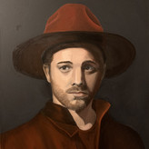
@Jan D. @C @blockhead Thank You for feedback! I decided to simplify the background and remove excessive vfx. Think it serves the purpose as a character design piece much better now. I'll keep in mind Your advices with my next artwork as I'm happy with this one as it is right now :)
Thanks again and have a great week!
Show all replies (1)

3yr
I do this for a living. You want to get a high dpi printer. HP makes good printers and they're pretty inexpensive. For highly detailed prints we us a epson stylus pro 11880, you also could run heavier canvas like materials if you don't want to print on solely paper.
edit : just realized you're doing small a3 prints. Epson would be grand format printing. I do know printers but cant recommend a desktop printer, sorry.
Jacob
3yr
Yaa, I want to start with small prints and maybe in the future move to a bigger format. 99% I'll go with Canon PIXMA IP870, after some research and thinking, it seems resonable to me not to start with more expensive printer. Will see if someone has to add to the topic though :)
Show all replies (1)
added a new topic
Printer for fine art printing3yr
Hello there,
I'm going to buy a printer to sell my digital art prints. I was wondering if anyone has some experience with such printers and if so any recomendations. I'm interested in A3/A3+.
1. Please only give first/second hand (meaning you have a friend who does print art) information. I've done some research but I'm interested in real opinions of users.
2. I'm not interested in outsourcing - I'm getting a printer anyways!
Thank You!
Procreate!
Hands down Characters for Animated Film with Daniel Arriaga on Schoolism! :)
Show all replies (1)
3yr
Hey Steeve,
overall a really nice piece. Except one major thing I think everything works great - the pose. Maybe that's just me but the pose reads as if the character is about (and can't wait) to be "..ekhm.." in the butt.. I'd suggest you looking for a pose reference, there are plenty of images and video's of monks with stick, and if you're going for what's called 'Monkey on a tree' trick, take a look at the reference below.
Once again, that's a really nice concept piece, it's just in my opinion the pose ruins everything.
I that helps, Cheers!
Show all replies (1)
Hey, I've been using XP-PEN DECO 03 for a few years now - it's great and cheap! ;)
Show all replies (1)
3yr
Holy moly! It looks great! Only thing I can spot is that all your thumbnails look pretty similar one to another. I'm really curious how you could push these shapes in different ways because the result looks amazing! AWESOME! :D
Show all replies (1)
Show all replies (1)
3yr
Hey Palmer, these look pretty good! Not much to improve really, just a few little tweaks I could suggest that could possibly push it further:
1. Change the middle man clothes colors just a bit - they're very close in values at the moment.
2. The left boy expression I feel could be a little bit clearer.
3. I've heard that a good trick to make sure a characters lineup feel like they belong to one world is to keep the eye size consistant.
These are very minor, and the only tweaks I can suggest. I hope that's heplful :) Cheers!
Show all replies (1)
Wow! Especially left bigger one looks great!
3yr
I think you can improve on gesture, perspective and anatomy. It's something I also constantly struggle myself.. :)


3yr
Honestly I think the painting is good, it's simple and stylized, yet pleasing to look at. I can imagine seeing it in an art of book of a feature animation movie. What looks a bit of to me is his upper anatomy and face. I think that angle of his traps is too extreme, I can't imagine it work in 360 degree turnaround. Also try to work on his face expression. It's hard to relate to the character right now. I think slight adjustments of his eyes Andrzej mouth would fix that. Other than than it looks pretty cool! I hope that helps :)
Show all replies (2)
Show 1 more replies