

Albums

Activity Feed

@coralsea
•
1yr
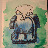
added comment inProject - Organizing Line Weight
Asked for help
Had another attempt while changing the light direction. I can feel that some things are not quite right but it was interesting for sure!

M C MO
1yr
I like it, it is definitely interesting

•
1yr
Looking good!
@coralsea
•
1yr
Asked for help
After watching the demo, I did two other attempts with a frog and a landscape with the importance method, and did a second try on the light / shadow rhino, I feel like it's a lot better!
@coralsea
•
1yr
Asked for help
Here's my attempt at the exercise. I just used different pens, so I didn't play on the weight of the pencil (dark/light lines). I don't like the upper contour of the front leg, it kind of feels like it's been attached later on 😂, same for the upper part of the right contour of the head. Should've made the eye thicker also. Super interesting exercise!
For the shadows/light method, I think I got really confused haha (the front leg seems like it's coming out of a shell like a turtle). I'll try again both exercises, and attempt level 2, after watching the demos, maybe with a different tool.


@breakfast
•
1yr
This was my attempt at the depth and form exercise. I don't think I have this quite yet. I'm going to watch the next demo and critique and then try again!
@coralsea
•
1yr
Asked for help
I chose a "simple" creature, without many different volumes and shapes. I love the energy and the flexible nature of rays. I had a lot of fun (and difficulties) trying to figure out where the eyes and mouth would go. At first I was thinking of a little ray doing acrobatic jumping, with the wings wrapped around her body (like a rocket) but it's too soon for me haha, I couldn't draw what I had in my mind.
So I just tried different things in the last 2 pages and ended up with a ray that jumped too far from the water and seemed scared of where she's gonna land.
It was a really good exercise for me, very good for letting go of the pressure of reproducing something, to tend towards more confident strokes and shapes.
I'll try again with the same animal and a different one after watching the demo and critiques
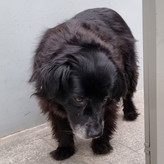
@coralsea
•
1yr
Asked for help
It was ok drawing the penguin and some parts of the character with the whole arm and shoulder but the hand demanded much more precision, and I just did the first gestural lines with the whole arm and quickly switched. I can't really do tapered lines for the moment.
Also, I don't know if the overhand grip is the best option or just normal grip but moving the whole arm? Any opinions? :)
•
1yr
Excellent! You did this assignment exactly as you were supposed to.
An overhand grip generally makes drawing with the whole arm easier. Drawing larger helps too. Overhand grip is how a painter holds their brush because they can make broader strokes.
If you want to draw small, the tripod grip is more natural.
I like to draw small and I think It’s good to practice both.
Big, overhand grip drawings help loosen up the hand and the mind.
@coralsea
•
1yr
I know it's not totally answering the assignment but I was asked to paint a mural, and I thought I would just do it with 6 values (for the skin), a little bit like the portrait assignment here (without simplifying the edges). I used 3 for the shirt, 5 for the hair. I'd be happy to have feedback :)
•
1yr
This looks great! Good job separating and designing the different value shapes
@coralsea
•
1yr
It worked out ok for the camel I think, it had rounder lines and the proportions didn't matter as much. Harder for the skull with all the little bits everywhere.
I also worked on another project (the woman) and I felt like it was a lot easier to draw confident lines on a big wall than on my small notebook.
•
1yr
Draw big if it helps with confidence! Good stuff
@coralsea
•
1yr
1st attempt with the snail, didn't really do my best there. I did it again, focusing on clean lines and it was much better. Harder with the boots and the hands for different reasons : the hand needed so much precision that I couldn't get myself to be more confident

•
1yr
I think the snail in the first image presented shows great simplicity and linework -- nicely done! With the boots and the other snail, I wonder how large your drawing is in real life -- having them too small may impact the quality of your linework. A good practice is to have them fill up the entire sketchbook page.
With the hands, keep in mind that because we are simplifying, having all the details of the hand's crevices is not necessary. Instead, focus on the overall outlines created by the fingers and arm. If you do want to add more complexity, a tip to try out is to keep the complexity only on one side, whereas the opposite side remains simple. That way, there can be some nice variety while still keeping things relatively simplified :)
@coralsea
•
1yr
Asked for help
Hi everyone! Happy to be able to share my attempts, all with just a 2B pencil. I drew the 1st pear without having the instructions (only "simplify"). Then I drew the portrait before watching the demo & critics. And 2nd pear 2 weeks after watching the demo.
I ran into an issue : I had 6 values, and decided to sacrifice the lightest shadow value (hence the 2 pictures). It's also a bit messy on the right side : after using the eraser, the paper would "catch" more the graphite, making anything very dark, not sure why.
If you guys have critics I'll be happy to read them!
Thank you