


@jdn
added comment inPortrait painting
2yr
woah ! , real? ??

@colormeant
2yr
Lol yes
Show all replies (1)
2yr
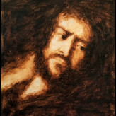
Colors temperatures and values need correction


3yr
I like the textures in colleration with the expression of the subject. This one can use more color temperature variations. If this light source is very warm and illuminates the whole scene with warmth then you can add cooler transitional halftone and keep both your light and shadow warm. Also I think the light part within the shadow half of the picture needs to be darken and cooler to push back a little bit. It's so exciting to see fellow traditional painters. Sorry for commenting so much. haha.
3yr
Thank you! Please don't apologize for commenting , this was an experiment, I tried a different approach, now I see the lack of playfulness of colors temperatures, thank you again!
3yr
It's a wonderful painting! Having that said I think it can benefit from some lighting clarification. Right now she looks like she's under water. If you're going for the ambient soft light sort of look, you can still group the lights and the darks into big passages first before breaking them down, whilst maintaining the hiarachy. How do you find painting oil on paper? I usually find it very absorbent and after a short while the colors would start to lose their chroma. Your colors look wonderfully rich tho. Also I think it would help if you include dimensions for your future posts.
3yr
Thank you for the feedback, I agree , I need to pay attention to the light directions , I rush things normally and did not want to use more time, my time is limited lol .
I sometimes gesso the sketchbook paper. Sometimes I dont and result in lack of chroma.
3yr
I like it, you may need to add variety of cool colors to play with the warm colors, also adjusting some chroma in the lights , just an opinion, i like your work.
Show all replies (1)

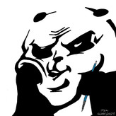
added a new topic
Self portrait age 383yr
I painted it in 2 stages , rough stage as a block in, then more or scumbling and glazing, any feedbacks welcomed


3yr
Hi @colormeant ,
What a beautiful painting!
My opinion:
The mouth is what jumps out at me first. Because of the red colour, and also because it's quite an graphic shape (with some harder edges) in the painting. Was it your intention to make the mouth the main focus of the picture? If not, I feel that perhaps some more hard edges in the areas you want the viewers' focus to go first, could improve the picture a bit . Also, I think that some more hard edges would give the face a bit more structure.
Furthermore I think that the use of some more cool colours could make the painting pop a bit more. And last but not least, I think that the shape of ear on the light side could be a bit more defined.
Quite an intriguing painting, I like it!!
.Leon
3yr
Hi @Leon ter Molen ,
Thank you for the feedback, I agree with you.
That painting was an experiment trying to achieve a specific aesthetic. The right ear was neglected, it needs cool colors. The mouth kind of a focus by keeping the edges sharp. I like some of the results. I will utilize them better in the future. Again thank you!
added a new topic
Umber sketch3yr
quick umber sketch, just practicing, i see many errors and i know it because it's better that an empty canvas
It doesn't matter what medium you use. Drawing is essential
added a new topic
Lilies, after Monet3yr
First time attempting master study of Monet, I learned alot, his use of colors and brush work is outstanding. This is an oil painting on board. I found a piece of wood board, sanded it down, 2 coats of gesso and one coat of titanium white. I enjoyed the process and I hope you enjoy it too.
added a new topic
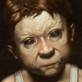
Portrait Oil Study on paper3yr
Destroy me with criticism, love to hear feedback, I rushed things because I was sweating, it's too hot in my working area lol I know I have to take my time ensure accuracy but I whipped it quickly, I always struggle with time.
This took 2 hours.


great work mate,i love the way this has turned out .... keep creating more of the good work ....i guess a lil more wrinkles on the clothes over the head would have made it even awesome you know not acttually wrinkes but a lil texture or color graditient kinda stuff. but overall its too good to be judged by me..
3yr
Thank you for the feedback, I may need to add more texture to the scarf, I afraid of overdoing though!
Show all replies (1)
added a new topic
Portrait drawing study in progress3yr
My issue is the time that drawing needs, still adding details when I have time, feedback appreciated

3yr
We're all always still learning ;) Nice piece, I like the soft look. I'm not sure the dark background works as well with the soft lighting though, I feel like it needs some variation or lighter more variation. I'm probably wrong, but I think the dark background would suit harder shadow edges to accentuate the contrast.
Her ear is also maybe a bit bright, but it's really nice overall :)
3yr
Thank you Dan! Background is hard lol
I need to add a something to harmonize the overall look, thank you for the feedback !!
added a new topic
Portrait Study 2 -A Girl With a Red Scarf3yr
I got tired and lost focus, I should walked away and come back a different time, any feedback is appreciated, I'm still learning.