Portrait Oil Study on paper
4yr
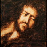

@colormeant
Destroy me with criticism, love to hear feedback, I rushed things because I was sweating, it's too hot in my working area lol I know I have to take my time ensure accuracy but I whipped it quickly, I always struggle with time.
This took 2 hours.

Looking pretty nice! I like the soft shapes, so it leave a bit space for the viewer to decipher.
The only problem to me is this specific posture looks a bit too "nose up", maybe it's the proportion, or just the lighting and the hair shape make me feel that way. Sometimes photography does look wonky if you copy them. maybe I'll try tilt the head just a bit downwards, so the eyes won't appear as high, or just thicken the hair on top. Because the jaw in the image doesn't really show much of a "up tilt" look, so that might be the issue.
(Or... this could totally happen if you referenced an image with wide angle lens or the viewpoint is too close to the person's face. This is a common thing in portraiture both in photography and painting, this ends up making the eye higher and the jaw lower, basically stretch the look of the face, so maybe you can look back at the original reference, and see if it shows this kind of "stretchy/wrapping" effect)
Also, maybe you could treat the contrast/edge in both eyes differently, like to slightly darken/blur the eye on the far side, so it best emphasizes the eye in the front which has a very sharp reflection compared to the rest of the image, which naturally becomes the focal point. Now both eyes have roughly the same contrast, so the viewer could jump around in those two spots.

Great classical colours! I would personally spend some more time on it moving the mouth to the left and work on refining the lips. I would also add some sharper edges and details in strategic places.