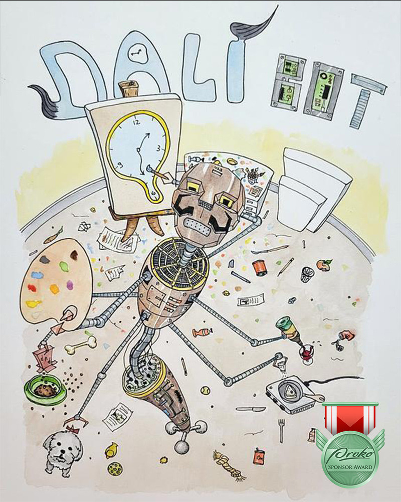
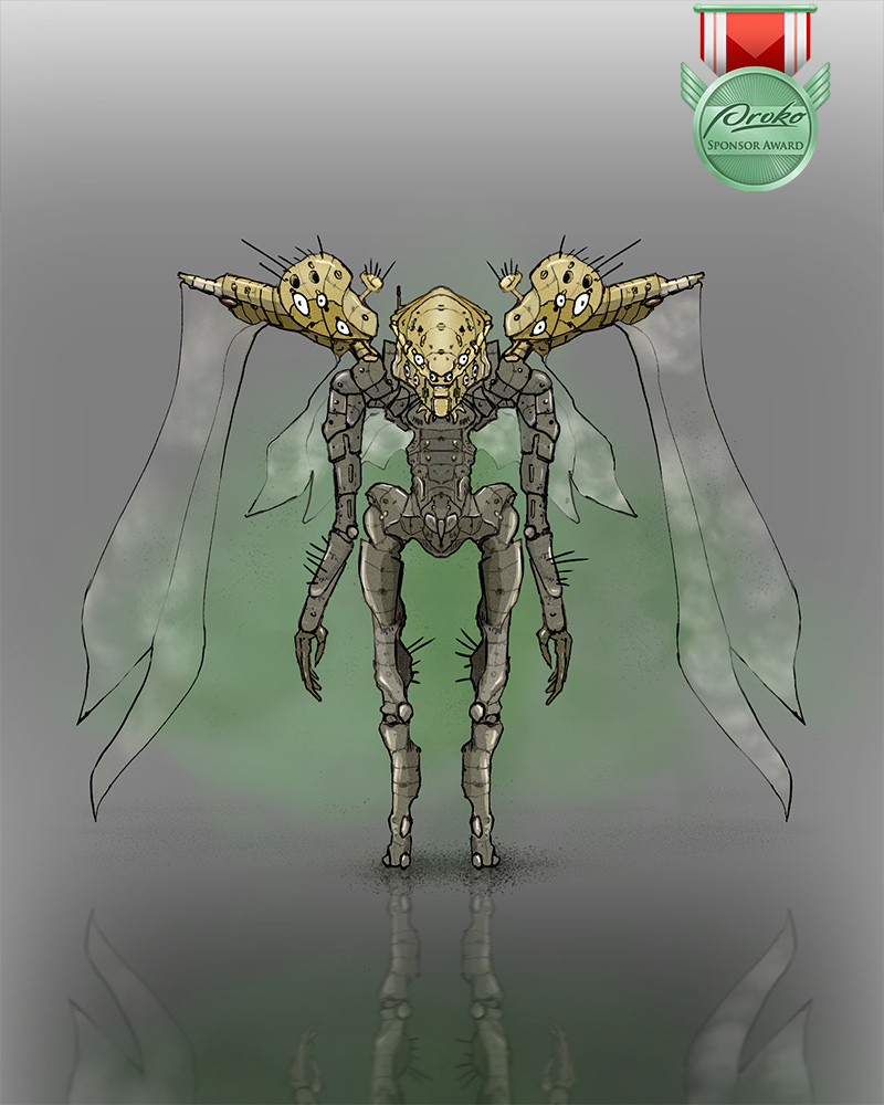
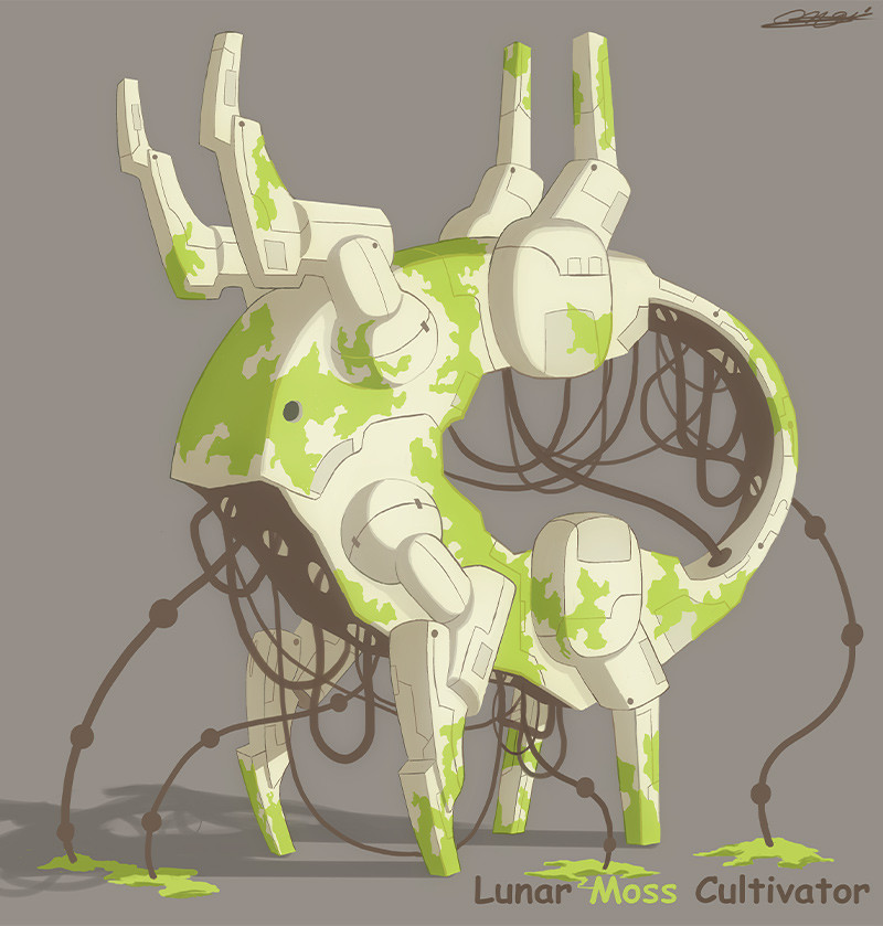
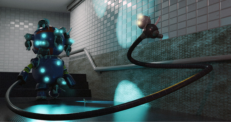
CHALLENGE: For this month’s challenge, we want you to create a sensationally strange robot! We’re talking about a truly Odd Bot that pushes the boundaries of design and your imagination. Using your preferred medium, loosen up and get your creative juices flowing in order to design an odd bot for the consideration of this month’s judge: professional artist and robot aficionado, Josh Sunga. Josh will judge entries based on fun shape design, interesting proportions, cohesiveness of idea and the overall "oddness" of your odd bot.
Prizes provided by: Wacom, Sentient Academy, Vision X Live Conference, Trekell, Canvy and Proko.
Prizes
Winners will be contacted via the email on their Proko.com account.
1st Place
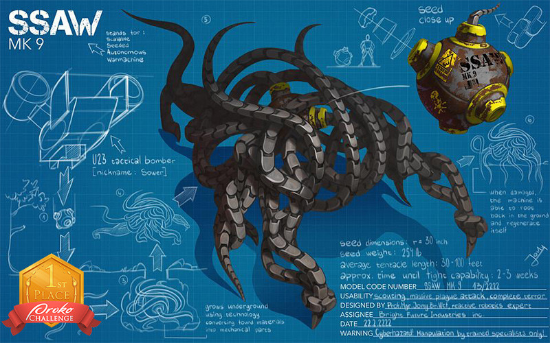
Jomy - @jomy
Prizes
Wacom One Creative Pen Display
1 year access to Sentient Academy
Vision X Replay Pass
1 year Canvy subscription
Proko Figure, Portrait, and Anatomy courses
Josh's Notes:
The layout is great and when I read the notes and ideas it became awesome. And of course the design itself looks super cool. Good job!
Paint a Statement:
The render here is solid but I want more of an impact in the mass of tentacles creating the body. As of now the lighting is even across the body and the legs at the forefront. Casting a bigger shadow where those limbs connect to the body would help break up the lighting. This alongside the fact that you silhouetted the back will make the head a better anchor point. Another lighting trick you can try is exaggerating the contrast in the cast shadow on the ground. Of course, you want to do this in the area you want the viewer to pay most attention to, namely at the front of the robot. You could also try popping out some of the nice negative shapes you got.
Texture:
Texture is the next obvious step- just as you did with the close up of the seed. I would keep the dirt stains in areas near to the ground and paint loose scratch marks in the spotlight of the head. (Scratches on metal catch light easily and are thus good tools to capture attention). Wear and tear on the metal could be represented with darker brushstrokes to get variation in the values beyond just light and shadow.
Color Variation:
A lot of this is a stylistic choice but introducing subtle (or not so subtle) color variation can help distinguish areas of interest or just pack more energy into a painting in general. Especially because the seed idea is so cool I want it to pop more. It’s a great secondary focal point as the viewer connects the dots through the blueprint notes. Bumping up the warmth in that yellow by a lot would serve as a nice accent color amidst the otherwise monochrome design. And since it’s so obscured by the tentacle arms I think you can get away with more saturation. (Also notice the proportions in the seed caps. The alternating shapes of yellow and gray are roughly equally sized. Try to get a BIG MEDIUM SMALL in there).
You can use gritty colors to emulate dirt stains but sometimes I like to just add colors that I like. Hints of green and red are justified in metal as it’s oxidized- I like to take artistic liberty with this. You can even integrate some of the blue from the background into the lighting. When it comes to color I’ve been trying to express the more artistic side of the process recently- whatever helps the design look cooler!
Other Notes:
If you’re up to the tedium I’d exaggerate the bends and twisting motions of the arms by varying the width between each link in the arms. As an arm bends back the separation between the links would be greater/As the arm curls in the link would compact together.
2nd Place
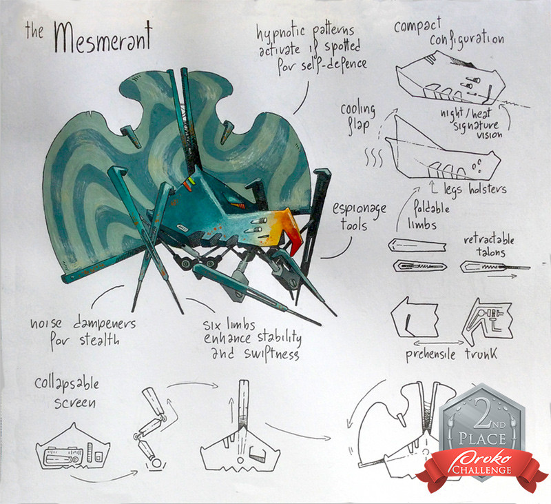
radicchio - @radicchio
Prizes
Wacom Intuos Small Bluetooth
Vision X Replay Pass
2 Proko courses of your choice
Josh's Notes:
Awesome concept and presentation to match! (I always love to see notes!) And the hypnotic idea is just cool. Good job!
Iteration:
This design is solid to me, so if you still want to move forward- I would take the iterative route. (Though there are a few tweaks I’d make here and there; it wouldn’t change the design too dramatically.) The goal here is to get variety on the page. Make simple and bold changes like making the hypno-panels a lot bigger. One iteration can be a lot taller and another much wider. Or exaggerate the trunk- maybe pull it out more aggressively. Try giving it more eyes. Flare out/widen the cooling flap. Perhaps make even the whole body a lot longer. Maybe add needle-like projections to the body as a defensive measure- maybe they shoot out like darts. (To go along with the hypnotic theme, maybe they are sedative). Piggybacking off this, maybe the limbs can shoot out their needle legs as a last ditch effort of escape. You’ll get to see if these changes are valid to you as the designer when you see them all together. An idea can rapidly develop this way and many times it evolves into something you think is cooler. You’ll be able to pick and choose aspects you like from each iteration and improve your design. (Though sometimes you see that what you had originally is best). It doesn’t hurt having the explorations anyway- you could make a whole line of espionage bots designed with different abilities and purposes. I love working iteratively because you develop a range of designs and get to work in a growing visual context that helps your idea become more unique! (This was probably the most practical exercise I did to hone my design sense in school- making each iteration different is simple enough but you get to see how powerful shifting proportions and shapes around affect a design).
Other Notes:
Make the hypno-panels semi-translucent and much brighter. The trippier the better! This would also break up the uniformity of green and the material throughout the design. Another way to break up the color/material monotony is making the inner metal of the limbs a warm gray.
Dramatize the legs to make it feel skittery and sneaky. Try to pose it in motion to make it feel creeping.
I would also pull the head up more- just enough to make it look inquisitive.
3rd Place
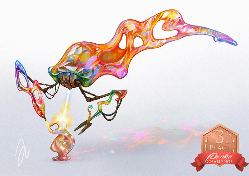
julia_nedzynska - @julia_nedzynska
Prizes
One by Wacom Pen Tablet
Vision X Replay Pass
1 Proko course of your choice
Josh's Notes:
Love this idea and wonderful colors! It’s a great example of playing with crazy shapes and being able to justify it through design.
Continue to Wonder:
When an idea lends itself to your imagination don’t stop asking questions. (Ask as many questions as possible even if it is only slightly related). The name “Glassworker’s Assistant” really sparks the imagination- we get to wonder about that relationship and who the glassworker is. To me, it’s cool if the glassworker is as we know glassworkers today- but I always try to stretch an idea beyond our world. Maybe the glassworker infuses his material with various magical properties. How would said properties affect the glass and the visual design itself? You could explore this for days and I guarantee you’ll come up with an even more fantastical design. I also imagine the bot itself is like a hermit crab and makes random glass pieces its home. Maybe it’s only able to use the glassworker’s failed sculptures or maybe the glassworker makes “shells” for it. (You’ll always come along a split path in exploration so I’ve resigned myself to just explore everything- it’s my favorite part of the process anyway). Maybe the glassworker also makes the crab “glass claws.” (I know it makes more sense to give it glass cutting tools but I always want ideas that I know will allow me to push shape design). I like ideas like this because “glass claws” don’t make sense at first. There’s a contrast with the toughness of a claw and the fragility of glass- and just as contrast builds interest in visual design I believe it does just as well in words and ideas. Thankfully, we artists get to solve these problems with our imaginations and having the glassworker craft unbreakable glass with magic or with certain rare ingredients isn’t too out of reach!
Shapes:
Your shapes alongside the colors create a fun visual. I love playing with irregular shapes and though by nature carry visual interest- we can tweak the design to have a little more. Notice how all the major shapes are elongated and slender. If we vary the characteristic/proportions of our shapes there will be contrast and thus, more visual interest. The perfect spot to create this contrast would be the head (it’s already the most contrasted being metal and a simple sphere shape). It’s as simple as doing the opposite of “elongated/slender” so I would round out the glass portion of the head and make it more obtuse. This in turn would make the rest of the slender shapes feel more elegant and we’d get a nicely tapered shape from head to tail.
Notice the negative shapes and their general groupings. The ones in the tail end are all the bigger negative shapes and fairly equally spaced. The negative shapes in the arm on the left are all similarly medium sized. Though the shapes are good you can still vary the sizes more to get better contrast between them. BIG MEDIUM SMALL isn’t a hard rule but it would help here.
Hierarchy:
Your robot is equally rendered everywhere so we miss out on all the movement we can design by creating a hierarchy. (A good hierarchy allows viewers to navigate your design through
primary and secondary focal points/areas of interest.) There’s no one way to create a hierarchy but a focal point can really hit home with good lighting and controlling the level of render in different areas. Notice the highlight shapes you have on the head. I would organize them closer together and describing the form better so the concentration of them would grab more attention. You don’t have to make your lighting super realistic- but let it be a compositional tool to direct the eye at the very least. Simply making the tail gradually darker toward the end will help the eye return to head. This helps creates that movement between areas of interest.
And lastly I’d make the sculpture smaller and possibly a different vibrant color. There aren’t too many small shapes in this design- and perhaps a bright green will offset the warm colors while still tying into the hints of green you have in the head area.
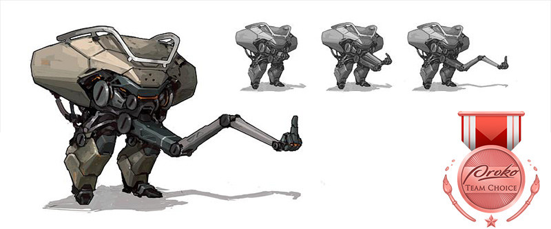
Team Choice Award
Tory Tan - @tortor
Prize
$250 Proko Gift Card
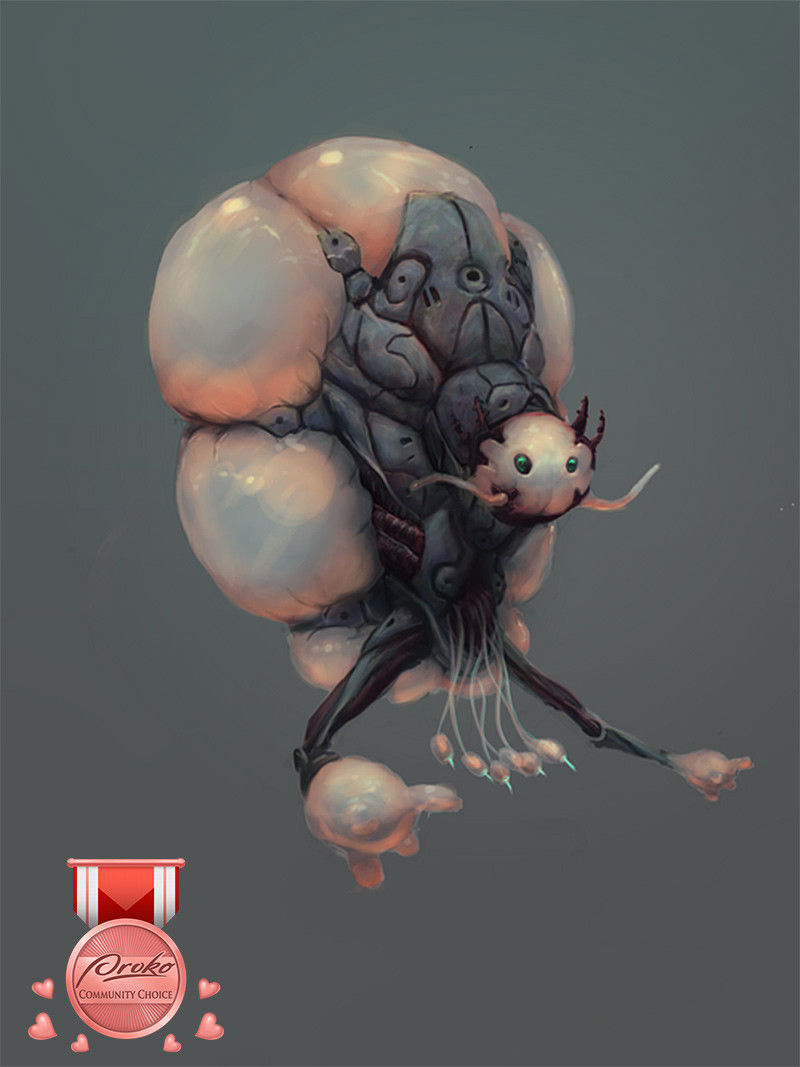
Community Choice Award
waldhari - @waldhari
Prize
$250 Proko Gift Card
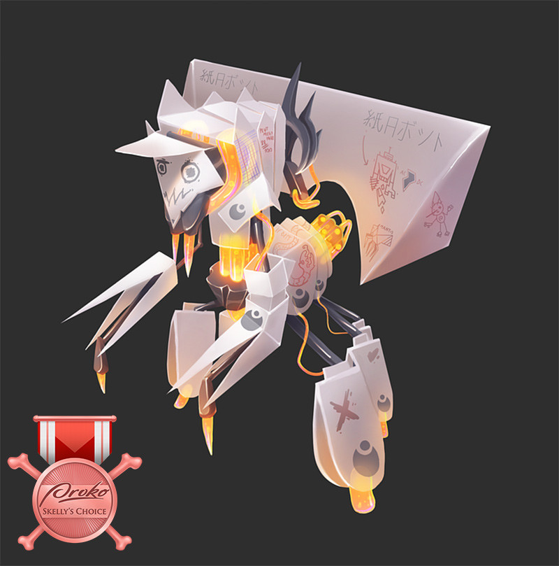
Skelly's Choice
côme - @magicraymon
Prize
Proko Skull
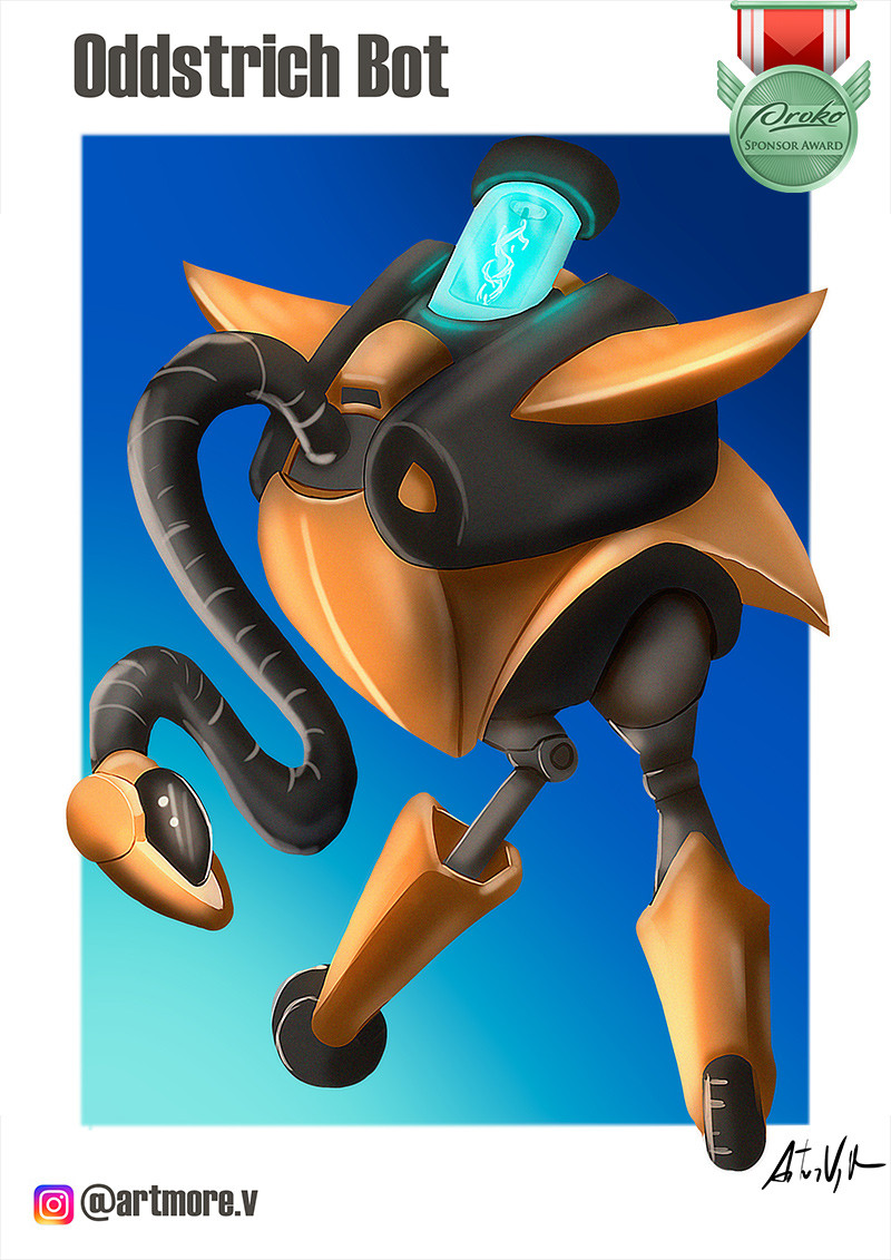
Wacom Random Winner
artmoreira - @artmoreira
Prize
Wacom is awarding a random participant a Wacom Intuos small tablet.
Trekell's Choice
Cecilia Stagni - @cecilia_stagni
Prize
Trekell Brush Set for Winner’s medium of choice, Trekell Panel, Trekell Brush Soap, Trekell Brush Restorer, Trekell Brush Case
Sentient Academy Choice
Vincent Schneider - @vswrks
Honorable Mentions (in no particular order)
maddium - @maddium
Josh's Notes:
You got me at the name! The design is wonderfully odd and helps me get lost in my imagination too. Is it on our moon? Since when did moss grow on moons? Maybe some people call it moon moss and others lunar moss to sound more sophisticated… Whenever an idea gets me asking questions it’s always good for the design.
But onto the critique!
Value Structure:
The easiest improvement to be made is to bump up the contrast. Notice the whole image feels set at a midtone in the value range. I would make the background lighter and the dark parts of the design darker. (Local value and shadow included). We can create movement for the viewers’ eye with better contrasts. You can also set a light gradient moving up from the ground plane. It could allude to the glowing of the moon that it’s on and it would help silhouette the legs and wiry bits below. (Allowing the viewer easier access to a point of interest on the first read). To push this lunar lighting further I’d darken the top portion of the background even more to silhouette the top legs of the robot as well. This would create an alternating dark on light and light on dark value structure which is varied (increasing interest) yet balanced (creating unity).
Simplify the Shadow:
I usually simplify the cast shadow on the ground and try to just make it a shape that compliments my design. Any major shape you put in the image should add value to the piece. Though the shadow emphasizes light direction- it’s obvious enough with the lighting on the robot itself. The shadow also creates movement but the frame is too small that it feels cramped. I’d either extend the frame and make the shadow a more significant part of the composition in leading the eye to the robot or simplify it.
Render the Tubes!:
I’d spend more time on the tubes because they start to flatten out the image given that they are painted with a single value. It’d be good to silhouette most of the wires, but because they are a big part of the design I would render a few of the main ones.
Also some spontaneity when drawing dangling wires is good but I’d try to make each tube follow a more designed gesture.
Functionality:
I’ll take fun shape design over most things and I don’t prioritize functionality beyond a sense of believability. That said, it doesn’t feel like the legs of the robot can bend. (But I actually like the idea that the legs don’t necessarily have to bend and primarily move at a pivot from the body. The clunkiness in that movement would be more charming)! I’d either design joints to improve functionality (simple as drawing a circle to create a hinge joint) or I’d make the leg design even more primitive to make it feel purposeful in its clunkiness.
Shape Break Up:
If you notice- all the cut lines you designed on the surface break up the shapes they are on into different sections. Try to compare the sizes of these newly created subsections whenever you’re designing these internal details. (Just as you want variation in your overall shape design/proportions, you want it in the smaller break up of shapes). The inner details you have either break up the shapes roughly at a 50/50 split or create all similarly sized subsections. Try to design your internal details to create a variety of big, medium and small shapes within a given shape.
Bonesy - @bonesy888
Josh's Notes:
Love this! This specific shot is awesome - the heavy bot is contrasted nicely with the dynamic tube arm. There’s also a great contrast with its slow, clunky walk which you captured well versus the zippy motion of the arm.
Proportions:
I like the simple, bubbly shapes but the body and head are too similarly sized. I’d make one slightly bigger than the other. I’m thinking the torso would be the safest bet- if the head is made bigger it may feel too heavy with the doll bots attached. The arm break up is also a 50/50 split with the forearm near the same length as the upper arm. To alleviate the monotony I would make the forearms even fatter (it would play well with the bubbly shape language you have already) and make the upper arms slightly shorter. It also plays into the idea that those arms are being used to catch these dolls and would perhaps need something more heavy duty.
On the same note I would make the leg socket shorter and design the feet to go gradually wider for the same reasons of variety in the proportions. How stylized or exaggerated you want to push and pull this is up to you. I always try to get contrasted proportions because it directly affects shape design and builds visual interest.
Adding More:
Your overall design is great in terms of concept, posing, and having a head full of robot baby dolls attached (It’s a great focal point to work with). You also designed the repeated internal details well without getting too monotonous. Though one knit pick is that the red decals can have varied proportions with widths and lengths. But texture and material variation is the next major step- I can already imagine the grime you can put on this thing taking from the Big Daddy inspiration. You can use the paint job to communicate a lot- adding even your most basic industrial type or symbology could really push the realism. Paint chips/scratches, grime on the lights, broken lights, rust or oxidation- as of now the bot is too pristine. And of course, introducing the various materials the bot consists of goes hand in hand with textures.
Focal Point:
I would tone down the blue lights in the torso so that the head with babies on it becomes an even stronger focal point. When creating your scene there’s lots of options to explore too. You can either put the head in direct lighting to show it off or put it in shadow to that viewer only sees the white of the eyes of all the captured dolls at first- it could be a nice dramatization! (I love the different baby poses you have and the fact that the captured ones have white eyes. Maybe you could have one turned off with its eyes shut down too)!
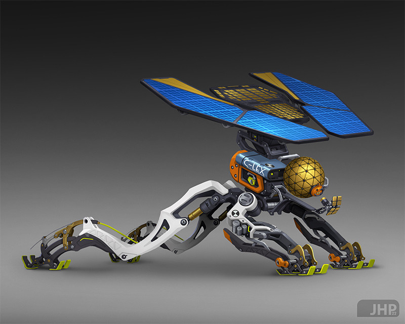
João Henrique Pachêco - @jhpacheco
Josh's Notes:
Love the weird proportions! And the material variation is great and well balanced! Awesome shape design too!
Focal Point/Movement:
I have the urge to make the head huge! As of now the legs carry the most visual interest being the most complex. But I want a better visual pay off after following the flow of the legs up to the head and the solar wings. Making the sphere head almost filling the space between the ground and the wings would give it more of that STATEMENT I want. It would be a nice anchor point too being a simple shape amidst the surrounding complexity of your design. This way the viewers can get lost looking around at the intricacy of all the tech but always find their way back to a strong focal point.
Visual Associations:
Your design feels like a creature which is awesome. Imagining the solar panels as “wings” makes me want to explore an iteration where we make the panels much longer and mirroring the sleek gesture of the legs below. I would definitely explore different silhouettes of solar wings based on different creatures too.
Another iteration I’d like to explore would be after making the sphere head bigger. I want to see how integrating the blue solar panels into the likes of a lion’s mane would look. Your design is like a chimera of a dragonfly, grass hopper and something mammalian to me. It’s not that you have to pick an animal and make the inspiration obvious in the design but I like to make as many of these visual connections as possible to spark my imagination further which helps me explore more interesting shape design with intent. Ideally in the end I want the whole of my designs to have the depth of interesting visual associations, good shape design and that aforementioned STATEMENT.
Give it a Name!
Your design is one of the most well executed and cohesive in terms of functionality. The proportions are fantastic as well! The next step for me is pulling out an emotional reaction out of it! Whether it’s giving it some more animalistic attributes or making it more menacing or cute doesn’t matter to me as long as it helps the viewers get lost in their imaginations with your design. Giving it a name makes you think about cohesion in terms of the design’s overall purpose. Even the most simplistic name challenges you to see if all the parts work together to be called said name.
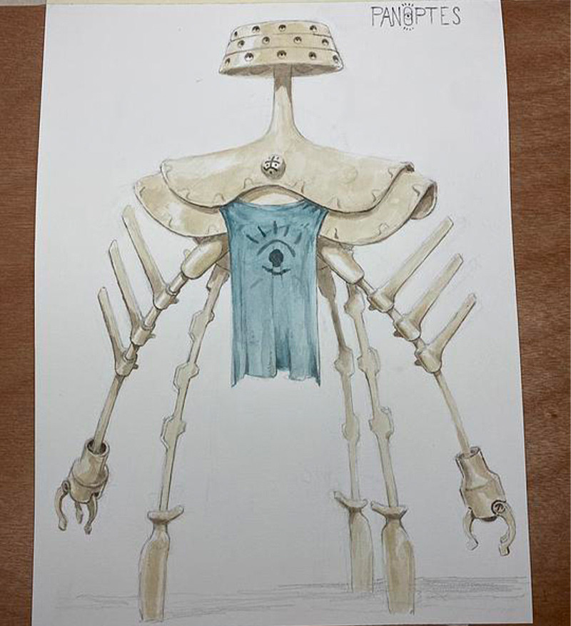
Jonas Wenzel - @jonaswenzel122
Josh's Notes:
Nice! It’s great to see something traditional. The shape design is unique so great job. (I know you won’t be able to make changes as easily but you can always scan this image and modify it digitally too)!
Visual Weight:
Consider the uniqueness of each element you add and how it pulls the attention of the viewer. (Force of attraction determines visual weight not necessarily the largest component in a piece). As of now the top piece with eyes is competing with the face mask which makes me wonder which one is the head. I’d pick one to be a more dominant focal point by either repeating the face mask throughout the shoulder pads to make it a less unique shape or making the top piece smaller and less eye-catching. Either one is valid but you’d have to see what looks better. (I’m thinking the former could emphasize the “Argus” inspiration more but it might look too tacky).
Other Notes:
Establish the shadow below and make the feet feel more planted to the ground. As of now the pencil shading works but it looks unfinished. Even if you just scribbled darker lines beneath it would feel “finished” if your line quality is confident. I’m personally trying to get better at leaving areas a little looser and more expressive to add that artistic touch to an otherwise fully rendered design.
Turn the hand on the right to show the third finger so it doesn’t flatten out.
Something I would want to explore is continuing the spines on the arms both up to shoulders and down to the wrists.
Though the strength of this design is in the simplicity of shapes I would add a little more detail to the feet or adjust the shape just slightly more. (The hand shape is designed simply and has just enough interest). Another route you could go is stretching the foot shapes to be taller- it would become a good medium sized shape and contrast nicely against the primary large shape of the head. (The two shapes being tall vs. wide respectively). With the newfound contrast here, I would also consider making the blue fabric much taller and slender- almost touching the ground. This would definitely make the bot feel taller and imposing.
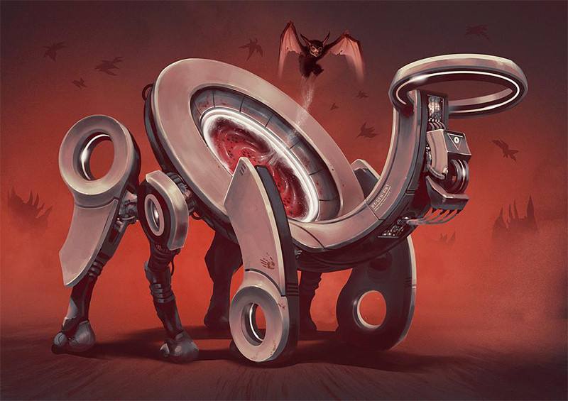
Joe Watson - @joe_63
Josh's Notes:
The concept is awesome! And I love that you are creating a mood here.
Action Angles!:
The entire image alludes to a lot of action which is something I want to infuse more into the design itself.
You can do this by pulling the front legs forward or backward at an angle. You can also make them angled inward. Creating better angles simply makes the design more dynamic. I would also taper the front legs toward the circular feet. (Tapers can be subtle but still help lead the eye from one end to the other). I’d make the hind leg armor plating taller. (This would make the angle its set at already more noticeable and dramatize it.) If you notice through the repeated shapes of the legs, there is a zig zag motion- I want to capitalize on that and reinforce it.) It’d be a nice rigid contrast with the swooping gesture of the neck.
Focal Point:
The focal point is obvious here but we can support it more with small tweaks in the design. I want to see if making the neck/head more slender would help the portal body feel more dominant.
Another definite way to bring attention to the portal is making the splash from the emerging bat more like a rush of blood rather than a faint white spray. That would definitely become a stronger anchor point for the image. (Especially if you design the special effect in an erratic motion to contrast the heavy, industrial shapes of the robot). It would also be rendered with more highlights which are eye-catching by default.
(Your design alludes to the notion that the portal is powered by blood so this would establish that as well).
That said, I want to up play the blood stains on the robot but would be careful to not over do it. I’m thinking I would add a bloody mess of loose paint strokes on the ground which would also contrast nicely with the robust/solidness of the robot.
And still another way to pull in our eyes back to the portal/focal point would be to strengthen the gradient you have in the background. I’d go darker and more purplish at the top to pop out the red of the portal. A simple cool and hot temperature shift through the color can work wonders in adding interest and directing the eye.
I’d also make the bat face smaller- it will make the robot feel bigger and commanding. I’d also vary the two background shapes on the left and right more. Maybe one more simple and at a different height.
Another suggestion would be to (since the image feels hellish) make the fine print and symbols on the bot more runic and ancient!
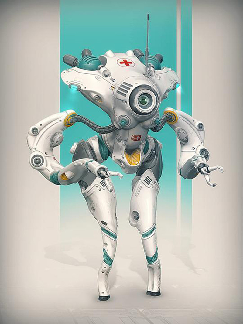
Tarek Samaan - @tsamaan
Josh's Notes:
This is great! Your break up of shapes is working super well.
Adding a Twist:
We could push the proportions by making the legs a little taller or add some dynamic lighting to pop out a focal point but your design is solid and I’d rather challenge it in a different way. (Your proportions and shapes are weird enough and I love it.) I’m wondering what interest we can add by asking how or what this robot heals being a medic. (I know it works perfectly well as is but I want to add a twist worthy of the weirdness in the design). Because the anatomy is tentacle shaped I’m thinking it could be a medic bot for aliens. This way I could open up the design opportunities for myself beyond “medic robot that heals humans.” I’m looking for opportunities to give imaginative reasons to cool parts of the design. For instance, you made that yellow vent in the groin area which alone is a cool visual--but I’m thinking the robot can use it to insert baby alien slugs (either to incubate them or use them for power- or maybe it’s a symbiotic relationship!) Whether the idea is too outlandish or not- I’m liking the path of ideas it might lead me. In turn, I would have to design visually how to communicate this- which (potentially) adds more depth to the design. Finding any excuse I can to add a story twist to the (hopefully) interesting shapes I have is always what elevates a design from great to awesome or interesting to wonderful.
This is my personal preference obviously because I enjoy more outlandish designs- I’d definitely move forward with the whole “powered by alien slugs” route and try to integrate that into what you have. Maybe the robot is infested with them almost- slime could be dripping from different crevices. Maybe it’s even holding one in its claws. That way you can have the eye looking at another character and create a moment for the viewer. Maybe the spheres in the back hull harbor the collected slugs and are made of glass so we can see them silhouetted against the background. I could go on but the point is that your design is already great but I want to build an interesting context around it to feed back into the design. Of course, it’s up to your imagination to find a path that you’d like to explore!
Other Notes:
I know this was modeled but I’d add slight color variation and paint strokes in larger shapes/areas of rest like the upper legs or the head area.
Get loose and add paint strokes in the floor to add more energy in the piece.
Strengthen the gradient you have in the background. A darker top portion will definitely help the head silhouette pop as well as the glowing lights on the sides.
Harvey Bailly-Passfield - @harveybp
Josh's Notes:
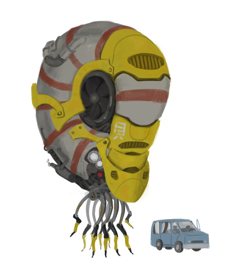
This one is charming and I love the simple storytelling! I imagine this thing curiously floating up to the van and terrifying the vanished driver. It also reminds me of Simon Stalenhag’s work which would be a great reference for this.
Focal Point:
First I want to pick a point of interest within the robot and make the viewers’ eye gravitate there. If you pull attention to various places you create a hierarchy and you can design the movement within that hierarchy. You just have to ask yourself which parts of the design do you want the viewer to notice more?
I would pick the eye area of our bot. I’d increase the contrast around the eyes so that they’d appear glowing. This alone would create a better focal point. Also with some dynamic lighting we could definitely create more movement and mood in the image. I would put the whole top shell in shadow just above the eye.
Value Structure:
The value structure here can get more contrast in general. The majority of the image is in the midtones. I want to add more darks and lights. You have a good break up of values with the turbine and lower portion of the nautilus but I’m thinking we can get a better separation of parts if we make the tentacles even darker against the lighter value shell.
Another area to vary the value structure is to paint the vents you have yellow in dark grey. On the other end of the spectrum, I would make the yellow plates more specular- adding highlights. This would increase the range in your values- and allow you to direct the eye with different value contrasts moving forward. A simple way I think about it is that any sort of contrast adds interest and grabs attention. The most easily detected contrast is through value!
Contrasts:
Another contrast to capitalize on is round vs rigid. Notice the top portion of the shell is a nice, long curve coming down to the more complex parts of the robot which have more hard edges that you can accentuate in the silhouette. (Sharpen silhouette breaks like the bottom left exhaust and make the shape more distinct).You are already accomplishing a good contrast with the bigger shapes above and smaller shapes below. I always try to think of different contrasts in my designs to implement/exaggerate no matter how secondary it might seem. You can even carry over the round vs rigid to the nautilus and the van. I’d sharpen up the silhouette of the van and round out the nautilus shell even more. (Making the red stripes wrap around the form better would help here)
And the last thing- lower the car and make the robot appear to be floating!
Wei Chai - @wei
Josh's Notes:
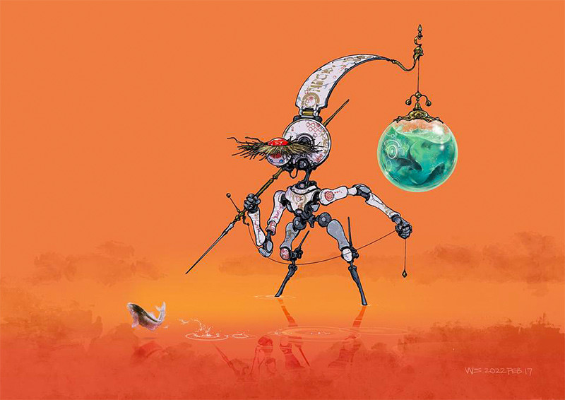
Awesome! Love how the image feels ancient and advanced. I can definitely imagine a cool world for this bot to exist in.
Pushing Proportions:
The proportions overall are solid but I’ll suggest a few tweaks that could increase the visual interest: Make head smaller/straw hat wider- this also gives you more room to showcase the neck (which would help with clarity/depth by showing overlapping parts).
With robots I try to contrast my proportions as much as I can get away with. The arms look fine but I want to make the upper part shorter and the forearm longer. Same with the legs. (The legs feel like stilts but you can establish this better by making them taller). Doing this the leg design would have a BIG, MEDIUM and SMALL shape with the lower stilts, the upper leg and the knees respectively.
Making the straw hat more prominent by pulling it out wider. (Will emphasize the contrast between robotics and the “village feel” you have going on). That said, I’d consider making the spear more makeshift to go along with the straw hat. It could develop a story here by contrasting the ornate/high-class design of the robot against the fishermens’ duty it is performing. That’s got me asking lots of questions already about this imaginary setting you’ve created!
Material Contrast:
A contrast to exaggerate would be between the functional metal frame vs. the ornate plate armor. I would make the darker metal feel more rigid and worn/rusted to make the elegance of the white plates more apparent.
Style Consistency:
The upper legs are cast in shadow but the rest of the image is flat lighting. I would keep the quads white.
The fish and sphere of fish are over rendered compared to the line and flat color style you have. I would outline them and simplify the rendering to flat colors.
You can also really emphasize the moment here by designing more eye-catching ripples in the water- I would definitely stylize it.
And lastly, props to you for creating a great setting! There’s always beauty in simplicity.
Roy Larreteguy - @roylarreteguy
Josh's Notes:
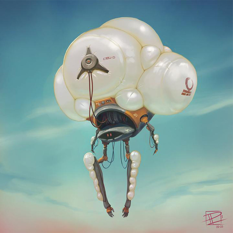
Love the idea and the friendly/playful world I imagine this guy floating around in! I like the contrast of the primary, top heavy shape contrasting the smaller, slender arms.
Exaggerate!
First I want to exaggerate the upper cloud shape. I would explore different widths and heights. (Whatever the core interest of the design is I will try to hone in on and make it a STATEMENT)!This will help with the proportions of the design too. The top cloud is too balanced with the robot below. (If you drew a line at the bottom of the main cloud it would roughly be a 50/50 split from the top and bottom of the design. Try to recognize these visual ratios and keep them offset. I would love to see an iteration where the cloud was huge and the head and arms smaller in an 80/20 split.
Big, Medium, Small:
Breaking down the design into its most distinct shapes helps with varying proportions. Within this design I could simplify it into the top cloud, torso/head and then the dangling arms below.
The cloud is obviously the biggest shape. But I’d argue the torso/head area share the same visual weight as the dangling arms (even though they vary in proportion and shape.) If you drew a box around each section you’d see they fill roughly the same amount of space. Using BIGMEDIUM SMALL as a guide I would again exaggerate the cloud to fulfill the BIG, keep the head/torso as the MED and maybe make the dangling arms the SMALL.
Other Notes:
The design also has me thinking about different types of clouds. This gets me thinking about possibilities like the robot having different modes based on the weather or just having separate iterations.
Vary the size of the cloud shapes on the arms. Apply Big, Med, Small even to your secondary and tertiary shapes if possible.
Increase contrast- darken the shadows.
Remove wires or make them more attractive gestures/let them lead the eye through the design more purposefully.
Maybe make the head smaller- it would make it feel more hermitted. Or designing the shadow on the head to follow the hood that is casting it might accomplish the same effect.
Make orange feel hotter/saturated especially against the blue sky.
Making the eyes glow more would create a good focal point.
ofelia - @ofelia
Josh's Notes:
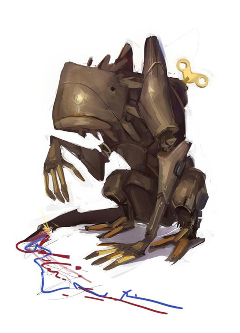
Love the character this robot has! Your painting style really helps build a whimsical mood too. I imagine a wholesome story about fixing the bots tail. It would fit perfectly in a dark fantasy setting too.
Focal Point(s):
I love the looseness in the rendering but I would pick an area to polish above the rest to emphasize a focal point. I usually pick 2-3 areas to do this to create movement between areas of interest. I would pick the head/ shoulder area and the hand next to the broken tail. When I say “polish” I don’t necessarily mean more rendering though it would help to tighten up part of the face area. But there are many ways to emphasize focal points by adding interest. You can add subtle color variations or create temperature shifts or simply add more scratch marks and texture. But again, I love the looseness of the piece- it’s a fine balance to render toward realism and keep the artistic energy from the act of painting in an image.
Contrast(s):
I want to add value contrast by darkening the joints between the metal. (You can create a material contrast by rendering the joints as rubber as well.) We can play up the material variety even more with the gold metal you have but just take care to render the gold differently than the normal metal. Perhaps making the gold more specular while the normal metal is painted dull.
We can increase the contrast in terms of lighting as well. I would darken the neck area simply to pop out the head more. It will make the head and shoulders pull forward to create a better sense of depth too. I would also cast a shadow from the front arm onto the leg behind it. Cast shadows always help bring a sense of realism as it further describes the form it is cast on. I would also put the windup handle in shadow to keep the lighting consistent.
Silhouette:
By darkening the windup handle it would definitely become a secondary focal point, being more strongly silhouetted. This is a good thing because it’s the single most rounded shape to contrast all the hard edges on your bot.
I would also clean up some of the edges. Again, I like your loose rendering style- but paying attention to silhouette and shapes in more detail will help. You don’t need to clean every edge, but places like the leg on the right have shapes worth figuring out more. Notice the edge of the hindleg on the right gets a bit monotonous with nearly equally sized shapes stacking on each other. Or notice on the top with the four protrusions being designed in a progression from short to tall that is too organized and evenly spaced. I like the slope it creates toward the head but try to vary the shapes and spacing to make your silhouette excellent!
Thumbnail art by Joe Watson

