


Instructions
Consider all the drawings you are going to make in the future. Values are essential for most, if not all, of them. By completing a Value Scale, you develop confidence and skill, which is not only going to save you countless hours of work but also improve your drawings.
Materials
- A soft pencil for dark tones. I like a 2B. If you want to go darker, you can use a 3B or 4B. But be mindful that softer pencils produce more sheen. To avoid this, you might try a Staedtler Mars Lumograph pencil or a Faber Castell Pitt Graphite Matt.
- A hard pencil for light tones. I like a 2H. If you only have an HB or H, they will work as well.
- A kneadable eraser and/or a mechanical eraser.
- A ruler. You can also use the edge of a book.
- A piece of paper. You need a proper drawing paper, around 160 gsm (98 lb). Canson Mi-Teintes, Fabriano Roma, or Arches work well.
Duration
This project should take 2–9 hours to complete. The time depends a lot on your experience level with your medium. Do not rush through the value gradient and value scale assignments. If you are pressed for time, do a 5-step scale instead of a 9-step scale.
Things to keep in mind
- If you work carefully, and with clean hands, you will finish much quicker than if you try to rush.
- Keep the tones very smooth (free of texture/noise) so you can see the value identity of each step.
- Keep the tonal contrast between all steps evenly distributed.
- This will take time. Expect to invest at least 2 hours, maybe up to 6 or 9 hours. Really push the level of finish on this drawing.
Steps
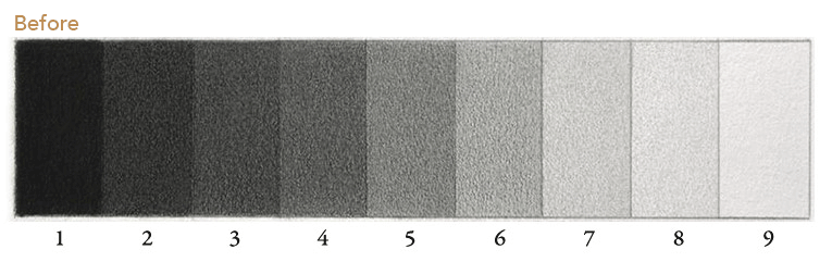
1) Draw the scale
Use light lines. Make 9 steps. If this is your very first Value Scale, you can do one with 5 steps.

2) Begin with the extremes
The most common mistake I see is students trying to make a Value Scale “from left to right”.You will get much better results by starting with the extremes of the spectrum: 1 and 9.Go as dark as your pencil allows on 1 and leave 9 empty (just the paper).

3) Find the center
Add the missing tone in the middle: 5. It won’t be perfect, but get as close as you can. Keep the tone even!

4) Find the center again
Add the missing tones in the middle: 3 and 7. Adjust 5 if you need to.

5) Add the final tones
Add 2, 4, 6, 8 to complete the scale.

6) Rebalance
Finish the scale by evening it out where necessary. A very effective strategy is to identify the biggest “jump” between two tones. Here that was between 6 and 7. I darkened 7 slightly, lightened 4 a bit, and made 5 more even. Done!
Common Mistakes
1) Noise
❌ Do not rush and create a messy tone. In a noisy drawing, you won’t be able to tell what value each swatch is.✅ Do create smooth tones.

2) Outlines
❌ Do not draw dark or thick outlines between each value step.✅ Do draw a subtle outline around the contour of the scale. This helps separate the light tones from the paper.

3) Blurred Boundaries
❌ Do not create soft edges or blurry transitions between value steps.✅ Do create razor-sharp transitions. This is one of the main points of this exercise. If you cannot make two tones meet with a sharp edge on a value scale, you won’t be able to do it in a representational drawing. For example, around the eyes in a portrait. Again, you’ll need sharp pencils for this.

Good Examples


