Bryce Kho’s Approach to Personal Illustration
68K views
lesson video
Bryce Kho’s Approach to Personal Illustration
courseDigital Painting FundamentalsSelected 2 parts (97 lessons)
-25%
$163.94
$218
You save $54.06
comments 4 submissions
Carlo Julian
Great video. It was very useful to see how he limits his colour palette for the sake of cohesion. Was also great to see the huge difference in going from the flat colours to adding a bit of lighting. Looking forward to more from Bryce Kho and other artists as well!
LESSON NOTES

Check out the premium course for additional lessons, demos, assignments and critiques!

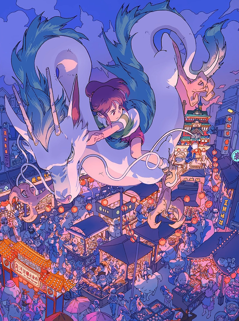
Hi everyone! I'm Bryce Ko, a concept artist and illustrator. You might know me from "Sea of Stars," where I did all the illustrations and character designs. In this article, I'll walk you through my process for creating a "Spirited Away" fan art illustration.

Fan Art: Spirited Away

Research and Exploration

For my "Spirited Away" fan art, I needed extensive research. I drew various characters to get familiar with Miyazaki's style, starting with rough sketches and gradually capturing the mood I wanted. This phase helped me decide which characters to include and how to evoke the feeling of the film.

Thumbnails and Composition

I created several thumbnails to plan the composition. Initially, I considered a horizontal orientation with Sen, but I wanted to include more characters. I settled on a scene with the main characters flying over a night market, inspired by my experience at the Raohe Night Market in Taiwan.

Line Art and Flats

With the composition set, I dove into the line art, incorporating various Ghibli characters as Easter eggs throughout the scene. For the flats, I kept the color palette cohesive, adjusting colors to fit within a unified scheme. By limiting the colors, I maintained harmony and made it easier to adjust later.

Adding Shading and Light

I added highlights and adjusted values to achieve the nighttime vibe of a bustling market. By crunching down the color palette and focusing on the main light source, I unified the piece and made the primary characters stand out. The final result captures the atmosphere I aimed for, with hidden details for fans to discover.

* * *

That's a glimpse into my illustration process for my personal work. Starting with thorough research and planning allows me to create more cohesive and engaging pieces. Remember, the more you connect with your artwork, the more it resonates with others.

Check out the premium course for additional lessons, demos, assignments and critiques!

DOWNLOADS
mp4
bryce-khos-approach-to-personal-illustration.mp4
605 MB
txt
bryce-khos-approach-to-personal-illustration-transcript-english.txt
19 kB
txt
bryce-khos-approach-to-personal-illustration-transcript-spanish.txt
20 kB
file
bryce-khos-approach-to-personal-illustration-captions-english.srt
31 kB
file
bryce-khos-approach-to-personal-illustration-captions-spanish.srt
34 kB
COMMENTS
Proko
Bryce Kho explains his illustration process, from research to final rendering, emphasizing study, color control, and storytelling.
Newest
Moka
8mo
Hello Bryce! I'm a long time fan of your work so I'm very excited to follow these new lessons of yours! :) I've been also wondering something for a while, not sure if I can ask it here but it does concern the process for sure and particularly the sketch phase : what canvas size and dpi do you use for your digital work usually? I remember you mentionning to use A3 size (sorry I don't remember in inches but I remember that was the size in paper format) for the Persona 5 fanart you did a while ago but that was traditional art. I'm asking this because in digital, I tend to work too small and/or maybe with not enough dpi (I often choose 300dpi) and then I usually have to enlarge it at some point or end up with my artwork being too small^^;
Moka
8mo
I'd like to correct what I said above because I checked my notes and it was an A2 format actually that Bryce used for that P5 illustration. Memory failed me a bit here x) Still would love to hear about @Bryce Kho or @Proko opinion on what are currently the "standard" canvas sizes for digital work for a detailed illustration destined to be printed?
Carlo Julian
Great video. It was very useful to see how he limits his colour palette for the sake of cohesion. Was also great to see the huge difference in going from the flat colours to adding a bit of lighting. Looking forward to more from Bryce Kho and other artists as well!
Alexander Simon
I hope we get to see how he goes about choosing a color palette too!
Dennis Yeary
Oh man I love to do this stuff. Thought I’m not sure how to get into it
Sean Ramsey
You're in luck! Bryce is going to deep dive his entire illustration process!
DreamMist
9mo
This is so cool i'm so excited for more videos!
Help!
Browse the FAQs or our more detailed Documentation. If you still need help or to contact us for any reason, drop us a line and we’ll get back to you as soon as possible!