Stylization, Color, Lighting and Background Critiques
4yr


Atharva Lotake
What do you guys think about my latest piece? I did it for Max Gerecke's Art Challenge. What do you guys think about the anatomy of the face and stylization of the anatomy and the clothes? Also is the lighting correct, does it read clearly? and can the background be improved. Constructive criticism appreciated. Thank you :D
PS I have also included the reference that I used.


wow that is a really good drawing... i just loved everything about it...
but his left hand... check ref and compare i guess... u got that folds wrong...
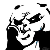

looks very nice are you sure that you aren't 10 hun's lost brother or something 😄
love your art please never stop. god bless and take care 😉✌ @ Atharva Lotake.


Hi @Atharva Lotake ,
cool drawing. Concerning anatomy and stylization everything is fine for me. Concerning the lighting: As her head ist somehow in the shadow, my attention goes to the face on the pullover. If this is intended, well done.