Recently Finished Piece. Would Appreciate Any Feedback (:
3yr


Elias Lemus
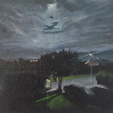
This is a digital painting I did as a portfolio piece! Any and all feedback is welcome. Critique, comments, suggestions..thanks and I hope you enjoy (:


•
3yr
Hey, @Elias Lemus, nice work!
I like the story in this piece, and, as a personal choice, I’d certainly keep the second character (the one in green). The way you thought of him in the scene, sitting and grabbing for the stick on the ground while looking at the orcs definitely adds a very interesting layer of visual storytelling. Without him, it feels a bit more like a “staged” moment to me, a posed confrontation between the standing character and the dog against the orcs; but with him in the scene, it’s like “they were unaware, perhaps just hanging and talking, when suddenly the orcs appeared and they had to get ready however they could in order to defend themselves”. If you like that ideia too and want to power it up even more, maybe you could consider “dressing up the set”, add some stuff scattered across the ground near the people - backpacks, bottles, tools, a bone the dog might have been chewing, a little bonfire…? Maybe take Steve's consideration about the standing character's gesture to an even more extreme level: draw him as if he is not fully standing, but still in the middle of the motion of attempting to push himself up; or, who knows, he could be off-balance, as if he tried to get up so fast that he almost fell down? Maybe the dog should be alert, as Steve noted well, but also its pose could subtly hint that it's also a bit scared? Just a few possibilities.
By the way, I totally agree with @Steve Lenze's observations concerning gesture and composition, I think he pointed out all the main stuff that I’d adjust too. As a complement to that, consider taking some more time to “sculpt” forms with more deliberacy. For example, think of these big boulders as 3D objects to be designed - model plane changes, consider shapes, angles, their size relationships in the scene as whole. Same goes for the tree trunk on the ground (as Steve properly pointed out already) and maybe even for trees and leaves. And even the ground might also have a bit more form and volume: little ups and downs, bumps, holes or carved out parts.
And, as an additional note, I think I’d perhaps take a bit more time to consider colors too. Things certainly look harmonious the way they are, but I feel like it’s all a bit too warm overall. You can think of strategies as to where colors could change: it could be the aerial perspective on the farther objects, getting more faint and blue with distance; it could be a natural local color change on the rocks, the leaves, the soil or the orcs’s skin; or maybe it’s the shadows cast from the trees that cool down part of the environment. Whatever solution you prefer among these or other ideas, varying the hue temperatures across the painting could help add some more visual interest and even atmosphere to the composition.
Hope you find these comments helpful somehow.
And I’m curious to see what else you’ve been coming up with (or will come up with) for your portfolio!
Best of luck! \o/
I can't thank you enough for all the great feedback! To be honest, really do like having the green figure. The way you describe the scene is pretty much the idea I had in mind, which makes me feel great! But I do think even if I kept the 2nd figure I could've done so with a better overall composition. I agree and see pretty much every point brought up! So not much to say on my end but to say thanks and I will take the advice very seriously because I do see the piece improving with those alterations. Thank you for giving me your time! I won't let it be for nothing!


Hey Elias,
let me begin by saying that I agree with what Jason Arizona said in his critique. I just want to add some compositional things that I think would help you. What I did was do a sketch over your painting to show you some of the things I think would help your piece. I hope it helps :)
Wow! So cool! Thanks for taking the time to do this! I appreciate it so much and it will help make my work better!


Asked for help
First of all, The proportions and forms are A1 here. Prime construction, excellent folds, wonderful perspective, I think all my hangups with the piece come down to value.
The painting is entirely readable, but it doesn't convey a mood as strongly as it could. The values seem somewhat light for this application, which I think might stem from the fact that three of the main subjects are in shadow, which compresses the value range. I would consider putting the three in a lit area, like a clearing, which would allow you to make the ogres/goblins/trolls/bad guys shaded more dramatically, and make them more threating and less "oh, there are some goblins there too"
Secondly, what is the purpose of the person in the green shirt? Who are they? What is the relationship between them and the person in the red shirt? Or them and the dog? For reference, I painted over them with another rock to keep the composition balanced. Has anything really changed? Is the story any different?
Overall, you have a good painting, but the framing and the mood could stand to be a bit clearer if you want to make it a GREAT painting.
This is seriously gold. Thank you so much. You have brought up so much I agree with and it seriously helps. I appreciate you taking the time to give me great feedback. I won't let it go to waste!

I think the story has changed in removing the second character. I read it as a father and son out in the woods, being interrupted by the goblins. I like how that character reaching for the stick shows action, but agree with Liandro and Steve's comments around making the mood and action more distinct. Also agree with the structure of the picture being good, just needs to add more contrast and atmospheric lighting: put the humans in the bright light and goblins in the dark, if the intent is that the humans are good/ goblins bad.