Need critique!
4yr


Ritik Gajbhiye
Hello everyone, i just need some critique on color or anything related to that. Have a great day! Thanks ;)


Good Evening Ritik: To me this look very nice, but I would add some darker shadows to the clothing, and where the cloth meets the skin section as well. Under the collar too. the Circle in the background I have mixed feeling about. First and foremost, the arch of the circle is almost inline with the arch of the head, creating a kind of Tangent with the top of the head. I kind of see the circle more in the distance, so I would add some atmospheric perspective by adding some blur to the circle. Maybe lower the circle a bit as well to avoid that tangent and add just a bit of light blue to so some depth.
Nice Job and keep up the good work.
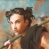

Hello. I think the circle is a bit too tangent with the silhouette, it makes it a little bit harder to read. it could look like a hat or something. Dont remove it, it adds a lot to the painting as well. You could also choose to charicature the european look even more by shading more under the eyebrows, but then you might have to raise the eyebrows as well, or she would look masculine. There are many round shapes, that is also a legitimate choice if you want a certain style, but be aware that you then have to be careful that it is still defining the landmarks in the anatomy. You can try and work more with corners and lines, it will look a bit more confident. Also the hair is a great opportunity to be expressive. Otherwise great piece, the colors work well in my oppinion.

Hi @Ritik, love the stylization. If I had to give some feedback regarding color, I would say that we can make some adjustments to the colors you've chosen for some areas of the face. Skin is semi translucent, which means that for certain areas, we can see the blood affecting the color of the surface of the skin. These include the area around the eyes, the cheeks, nose, and ears. I like that you've applied that knowledge to flush the cheeks and the nose, so we can bring in that knowledge to brighten up the eyes and ears as well.
I've attached a painting by John Singer Sargent. For the eyelids, he's chosen to use a bit more of a saturated red, and it brings a bit more liveliness to the skin tones in those areas. Same thing goes for the ears. You could slightly exaggerate colors in these areas of your painting to add more variety to the skin tone.
Additionally, you could play up the saturation of the colors for your shadows on the face (I'm mostly looking at the shadows cast by the nose, as well as the shadows on the left side of the face). The color seems a bit dull, but you can punch the shadows up a bit by making the color a bit more red instead of dark brown.
Hope this helps!
Thank you very much this is really helpful! I'm loving this platform, it's a great to get critique on work it really help! Thanks once again! :D

hello Ritik! i think the colors are working well. but if it was me doing this i probably would make the shadows a bit more consistent and present in some areas. (make the shadow appears more in areas like the nose, and in the left ear). is it. good job.

i think you loose a lot of shapes with the way you placed the red on the nose and the cheeks.
in the suggestion you see how i reduced that a bit and brought in the other local colors you established to get more shape on the form of the nose. on top of that i used your orange on the forehead and introduced it to other parts of your coloring so that it doesnt stand out just on that aread.
i added some light in the shadow for the same purpose to bring the shapes more out. in the suggestion+ i added some orange from the background circle on the figure. its something you can do to merge both elements a bit more together but thats totally subjective and up to you.
i hope thats helpfull for you.
Yes you're so right! Colour do look more unified in later ones! Thank you very much this was really helpful! :)


Hi Ritik! I think the colours work quite well together, but feel like it would benefit from some texture or smaller details :)
I do think so, I'm not much detail loving guy but do think it need little more polish! Thanks for the advise :)


Hi Ritik :) I would suggest changing that orange circle to blue or even a bluey purple because the skin there is primarily orange and blue is the compliment to orange. It should make the portrait pop more. You could also try adding some painterly white outlines around the circle and giving the piece a background colour, maybe a faint purple? I’d love to see the result ! Hope that helps :) 🎨😊🌸
That's very nice suggestion! I have done this one about a month ago so not gonna change it now(also i have already posted it on social media). I have been doing some value studies lately and thinking about doing some color work. That's why i needed some suggestions! Anyways thank you so much! That was really helpful! :D
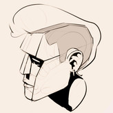

Hey! Your character silhouette is well defined however I think the shading could be more polished ( accentuate the sharp edges and loosen up soft edges). One more thing, the background circle is tangent with the head.
Hey, thanks for suggestions! Yes, i do think this is little underpolished and i do need to work on edges! Thank you and have a great day :)