How do I finish this digital portrait?
4yr


Smithies
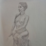
I started this digital portrait of my boyfriend months ago, but could never figure out how to finish it! Any idea how to stop it looking like a floating head, and make it look more finished? I wasn't working from a photo, so I was making up the angle of the shoulders, which I like, but can't figure out where the shirt should go. Not sure a shirt would add much anyway! Any suggestions, or critiques on the drawing would be appreciated!

Hi Smithies. Well, first of all, I think this is great work and actually, to my understanding, already in the pretty finished stage. While I don't neccessarily agree with all the feedback, because at this stage and your level it's more about personal taste, I do have three suggestions:
- The shadow on the cheek and under the chin could use a litte more reflected light to make it pop (you can do it either with lighter value in the darks or by adding a stronger core shadow in the transition)
- Watch out for your separation of the light and shadow side because your values on either side tend to be too similiar (especially the ridge of the nose, the outer left eye and your lips)
- Since this is digital, you can play around with the background on a different layer. In my opinion you don't even have to draw the shoulders. Just use abstract shapes, which are darker on the lighted area of the face in order to make it pop (a few artists on instagram for example: vynillus, Erik Gist). Or you can use a more oil painterly style with "tiles" (for example Shaun Othen)
Keep it up!!!
Thanks so much for your suggestions. I have been working on it pretty solidly today, although tangible progress is hard to see! I'm flip flopping between ideas, but I'm sure I'll get there in the end. I'm hoping to go along the abstract shapes route, but finding it hard digitally!
Account deleted
my definition of "finished" might be different from yours, so keep in mind that this critique might not apply
that said, i will try my best to give you some of my opinions.
i think the use of blacks is a bit inconsistent. the darkest value of cast shadow of the nose, nostrils, and the lips is dark gray, but then you used black for the mustache, under the lip, iris, hair. if you cant see what im talking about then you can turn up the brightness.
you can also refine some parts a bit more like the nose, lips, and hair. the brush works look kinda "patchy" and "spotty" to me ( not sure if thats the right word ), like how the nose bridge looks "dirty" ( kinda like faces of people wokring in coal mine, no offense btw, this is a blending mistake we all make, even professional artists ). from my experience, its usually because of working with texture brushes. another example is the forehead, i see a lot of horizontal strokes overlapping, and humans dont like too repetitive thing, its kinda boring. if youre going for painterly portrait then think of shape design ( big - medium - small ) or if youre going for more realistic stuff then just blend the forehead, since human skin are pretty soft anyway
another thing is edges, for example you can refine edges in the nose and cheeks / jaw to be less sloppy and harder. and yeah, adding a shirt will help, if youre having trouble then looking up photo references will aways help, or taking your own reference photo
thats all, hope it helps! and sorry if thats not youre going for xd

In addition to the other comments I suggest you play down the big highlight on the forehead, as it distracts from the subtleties in the features...


•
4yr
Hey Smithies! Great job on this.
In terms of making look finished, I think the general consensus is correct. Adding some sort of background or abstract shapes would go a long way. I linked some images from the artist Wangjie Li. I think they do a really good job making compelling portraits with essentially just outlines and abstract shapes.
Hope this helps!
Thanks for the help! Those pictures are really beautiful and I really hope I can go in that direction with this! I need to study that artist - wow!


whoa! This is beautiful! My personal take would be to add in some more detail for the shoulders and just fill out that part of the body since you already have the neck and partial chest in there. Pretty much what everyone else said. :)


Love it. And I really like the 'floating head' effect. But if you want to finish it then I suppose that you can ask your boyfriend to pose or - if he's to impatient - make a photo of him. Or you can just find a photo of a guy who stands in a similair position and use it as a point of reference for the shoulders and shirt.
I think this is a good shout! I'll corner him when he's feeling posey! Thanks for the feedback!

This is awesome as it is! If you did want to play with a shirt I think accenting it as negative space may be fun. Adding some spot shading in the background just over where the shoulder would be to indicate where the edge is. But it's beautiful as you've got it :)
Aw thank you! Yeah I think I might have a play around, and just see if I can find something that works.

I'd put a bit of reflected light under the jaw and to better define the planes of the cheek which remains in shadow, maybe try to make the texture of the skin and maybe a bit of volume to the hair.
Either way it might be fine if you leave it like that, like a sketch.


Absolutely reflected light under the left jawline and neck (subject's right) that's a great point! Also this looks excellent already btw. I think it needs just a hint of shoulder or shirt form to finish it. You could try a single weighted line contour down the shirt collar and the top of the shoulder. This would be similar to what you already have going on the right side of the image. Since the face is so dark, to make a contour line look intentional it might need to be darker, and consider a wider shoulder line unless his shoulder is tilted away from us. From that shoulder contour line I would pull away from the shirt with a digital smudge - the way you handle the wispiness of hair around the ears. Pulling the smudge away from the shirt implies "shirt is white" and "behind the shoulder is farther away" and I think that's all you really need. I attached a portrait I drew to just illustrate the weighted contour line idea. I can't say for sure that this is the best solution, but it worked for me for this portrait.


That looks great! One of your advantages is that you can easily try out different ideas since you are using digital art. You should make some thumbnail sketches, and use some ideas from other portraits. Try out a lot of different things, because your first one isn't always the best. You can create a new layer(or duplicate the layer as a backup), and paint the one that looks the best. If you don't like it, you can do it again. Looking at some reference can also help if you don't know anatomy very well. I hope that this helped :)

Hi @Smithies thats a great portrait ! Love the painterly look. As to finishing it as soon as I saw it I immediately thought of Cesar Santos’ portrait of Jordan Peterson, I think you could achieve a similar look with your portrait if that interested you - https://youtu.be/uQHU37DcrVE
alternatively maybe something like this with a white shirt and a painterly colour background - https://www.singulart.com/en/artworks/emil-nikolla-jordan-peterson-619879
can’t wait to see what you do with it :)!!
Thanks so much for your comments and tips! Very helpful to have a look at those links and it's given me some ideas so thanks a lot :)


Hey there! Fantastic artwork! :)
Well since you have already done the more tangible parts of the image, I think it's time for some abstract shapes. It's great because it makes the picture more interesting and it doesn't take your attention from the face.
Also, I would add a messy paper texture in the background to give it a bit of a character.
I hope I could help. Keep up the good work! :)


If you are still together, you can just tell him to pose for you and you'll see in the reference picture where the shirt would go. You can also go really loose on the shirt so it won't be so obvious if you don't want to deal with all that. But I think it would be worth it because it's a beautiful portrait!