Help finding my weak points, again.
3yr


@not_a_name
I posted asking for feedback about my weak points before and the main critique was about my lineart, i think i got a bit better about it, albeit its still a work in progress, so i decided to post some more of my newer practice for feedback and advice on what to improve, what do you think i'm doing wrong?


•
3yr
Hey, @not_a_name! I like your sketches, they’re fun to look at!
I think I may have commented on this older post you mentioned, and, from what I remember, you did improve your linework, that’s great!
For this set of drawings, overall, I agree with what fellows suggested below about pushing the gesture and exaggeration - if you can incorporate this as a habit into your practice, it can definitely help take your design skills to the next level.
Another thing I’d recommend is to mind the silhouettes. A good silhouette helps a drawing read better, as well as have a stronger impact and easier recognition. Notice negative spaces (“empty” spots) such as the areas between the arms and the torso, and see how you can use these shapes to design the silhouette of your drawings as an appealing and readable visual element per se.
Here’s a few study resources I like which tackle these subjects:
. @Stephen Silver’s book “The Silver Way”, or his character design courses at https://www.silverdrawingacademy.com
. Wouter Tulp’s “Expressive Characters” course on Schoolism: https://schoolism.com/courses/drawing/expressive-characters-wouter-tulp
. @Marco Bucci’s videos on “Drawing characters”, which is part of one of his courses here at Proko: Illustrating Children's Books (and beyond!)
By the way, these resources are mainly focused on characters, but the fundamentals involved can be applied to pretty much anything: props, environment assets, icons etc.
Also, if you have any other more specific questions, feel free to pop them.
Keep it up! Best regards.
Thanks for the feedback, i have some practice in mind that could improve my ability to see negative space and do poses, i intend to post my progress again as soon as i have more things to post
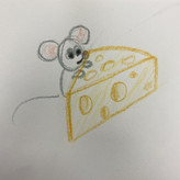

Your lineart had gotten a lot better! And now that its clearer I can see all the cool details better.
I think now it would help for you to work on gesture to help you draw more expressive poses.
•
3yr
This is good advice!
Its much harder thinking of a pose a cool design and descent lines at the same time, hopefully i get better with practice.

I am noticing some scratchy lines (mainly on your dinosaur page) but I think your designs are cool and cute :D
Maybe try to do the S curves (on the dinosaur's figure) in one stroke to make the gesture better.
Account deleted
These are great character drawings and I like your style of drawing them! I'm not much help lol