Figure drawing based on Steven Zapata's lessons
3yr


Artūras ČIvas
~3h figure drawings. Trying to improve on overall figure drawing: gesture, values, shapes, shadows managing and line quality. Need criticues on those aspects.
3yr
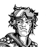
Asked for help
New sketch. Work from photo refference. Here I was trying to draw some clothing on human figure. Need advices on clothing texture. My mission was to make it feel like warm, kneeded robe. And of course all types of criticues are very wellcome.


3yr
Cool!
3yr
Asked for help
New figure sketch. This time I used background for figure stand out. I think it kind of works, but maybe community have sugestions? :)

3yr
I love how expressive the muscle is considering this is such a small surface! The backdrop indeed let the character pop out a bit more. How do you approach this kind of drawing? do you do the "box-like" sketch then add details? Looks like you just went straight in and everything is so accurate and clean. Would you like to share your process on this?
Show all replies (3)


3yr
I agree. Putting the dark gradient in the bottom helps draw the eye to the upper part. You could have pushed the effect further by making it even darker imo, but its very nice as it is.
Show all replies (3)
Account deleted
3yr
This drawing looks awesome, and the outlined areas around his body contrasts nicely with his head. I don't have much critique to give really. As for your question about the background - I think it works :)
3yr
This is looking so nice especially on such small surfaces... tbh at this scale my pencils will never be this clean, I scribble a whole lot


3yr
Hi @Artūras ČIvas , nice drawings and I especially love your shadow design. They look interesting and there's a clear distinction between shadows and half tones. Below are some areas I think that could be worked on a bit more:
- Anatomy: First photo right figure, and second photo left figure, the forearms are curved. There's nice gesture there but need to introduce some straights for rigidity.
- Shading: More gradual transition from core shadow to half tone in general. In the last photo right figure, there's a strong contrast between lightest light and half tone, that makes the person looks very skinny. The contrast could be reduced if that's not the effect you are going for.
- Alternating straight and curve lines: Taking first photo left figure for example, there are a lot of continuous curves or continuous straights. Try to introduce some straight into curved areas and vise versa to make the pose more dynamic. This method will also keep a good balance between gesture and structure.
Really nice drawings overall, these are dynamic poses and I can feel the movement. I hope those suggestions helped!
3yr
@Nicole Lee thank you for sugestions and structured criticue. I really try to focus more on gesture at first, because I find out that after rendering, my figure starting to look more stif than I was expecting. So I will try to incoeporate your sugested method.
Also, in some way I sometimes lost value control and get too dark after I smudged some areas. Somehow, before smudging shading looks lighter.