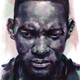
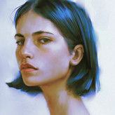
Digital Portrait Study
4yr

Shivang Goswami
This was painted in Krita and the reference photo was from Pierre Gonnord.
It has been a huge step up from my previous digital paintings however I would still love to get feedback on areas I could improve.
Here are some things that might help in criticism - I struggled to get the likeness of the subject, it ended up looking older. I've been slowly and steadily trying to improve on human head and figure for a year and half now. I tried really hard to use fewer, and simpler brushstrokes with mediocre success. And I very much admire painters like Huaishen, Yizheng ke etc.

It looks very good!! I would say it is still a bit flat, so adding more colors would probably help. Overall it is very nice!


I think you've done a good job, I especially like the way you've only hinted at the hair and the body, letting all the attention fall on the face, which I think is well constructed and where I don't see all your difficulty in using colour.
Maybe the part in the light is a bit too overexposed (I guess the reference was like that) and you could have put aside the reference and built up the planes a bit more.
I like it a lot anyway.

Hi! First of all let me say that your portrait is super cool! I really like what you did, great job!
The artits you mentioned are incredible, Yizheng Ke is probably my favourite digital portrait painter!
If i've to be picky about your work i'd say that you could adjust values a little bit and maybe some proportions here and there if you want more likeness. Avoid using pure white and pure black if you can, they usually "flatten" the image. Also, try to use more saturated colours in the area you want more attention.
If you want a more "painterly" look (i guess that's what you aim for, considering the artits you mentioned) you could also lose and change some edges.
Can i do a quick paintover to show you what i mean? I feel i'm not really great with explanation lol