Digital portrait I did a few months back
4yr
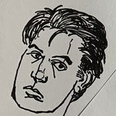

Redspur
This was the first time I really tried to "finish" a drawing, taking much longer than I usually do (about 5 of days of 3-4 hour long sessions). No color yet because I don't think I'm at that skill level yet. I tried being accurate as possible but ended up stylizing some parts I didn't feel were working. In hindsight, I think it was a mistake to omit the hands from the ref, feels a little unnatural without them. Feedback very welcome. :)


I think you did pretty well! I can really see the likeness to a degree. One thing I noticed was the placement of the eyes, I think that the right eye is about too far out, and the iris aren't in the right orientation. So while, you got most of the things in the portrait right, the slight mistake is what makes it feel a bit off. So just try to take your time in your block in phase so that you can sort out all the proportions and placements. Great work nonetheless!

This looks really nice, the hair is lovely and you've captured a likeness to the reference. I did notice that the values on the face could use more contrast, adding in brighter sections of highlights/midtones on the face would help. Specifically on the cheek bones, forehead and chin. If you are interesting in doing this piece in color I would recommend this video by Dave Greco: https://youtu.be/LeZc-uYXv3Y
Hands are a big struggle for me so I would have omitted them too! Keep up the good work!

Hi there Clay!
I think this portrait look very beautiful with clean and smooth shapes, I can see you spent a lot of time on it!
Some tiny details then it comes to value in comparison to the reference photo is that the Philtrum (the little cleft between the nose and mouth) could be a bit darker. (Unless that was one of the part you chose to stylize of course) and you could also make the white of the eye a lighter value then they are now to.
You really captured the airy volume of the hair from the reference, that looks great! To me the picture would look more balanced if the hair was of similar lengths on both sides though, so if it were me I would make either the right side of the hair longer or the left shorter. I like the texture of it to, it looks like actual hair without being to overworked.
You did really good work with it!
Thanks! You're right about that philtrum, I actually love that bit of the face so I'm surprised I de-emphasized it so much. Hair is always a blast for me, I usually get very expressionistic and worry less about the ref when I do it. I agree it could be balanced better. I didn't notice that until you mentioned it, good eye! Thanks again for taking the time to give feedback!


This is a really great drawing! I think you have captured part of the likeness which is really hard! I wouldn't worry about missing out the hands, although I think potentially adding more of the chest and shoulder at the bottom would balance the picture out a little better. I think it would be even better if you darkened the side of the face that's in shadow. The reflected light on the left side of the picture I think is too bright and draws my attention, so keep it lighter than the rest, but darken the whole of that side I reckon. Well done for finishing a picture though - so hard to do!
Thanks for your feedback! I shouldn't have cheated with that reflected light, it's not in the ref at all. Looking at it now, yeah, a darker left side would really help.
I think you captured most of her features quite well! One observation is that in your portrait, it is a little difficult to tell the direction of her gaze, I think due to the placement of the specular highlights over her pupils, which are also a little smaller than in the reference. Some advice I've heard that I use in my own work is to wait to place any details like specular highlights until the rest of the portrait is fully rendered (if at all), to help ensure that elements like the gaze direction read properly.
Thanks! I waited awhile to place lights (did a long shadow pass first) but I definitely rushed those highlights. The eyes gave me the most trouble overall. I couldn't get the pupils right. When I look at the eyes now there's something unnatural about them, like the lids don't quite read.