Critique my acrylic painting
4yr

mac hewitt
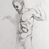
Hey guys just finishing up on this piece I posted earlier. Its a 50cm x 50cm acrylic piece i wanted to enter into a local comp. Was wondering if you guys have any ideas of things I can add.
I need to finish it up by tomorrow. The lighting is pretty bad atm due to it being night time and wasn't able to capture some of the different textures (iridescent/gold, gloss medium etc)
Hey all, thanks everyone for the advice. I was a bit short for time so i changed what i could. Here’s the finished product. I’m not the best a photographing paintings yet. Hope you like it and if you have any advice for photographing paintings let me know. I usually prioritise ISO then shutter since I don’t want too much dof in photo. And always prefer daylight.

This ls looking very nice! The flat style reminds me of Alphonse Mucha's work. I think this is already good as-is, but if you are looking to push the contrast a bit more, you could use more lighter and darker shapes. at the moment the piece looks like something that could be made into coloured windows in those cathedrals :D If this is what you want, I think you are on the right path.
Glossy paint doesn't want to show well on digital, as you can not possibly re-create the dynamic light reflection situation. It should look very well as a one-off piece :D


•
4yr
It's fantastic! The only thing I would point out is it took me a few seconds to figure out what's going on with her left arm, left leg, and the flower by the leg. They seem like the same value from far away. I would add some shadows where her arm touches her ankle and maybe move the flower a little so it's more clear.


Agree. Looking at the thumbnail, I can't tell what's what. Everything should read clearly, even shrunk down small (assuming your goal is for things to read clearly)


Hi Mac. This is really fantastic! Great colour palette and very cool sense of design. For me the most obvious thing to push further would be the shadows. There are more occlusion shadows to find for definite and the ones you have could definitely stand to go a good bit darker. The cast shadow on the neck is at a really good level, but the soles of her feet are maybe not as dark as they might be, for instance. I would take that neck cast shadow as a starting point and bring the rest of the cast shadows to that level and add in occlusion shadows wherever you can find them to give the piece more depth. Really great work though. Looking forward to seeing more of your stuff


I like this a lot! The colors are amazing, I admire that you can create such a whimsical color scheme :D Also all the details to explore are great. Maybe I would consider putting darker lines in skincolor between the edges where arms and legs meet or put some shadow there. Otherwise good luck, you can be proud!
Thank you, yeah my partner reccomended the same so I've been working on that now. It's reaffirming to hear the advice twice. Thank you