


Albums

Activity Feed

@frenchfries
•
1yr
added comment inProject - Measure Proportions
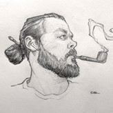
Asked for help
i really liked how the proportions came out, so I rendered it out. Unfortunately, I lost interest rendering the cloths. I’d love some crit, thanks in advance

•
1yr
Hey @frenchfries nice work on this portrait. You've achieved some really nice subtle shading in the skin tones here, the upcoming section of the course will cover shading and rendering so I think you'll get a lot out of it once you're there! As for the proportions of your lay-in stage, I think you jumped into rendering a bit too soon. The large shapes of the head and body are pretty close, but the smaller interior shapes of the features, in particular the eyes, and mouth are throwing off the perspective and proportions of the face. Take a look at the overlay and you can see the nose, goatee, ear and head shape, are all fairly well aligned and facing in one direction, but the eyes are off axis, too large, and appear to be at a different perspective than the other features. At the lay-in stage, these are SUPER easy corrections to make, you only have to erase and adjust a few lines to nail your likeness! But once you begin rendering, it's almost impossible to go back and correct without erasing all of your subtle shading. If you spend more time dialing in your foundation and constructing a sold framework in the early stages, your rendering will go much faster, and really start to make it come alive. You can't paint the walls without building the house first! Keep working on this lay-in stage, try a few more portraits, but don't jump to rendering yet. Once you get a lay-in you're happy with, hold your portrait up to a mirror, or take a photo with your phone and flip it to get a fresh perspective on your drawing. Flipping or mirroring the portrait will IMMEDIATELY show you where things are feeling off axis and you can start to make corrections and dial it in. Keep up the good work, I hope this helps!
@frenchfries
•
2yr
Asked for help
•
2yr
Nice rhino! Really solid construction, you're organizing your line weights correctly, but I think you can take the dynamics of your line weight a little further here! Your thiner lines toward the light source still feel like light lay-in lines. They're not feeling as fully connected as your weighted lines, and they get kind of lost towards the rear. Your weighted lines feel like cleaned up confident lines, so nice job there! You could do another pass to even it out, carrying the weight of your shadow lines into your lighter lines a bit more to get them all feeling uniform, and then beef up the weight of the shadowed side a bit more for contrast. Don't forget to unify your shadows as well, the underside of his belly feels a little light, it's not as shadowed as the underside of the neck/front leg area. Keep it up!
@frenchfries
•
2yr
Asked for help
before and after watching the demo. Second time I put emphasis on better proportions. Please give me some feedback, thx


Good job. I have not seen the demos yet, but I can clearly sense the direction you got from the demo.
@frenchfries
•
2yr
Asked for help
looking for crit, thx. I need to work on my proportions also I did this before watching the demo, so I realize I shouldn’t have outlined my values. I will be trying this again.