

Activity Feed


@andek
added comment inAdvice needed in relation to drawing surface(s)
3mo
In my opinion, you're not matching the techniques to the size of the easel properly. The equipment you have is perfect for large formats. I find it most comfortable to use it standing up, although I've seen people who sit on a tall bar stool while using it.
Try changing the format to a larger one (100x70cm ~ 40x27inch) and draw using your whole arm, not just your wrist. Only when detailing, change your grip and finish the drawing.
Show all replies (1)
4mo
Not a bad first attempt. Let me help you with some tips. Try to focus more on values. See how the selected places correspond with each other. Try to compare them, sometimes this is made easier by partially covering part of the drawing with a piece of paper or your hand.
Look at my reference. I suggest reducing the number of values to 4 and repeating the exercise.

Asked for help
I tried to avoid as drawing many flat surfaces to things which has volumes, as possible, to give the drawing more depth, keeping in mind @Martha Muniz 's feedback.
Also I tried to use line weight as a tool to divide my drawing into 3 image planes for added depth.
Finally tried to render this Akira Fanart a little for fun. Hope that doesn't violate the guidelines mention.
Your feedbacks and critiques are highly appreciated. Feel free to share your views.
@andek
4mo
Not a bad start. I have a few tips that can help you. The horizon is almost always in the line of sight. Arcade machines seem to be the right size, Keneda's character should be corrected. The vanishing point in this case will always be on the horizon. This also applies to the bar stool. There is also something wrong with the floor. Try to draw the grid using a 2 point perspective.
Show all replies (4)
4mo
Values are wrong. Look at my example, it was enough to darken some places to make the drawing read better. Try it yourself on your works. Just use a free graphics program (such as Krita).
Show all replies (1)
5mo
I like your style. This is a good direction. The pear looks solid. In a portrait you should do the same thing - adjust the values first and push the contrasts. This will make the drawing less flat.
Show all replies (1)
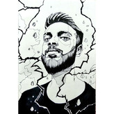
5mo
To help make the portrait more believable you can check the directions of the larger mases. Also campare negative shapes.


Asked for help
First try of the pear. Would love any sort of feed back!
5mo
Watch out for the value. Note that the brown spots only seem to be so dark. In fact, it is very close to light green.
5mo
Looks good. Be careful where you put the highlights.
Show all replies (1)


6mo
Then watched the demo but didn’t copy. I tried to do it from what I learned. I tried to keep two shadow values and three lights. I found it very difficult to create the two light Half-tones. It’s hard to create simplified shapes without drawing darker outlines. I’ll keep practicing.
5mo
I see significant progress, keep it up!
Try practicing shading on a simplified head model for a few days. On ArtStation, you'll find a cool light reference tool. Look for "William Nguyen head". Set up different lighting, try to draw 100-200 of those heads, then come back to this model and attempt to draw it for the third time. I guarantee you'll see a difference!
Show all replies (1)
Show 1 more replies
This is a good start, try to follow these steps and finish your work:
1. Carefully examine the references. The value of the fabric, lips, and eye whites is not the same. Often compare the tones of different elements and ask yourself questions about what is brighter and what is darker. Also, try not to use white color to lighten painting.
2. Find a simplified model of face lighting reference that closely matches the photo. Try to apply this lighting scheme to your work.