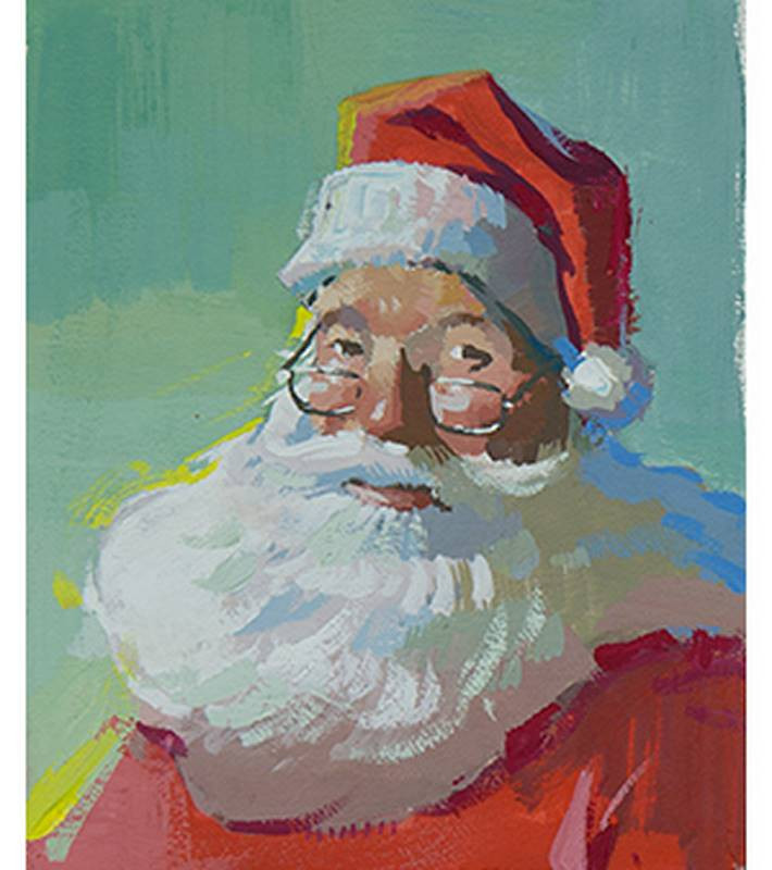
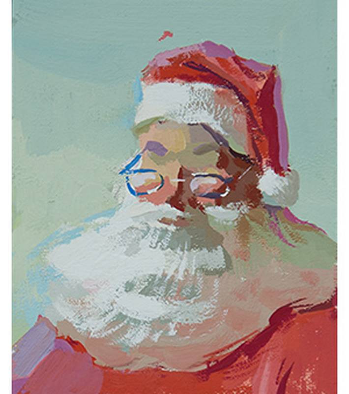
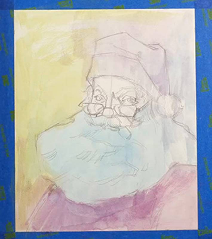
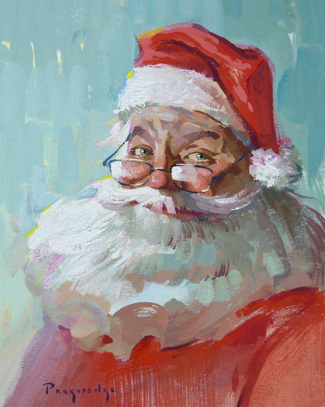
Hey guys, welcome to the first day of the 12 Days of Proko. We have a lot of fun stuff coming your way throughout the next 2 weeks. Every day we’re doing something different… Painting demos, free access to premium content, discounts, giveaways and collabs with some amazing artists. So, make sure to check proko.com/12days every day so you don’t miss out on anything. Today, I’m gonna start it off by painting Santa with gouache paint. It’s kind of like a watercolor, but you can go in with thick opaque paint if you want and you can reactivate the paint with water after it dries. That’s something you can’t do with watercolor.
So, I’m gonna show you how I use the medium and I’ll take you through my process from quick value thumbnails to the finished painting.
I’m gonna give this painting away to one of you guys. If you want a chance to win it, go to proko.com/12days and under Day 1 you’ll find a link to a gofundme page. Basically, donate to the gofundme and all proceeds will go to the National YoungArts Foundation. It’s a really good program for high school students. Basically what they do is find about 100 or so really talented artists in high school and they fly them out to Miami for a week for an amazing artistic experience. It goes beyond just this one week. Once you’re an alumni, you’re part of the group. They try to nurture these artists and help them out as they’re transitioning to become professional artists. They connect the students to mentors who are well known in the field. Many win money to fund their artwork. And there’s so many amazing things that happen from being part of this group. I was one of the winners 14 years ago. I’ll tell you a little more about my experience later in this video.
So, even if you don’t care about winning this painting, please go and donate what you can. It’s a really amazing program.
Anyway, Aaron Blaise was in town. He animated for beauty and the beast, Lion King, Aladdin, and a bunch of others, he is an incredible artist. He has his own YouTube channel now… He was in town and I thought he’d made a great Santa Claus. So, now I will paint Aaron Blaise as Santa Claus.
He came by the Proko studio, and I took some photos of him as reference. I think this one’s the winner.
Thumbnail Sketches
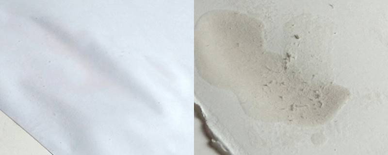
Gouache is a water based medium, which means the surface I’m painting on will get wet. If I use thin paper, it will warp. Some other papers, like the Silk Screen Paper I like to use with charcoal pencils, it breaks apart and leaves a bunch of boogers. I want to avoid both of those, so I’m using crescent illustration board. It’s nice and thick and has a smooth surface.
If you’ve seen any of my painting vlogs, you know that I almost always start with thumbnail sketches to figure out the value and shape composition. When I’m painting outdoors I’m limited on time, so I usually just do one sketch to make sure the vision I have in my mind looks good as a small value composition. But in the studio, I have time for a few to explore my options.
With this first one I’m trying out a few ideas. I’m testing a dark background to bring out the whites of the beard and hat. And I’m trying a vignette at the bottom. So, I wouldn’t paint the red jacket under the beard, instead I would let the white beard transition to the raw white of the paper.
I’m using just 4 values. White, halftone, shadow and the darkest accents. I’m putting those darkest accents around the edges of the face to bring attention there.
Let’s try another one, but this time let’s test out a lighter background and have the dark accents within the face and hat. So, I’m putting the same light value in the background, on the face and parts of the beard. Again, saving the lightest whites for the rim of the hat and the beard. The darkest darks will be along the whole right side of the face and in the creases of the hat. Aaand maybe a little bit of that dark in the background just on the left side to pop the face more. Just a little along the edge to keep the overall feel of the background light.
I like the second one but I’ll do another one just for kicks. Sometimes good things happen when you experiment. With this one I’m gonna kill the vignette idea, just cause I think I should at least try it with the jacket. So again, I’ll use 4 values. White for the beard and rim of the hat. The darker mid value for the jacket and red part of the hat. I like the idea of keeping the darkest darks within the figure. And I think I want to save them just for the deep crevices. The occlusion shadows. Then I’ll put the lighter mid value on the beard, the face and the background.
Now, looking at my three options I think I’m gonna go with the third one. It seems like the simplest, most elegant solution, and I like having the jacket in there.
Materials and Setup
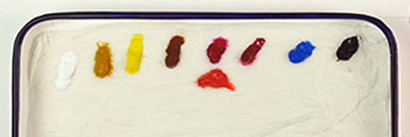
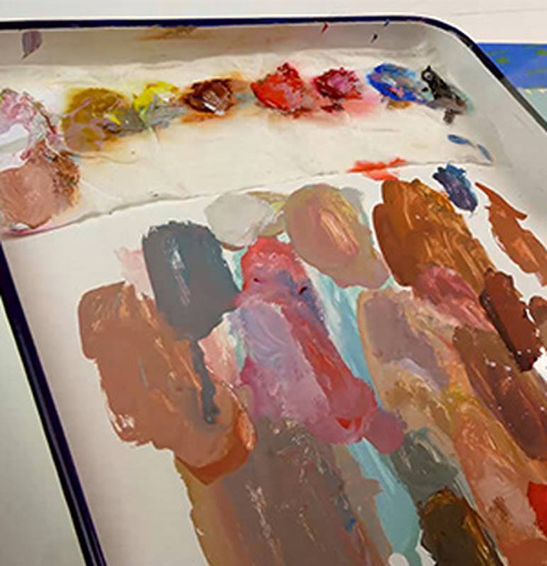
Alright, let’s setup for painting. I like mixing the paints on this metal tray. It’s a good size, it’s cheap and easy to clean. I don’t just squeeze out the paints right onto the tray though. Instead I dip a paper towel in water, wring it out, and set that up at the top of the tray. This will keep the gouache paints wet for a while longer. Otherwise they dry out way faster than I can paint. I’ll still need to spray the paints with some water occasionally, but the paper towel helps.
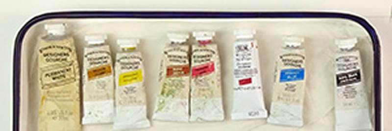
So, here’s what I’m thinking for the color palette. Of course, I’ll need white. Then I got the three primaries. Primary yellow, primary red and primary blue. On the other end is Ivory Black. And then I’ll put out 3 convenience colors. Yellow Ochre and Burnt Sienna will help me mix his flesh tones quicker. And Flame Red will help me mix the darks of the red clothing.
I have a cup of water and a variety of some soft sable brushes.
Color Studies
I got all my stuff, now I’m ready to do some color studies. It helps to have some kind of linear layin, but not too detailed. Just a big rectangle for the head and an S curve shape in the beard. Looking for a way to make it asymmetrical.
As you can tell I’m changing a lot. I’m not painting Aaron. I’m using Aaron as reference to paint Santa. So I’m not worried about getting his exact likeness. Definitely not in these color studies, but even when I do the final painting. In fact, I’ll intentionally change things to make him look more like Santa. Obviously a much larger beard. But also, that hat is waaay too small for his head.
I’m loosening it a little so it sits lower on his head. And moving that puff ball more to the side.
I’m gonna try a greenish background to complement the red hat and jacket. I don’t want a bright green, just a greenish tint, so I’m adding some of that ochre to knock down the green a bit. Also adding transitions of subtle variations in the green.
The red is gonna be by far the brightest color in the painting. I’m gonna be brave and start off with the red straight out of the tube. I can knock it back later if I choose to.
The shadows in the white beard and rim of the hat will reflect a lot of the environment. The greens of the background and the red fabric. Greener on the top plane of the beard since that will reflect the background and redder on the bottom plane since that reflects the red jacket. That green is a bit too warm. Throwing in some cooler notes in there, since I’ll going for a warm light and cool shadow.
Rosy red cheeks and a red nose. Some little dark accents for his eyes and glasses.
I want to throw in some more bright colors, so it’s not just the red that’s bright. I found that a good place to throw in bright accents is along the edges. So, some bright warm yellows along the lights, and cool blues along the shadow side.
I’m gonna do another one to explore some more options. Looking back at this first one, I realized that I was way too occupied by the details. I shouldn’t have been thinking about features at all. Just big color notes. The color comps are about experimenting with color combinations and not about getting a good painting. I don’t care if it doesn’t even look like a face, as long as the colors harmonize and have the feeling I’m going for. It’s an emotional thing.
So! With this second one I quickly threw in a linear layin and I’m gonna ignore the details as I focus on tiles of color. This one will be pretty similar to the first, but I’ll make a few changes. I’ll make the background lighter so that it’s more true to my thumbnail sketch. And I’ll swap the warm and cool side. I’ll make the shadows warm and the lights cool. As I mix these colors, I’m thinking of value and temperatures more than exact colors. Getting temperate and value right are the main two things to harmonize your colors and avoid muddy paintings.
So, I definitely like the second one better. I could go with either one, but I like how the second one looks like it’s colder. As if he’s at the North Pole. Remember, the point of these is to develop the emotional part of the painting. Which one is better at telling the story that you want to tell?
Main Painting
I start the main painting by putting some painters tape as a frame. After I’m done, I’ll take it off and I’ll have a nice sharp edge around the whole thing. Stick around to the end, because taking off the tape has to be the most satisfying thing in the world. Seriously… It’s really satisfying.
Of course with this one, I’m gonna be a lot more precise with the drawing. I like to have my drawing completely figured out before I put in any paint. Let’s get a nice clean palette with fresh wet paint. Get rid of this dirty water and get a clean cup. We’re professionals here...
If you’re someone who’s intimidated by a blank white canvas, starting with large color washes can help. I try to think about what colors I want to show through between the gaps of my brushstrokes.
I’m a lot more concerned with the brushmanship now because these strokes could be the final strokes in the area. Especially the outer parts where I’m not gonna put much details. I want the strokes to be interesting enough that I don’t have to paint details.
I’m a fan of getting the full value range established early on in the painting. So I put some of the brightest spots on the beard and now I’m putting in some darks in the creases. This helps my evaluate everything in between.
As I mentioned earlier, you can reactivate the paint with water after it dries. So you can go back in and soften the edges between the tiles. It’s not easy to do. You have to be patient and careful as you massage the edges together. I usually don’t blend the edges much or at all. I like the hard tile approach. When I paint with gouache I think of it as an exercise to put down clean color tiles with interesting shapes. It’s great training for oil painting because most people tend to overblend when they start painting in oil. Gouache forces you to commit to your brushstrokes. To mix the right color and put it down the right way the first time without mushing it around to fix it. Also, to get gradiations you have to mix a few intermediate tiles as step from one color to the other. With oil we can be lazy and just blend the two together together to get the soft edge. But because gouache forces you to mix each tile, it’s a great time to throw in some color variations or a more accurate color transition within the transition.
So, that National YoungArts Foundation I was talking about… If you’re in high school, or you know of a high school student who has some real skill in the arts, tell them to apply. And it’s not just for visual artists. There’s categories in dance, music, theatre and a few others. When I was a senior in high school I was one of the winners in the film category. I submitted my drawings and paintings into the Fine Art category and my Game of Pool animation into the Film category. Going into the event in Miami, I didn’t know what to expect, but it ended up being one of the best things that happened for my art career. A think a lot of the artists that go through it agree, that they leave with a amazing amount of confidence in themselves and that they can do this. This hobby, this thing that they love to do can become a career. I left excited to continue my journey and 100% knew that this is it. This is what I’m gonna do.
The organizers of the event get a lot of credit for making this thing great. They do everything they can to set up their alumni for success. For example, some of the things that happened to me… I got to show my work at the Smithsonian museum, where I met the President of American Airlines. He decided to show my animation on all American Airlines flights for a few months. I ended up winning the Presidential Scholar Award and went to the White House. There were a bunch of other smaller events throughout the years where I got to show my work, such as a dinner in New York for all their biggest donors. The man I was sitting next to ended up becoming a good friend, a mentor, and a patron of my art. He’s ordered a lot of commissions throughout the years.
Obviously the experience was amazing and I benefited a lot from it. It’s a really good program to get young artists started at the most sensitive time in their art journey, right as they’re about to leave high school and make some difficult decisions.
So, if you want to support the National YoungArts Foundation, or you just want to win this painting, go to proko.com/12days and you’ll find a link in Day 1 to the GoFundMe page where you can donate to them. And of course I’ll put a link in the description below. Also, everyone that donates will get a discount code to save 25% in the Proko Store. If you’re planning on getting premium, you can actually save some money by donating and then using the discount code.
Alright thank you guys for watching! This was Day 1 of the 12 Days of Proko. We got eleven more. Check back everyday at proko.com/12days!


