Art of Caricature


The Thumbnail Sketch
I begin my thumbnail sketch of YouTube personality PewDiePie by staying loose and drawing as quickly as I can. Thumbnail concept sketches like this are usually going to be scratchy and sloppy. The goal is to figure out the level of exaggeration the caricature will ultimately take. And I find it’s best to draw quickly so that I draw more from my gut or instinct, rather than thinking too literally about what to draw. So anatomy, perspective or being neat is not a priority yet. Remember, we break down the caricature drawing process into separate steps so that we can focus on one main goal at a time. And right now, my focus is solely on getting a funny exaggeration that has a decent likeness. Usually, I do several thumbnail sketches. And I recommend you do too, in order to explore multiple possible directions for the exaggeration. But on this one, I felt like I got exactly the look I was picturing in my head. It’s not a perfect likeness yet, but the potential is there. The likeness can be refined at the next step of the rough sketch.
The Rough Sketch
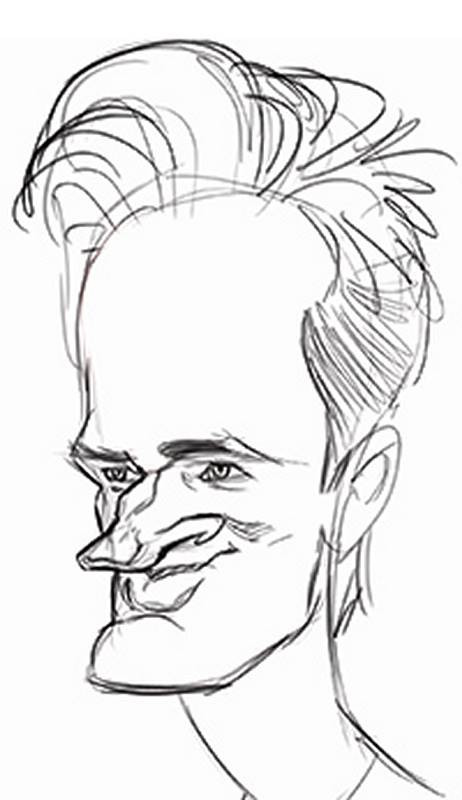
For the second step of this process, I trace directly over my thumbnail sketch. I trace the shapes that are working well, and alter some of the other shapes and features if it helps improve the likeness or strengthen the exaggeration. The most obvious change I made here from the thumbnail sketch was increasing the bulk of his chin.
As I’ve said before on my other demonstration videos, the rough sketch is the part where I tend to have the most fun. I’m constructing the features and figuring out problems, while still enjoying the creative process of exaggerating a face. And I’m not focused yet on how well the anatomy is put together or if the features line up with one another in perspective. That will be taken care of in the next step. For now, I’m just sketching freely. The rough sketch should feel like it’s developing organically, from your gut reaction to the face. I don’t like to get too rigid or stiff yet, because I feel it will hinder my ability to create spontaneous new exaggeration choices. But of course, you should slow down a bit at this stage and take more time than you did on the thumbnail sketch.
To refresh your memory about some of the basic principles of exaggeration, remember: Look for the features and traits which make your subject different from the average head and then make those differences more obvious. On PewDiePie, I saw him as having a head that was taller and thinner than the average, with a larger, more prominent forehead. Also, his nose is very distinctive. It has a bridge which, from top to bottom, goes narrow, wide, narrow again and then wide at the ball at the end of the nose. And it sticks out from the front plane of his face quite a bit. So in my sketch, the nose sticks out even farther.
He has a very strong and chiseled chin and jaw. But it doesn’t make him look bulky and muscular, because his neck is long and thin. Also, his eyes have a very slight slant to them. Overall, he reminds me a little of a forest elf. And whenever a caricature subject inspires additional imagery because of how they look, that’s something you can work towards in your design.

My cross hatch shading is fairly loose and quick. I just want to do enough to suggest the forms. I don’t like to do much more than this at this rough sketch phase because now it’s time to move on to the next step of the Abstraction and fix any little errors that crept into this drawing.
The Abstraction
To do the Abstraction, I dim down the current layer and work on a new layer above it. And just to review, the Abstraction is the linear system of rhythm lines that I use to retrace the shapes. But because I’m tracing over using simple straight and arcing lines, the Abstraction will help me to notice any unseen drawing errors. Many of us have trouble lining up the features of the face so that it looks symmetrical. Something like that is really important in traditional portraiture. But even in caricature, I like to have a properly constructed drawing. The features may be exaggerated, but I don’t want unintended distortions to dominate the picture.
The key to drawing the Abstraction which makes it work is how the rhythm lines cross over the centerline of the face and make it easier to check whether features like the eyes and cheeks are in the correct position on the head. I like my caricatures to appear three-dimensional and realistic, so that if someone wanted to actually sculpt these faces in a medium like clay, they could use my design, and it would look good from any angle. To me, that’s an important part of what makes a truly great looking drawing.
I try to draw the rhythm lines as smoothly and cleanly as I can. It’s sort of difficult to do that when working digitally, like this. I much prefer to draw with graphite or charcoal pencils because I feel like I have better control of the lines. Whatever drawing tool you use, just be sure your Abstraction lines are laid down with long smooth strokes, not short scratchy strokes. That means you may have to draw more from your elbow or shoulder. Not your wrist. Drawing by moving only your wrist forces you to make only short strokes of the pencil or stylus.

The Final Drawing
To begin this last stage, I rotate the face to lift his gaze. Then I dim down the Abstraction layer and create a new layer for the final drawing. I give some thought to the weight of my lines here, drawing them thin or thick depending on the situation. I have a long background of drawing caricatures with ink, so my natural instinct is to draw with some line weight variation. It’s sometimes called “calligraphy”, but only in the most general sense. It’s just to add more visual interest to a drawing and give a suggestion of dominance of one shape over another. If I were doing an actual inked drawing, the line variation would be more obvious. Maybe I’ll do that in a future lesson.
The procedure I try to follow when doing a final drawing like this is to outline all of my shapes first and then add my shading. But sometimes I get a little ahead of myself and start shading before the entire line drawing is laid in. It doesn’t really matter in what order you lay in your final rendering. Once the Abstraction is in place and it’s time to begin the final drawing, as long as you stay faithful to the Abstraction and trust that it will guide your lines, you can proceed however you like. You can work on one small area like an eye and bring it to completion before moving on to the next area. Or you can do it more like me and try to trace the outer contours of the shapes first and then shade all around the drawing as you please, until it eventually feels finished enough.
To finish up this drawing, I was originally planning on using all cross-hatch shading with the pencil tool in Corel Painter. But I decided to flesh it out a bit more, so I ended up switching to a large charcoal brush to add some broad tones. Deep down, I’m more of a painter, at heart. And I feel most comfortable working with values and shapes rather than purely with lines. But this course is more about caricature drawing rather than caricature painting. So I try not to spend too much time painting with values. Although, one of the lessons in Part 2 of this course will focus on digital painting as a rough sketching technique. So if that’s something which interests you, be sure to check out Part 2 of this course on the art of caricature.
In these last few moments, I finish up shading with the large charcoal brush. I wouldn’t consider this a painting though. It’s still just a drawing. I just happened to do some of the shading with tone, rather than with line. Much like how I would finish up a real charcoal drawing on paper.

I made additional demos from start to finish for the premium caricature course. It includes fully narrated caricatures of Jennifer Lawrence, Donald Trump, Jackie Chan, and more…. You can get those examples and all the extended premium lessons in the Caricature Course!